Wide Open Spaces - Jota Designs Inc.

W hen the time came to overhaul the first floor of their home in Ottawa’s Glebe district, the owners turned to
Joe Palazzolo of Jota
Designs with their wish list.
“We want the entire first floor to be an open-concept space that works for entertaining, extended family gatherings, and everyday living.”
Wide
Open Spaces
By Roger Martin
Photography by Tania Palazzolo and Roger Martin
The previous layout consisted of a series of smaller, boxed-in rooms joined by a dark, narrow hallway that opened from an uninviting, cramped front entry way. The rooms lacked natural light and adequate traffic flow.
The ideal arrangement for their home, they realized, would be a large kitchen area for cooking and casual dining with an adjoining family room for informal living. In addition, combining the living room and dining room was a necessity to create a large, inviting space for entertaining.
“We rarely used the living room because it was tiny, dark and closed in,” the owners explain. “It was only used when absolutely necessary, mostly during special occasions and holidays.”
To open up the front of the house, Palazzolo created a series of prominent, sweeping arches in the wall adjoining the living room and dining room to the hallway. He also removed the wall between the living room and dining room. The end result was a sun-drenched, voluminous space perfect for entertaining large crowds.
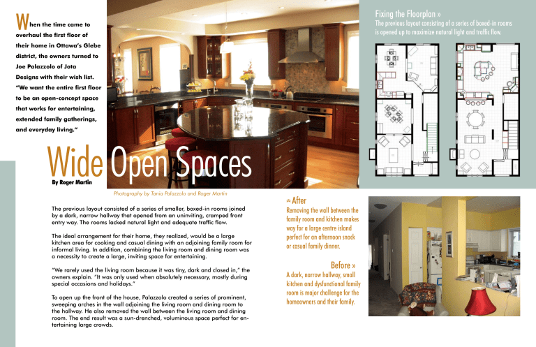
After
Removing the wall between the family room and kitchen makes way for a large centre island perfect for an afternoon snack or casual family dinner.
Before »
lii
A dark, narrow hallway, small kitchen and dysfunctional family room is major challenge for the homeowners and their family.
Fixing the Floorplan »
The previous layout consisting of a series of boxed-in rooms is opened up to maximize natural light and traffic flow.
T he rest of their wish list was fairly straight-forward.
“We needed a space where the family can gather for cooking, casual dining, homework, socializing and relaxation. The separate kitchen and family room simply didn’t meet our needs,” they said.
Transforming the existing kitchen and separate family room to meet their needs meant updating appliances, materials and the overall layout. Tackling structural issues first, the designer suggested removing the wall between the kitchen and family room. This produced the space needed for a substantial centre island with room to seat the family of four.
“Removing the wall presented a huge structural challenge,” says Palazzolo, “We hired an engineer to do a structural analysis. He determined a steal
I-beam was in short order to provide a maximum opening between the two rooms.”
Palazzolo also deleted the existing breakfast area. Doing so let him create a larger food-preparation zone, a more efficient layout that allows for multiple activites, and a smooth transition from work, to casual dining, to casual living.
“Everyone gravitates to the kitchen now. The kids love to sit at the island to do homework and eat snacks. It’s become a real hub of family activity.”
Above
Removing the existing eating area makes way for an expansive chef’s kitchen with ample countertops for meal preparation.
Below
An informal sitting area next to the kitchen becomes an ideal space for guests to sit while the host prepares dinner.
Sunny & Warm »
The newly opened living and dining room allows natural light to flood into the space, creating a bright and cozy area to hang out.
»
Space for Entertaining
A passthru between the kitchen and dining room links the casual and formal areas of the main floor, which is great for entertaining large groups and keeping the host a part of the action.
F urthering the open-concept design, Palazzolo designed a grand passthru between the kitchen and dining room echoing the arches in the hallway.
The look is cohesive and adds a sense of sophistication to the transitional design.
The entire first-floor renovation was done by father and son team Walter and Axel
Lanzinger of Lazco Design and
Development. The final step was to redo the fireplace and stairway. The fireplace was built out and covered with a dramatic black slate surround.
A new mantle was completed with traditional millwork detailing, which was reinforced by details in the staircase.
“Walter was really great at adding detail,” says the wife.
“He suggested the final design of the fireplace surround and staircase and the end result is beautiful.”
Soft furnishings combine to form an eclectic mix of traditional and contemporary pieces, and work to reinforce the overall design of the first floor. A bold red sofa in the living room adds a dramatic hit of colour and brings a touch of urban style to this stately, sunny and inviting family home.
“Joe really listened to our ideas and input,” says the wife.
“Walter and Axel started and finished the renovation on time. All-in-all, it was a really good experience.”
“We love the new space. It’s so open and inviting.”


