Color Theory
advertisement

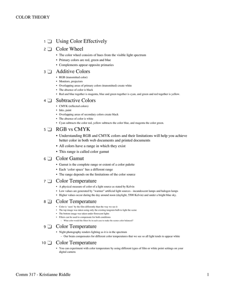
COLOR THEORY 1 2 Using Color Effectively Color Wheel • The color wheel consists of hues from the visible light spectrum • Primary colors are red, green and blue • Complements appear opposite primaries 3 Additive Colors • • • • • 4 Subtractive Colors • • • • • 5 RGB (transmitted color) Monitors, projectors Overlapping areas of primary colors (transmitted) create white The absence of color is black Red and blue together is magenta, blue and green together is cyan, and green and red together is yellow. CMYK (reflected colors) Inks, paint Overlapping areas of secondary colors create black The absence of color is white Cyan subtracts the color red, yellow subtracts the color blue, and magenta the color green. RGB vs CMYK • Understanding RGB and CMYK colors and their limitations will help you achieve better color in both web documents and printed documents • All colors have a range in which they exist • This range is called color gamut 6 Color Gamut • Gamut is the complete range or extent of a color palette • Each ‘color space’ has a different range • The range depends on the limitations of the color source 7 Color Temperature • A physical measure of color of a light source as stated by Kelvin • Low values are generated by "warmer" artificial light sources - incandescent lamps and halogen lamps • Higher values occur during the day around noon (daylight, 5500 Kelvin) and under a bright blue sky. 8 Color Temperature • • • • Color is ‘seen’ by the film differently than the way we see it The top image was taken using only the existing tungsten bulb to light the scene The bottom image was taken under florescent lights Filters can be used to compensate for both conditions – What color would the filters be in each case to make the scenes color balanced? 9 Color Temperature • Night photography renders lighting as it is in the spectrum – Our brain compensates for different color temperatures that we see so all light tends to appear white 10 Color Temperature • You can experiment with color temperature by using different types of film or white point settings on your digital camera Comm 317 - Kristianne Riddle 1 COLOR THEORY • Tungsten film is made to compensate for incandescent bulb lighting – Using tungsten film or tungsten compensation white point will create a blue-ish cast in normal daylight conditions 11 Color Hues • Related colors are close together on the color wheel – Red and orange-red • Contrasting colors are further apart – Yellow and violet • Complementary colors are opposite each other – Blue and yellow • Colors are also referred to as warm (yellow components) or cool (blues components) 12 Color and Meaning • • • • 13 Every color evokes a mood or tone People are drawn to different colors for different reasons Always consider color when communicating Color and Meaning Color Saturation • Purity or intensity of a hue • High saturation-hues appear intense or ‘vivid’ (undiluted pure color) • Low saturation-hues appear light or transparent (pastels) 14 Color Brightness • • • • • 15 Brightness is often confused with saturation Brightness is the intensity corresponding to a tonal value in black-and-white photography By adding black or white you get various nuances of a hue with different degrees of brightness Lots of black, dim lighting or an underexposed image we refer to as muddy Lots of white, bright, intense lighting, or an overexposed image we refer to as “hot” or blown out. Color Contrast • Light and dark contrast – – • • 16 17 High contrast light - when the sun is lower in the sky - enhances the contrast of colors (broader range of luminosity-darks are darker & lights are lighter) Low contrast light - cloudy, rainy, misty or foggy weather - produces muted colors of unvarying brightness (lower range of luminosity) Color Contrast • Contrasting color hues • • • – Colors far apart on the color wheel are high in contrast (complementary colors) – Colors close together on the wheel are low in contrast High contrast colors - communicate dynamic images (warm combined with cool) Low contrast colors - communicate harmonious images (all warm colors or all cool colors) One hue in varying degrees of brightness and saturation is referred to as a monochromatic image (image right) Spot Color • • • • 18 Colors in the shade are undefined and less brilliant Colored surfaces illuminated by the sun appear to be more saturated and more vivid The more intense the spot color, the stronger the effect Spot color need not be a large area of the image Spot color pulls your eye to it You can use spot color to make a statement or express symbolism – The movie The Sixth Sense uses spot color Controlling Color • Once you understand color and how light (or the absence of light) affects it, you can make choices for communicating what you want while capturing photographs or while working in Photoshop Comm 317 - Kristianne Riddle 2


