Graphic Standards and
Brand Identification
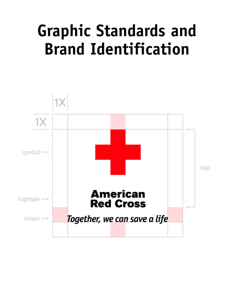
symbol
logo
logotype
slogan
symbol
logo
logotype
slogan
Respecting Our Logo
It is up to all of us to correctly use one of
our most valuable assets—a logo that stands
as a worldwide symbol of goodwill and
humanitarianism. Each time we violate our
logo guidelines, we weaken the irreplaceable
value of our symbol. And why should we alter
one of the most recognized symbols in the
world? Would a neighborhood McDonald’s®
restaurant suddenly sprout green arches?
Would a local Coca-Cola® bottler replace
the signature logotype with a font they
liked on their computer? Of course not. A
trusted and respected emblem is invaluable,
and by using it consistently, the organization is strengthened and communicates a
unified message.
What Makes Us Special?
Our Brand Identity
The American Red Cross competes with
thousands of charities and nonprofits. What
makes us stand out? What do people think of
us? There is a common thread found in our
services—and a unique perception of the Red
Cross—that positions us in the community.
The American Red Cross is the premier organization dedicated to helping people save lives.
This is part of our brand identity.
The idea of "saving lives" is both literal and
figurative. For example, providing blood is
literally a lifesaving activity. But helping
a family put their life back together after
a house fire is also a lifesaving experience.
Teaching HIV/AIDS prevention is a lifesaving
activity…as is lifeguarding. And think of
the impact we have on the lives of the
men and women serving with the Armed
Forces in distant lands. Our emergency
communications are "lifesavers" too.
To reinforce this message and to position
ourselves in the community, we have carefully researched and adopted the new brand
slogan, Together, we can save a life™. It
represents the American Red Cross and it
is empowering to people. Helping the Red
Cross save lives brings great satisfaction and
a sense of accomplishment—something we
all value.
It is important that we feature our new
slogan on our materials (see p. 10). Splash
it everywhere. The graphic file is available on
the CD (ARC A4718CD) or online. Let people
know what makes us special!
Our Logo is Protected
The American Red Cross owns rights in many
trademarks, including American Red Cross,
Together, we can save a life™ and the red
cross emblem consisting of a Greek red cross.
Trademark rights accrue upon adoption and
use. Trademarks do not have to be registered
with the U.S. Patent and Trademark Office
to be recognized and enforced. The American
Red Cross’s trademark rights in American Red
Cross and the red cross emblem date back
to 1881, even though we do not currently
have registrations for these marks. With the
exception of a few individuals and companies
that used the Greek red cross before 1905,
the American Red Cross has the exclusive
right to use the Greek red cross (and the
trademark American Red Cross) in the
United States.
If you have questions about using the logo,
please contact Carol Robinson, director,
Creative Services, at 202-639-3235, or
robinsonc@usa.redcross.org, or e-mail
brandid@usa.redcross.org.
Table of Contents
Logo and Brand Slogan Basics 2
Incorrect Use of the Logo and Slogan 12
Color Basics 4
On the Web 14
Spanish Translations New! 5
Use With Other Logos 15
Lines of Service Lockups 6
Promotional and Recognition Items 16
Unit Name Lockups 7
Clothing, Accessories and Patches 17
Business Cards and Stationery New! 8
Pins and Jewelry New! 18
Our Slogan New! 10
Architecture and Related Uses New! 19
Illustrations New! 20
© 2002 The American National Red Cross. All Rights Reserved.
Any use of this publication, including reproduction, modification, distribution
or republication, without the prior written consent of the national headquarters
of the American National Red Cross, is strictly prohibited.
1X
1X
One-line Vertical Logo With Slogan
Horizontal Logo With Slogan
Two-line Stacked Vertical Logo With Slogan
These are the three lockups used with the brand slogan. White space equal to at least the length of one arm
of the cross (1X) must be left all the way around the lockup.
One-line Vertical Logo
Horizontal Logo
Two-line Stacked Vertical Logo
These are the three acceptable configurations of the logo. White space equal to at least the length of one arm
of the cross (1X) must be left all the way around the logo.
Logo and Brand Slogan Basics
Shown here are the correct logo (cross and
type together), logotype (type alone) configurations and lockups with our brand slogan.
The basic guidelines are listed below.
■
You may enlarge or reduce the logo, but
do not alter the relationship between
the elements, and do not recreate the
logo. Use the artwork from the CD.
■
The cross may never be used alone, with
a few exceptions, such as jewelry and
architecture, and it must always be a
Greek cross made up of five equal squares.
■
The logo must always appear on a white
background, with a few exceptions, such
as pins and jewelry. White space equal
to at least one arm of the cross must
be left all the way around the logo.
■
Do not screen the logo or reverse it out
of a color background.
■
The logotype alone should be used very
rarely, and only when it is impossible
to print on a white background or when
colors other than red and black are used.
One use would be on multipart forms,
where colored papers are used. Clothing
should have the full logo on a white
background, but if you absolutely cannot
afford it, the logotype alone may be used.
■
Do not alter or recreate the logotype or
brand slogan lettering.
Use art on the CD, or download logos and slogan from CrossNet or www.redcross.org/logos/sig.html
2
One-line Logotype
Two-line Stacked Logotype
Use the logotype when you cannot print on a white background or when colors other than red and black are used.
The slogan can be used alone, not as a lockup, as long as the logo appears on the same page or spread. Do not
recreate—use the supplied art.
The one-line horizontal format has been discontinued. For units using this format, aim to phase it out by July 2002.
It is not necessary to throw away existing materials with this horizontal logo, but please replace the logo when
you replenish. The slogan We’ll be there has been discontinued.
Color—Red and Black Has the Most Impact!
The American Red Cross logo colors are red
and black. The red used for the cross is
called “Red Cross red.” It can be achieved
in two ways:
The all-black logo was created for use in
all-black ads, such as newspapers. It may be
used for strictly internal documents when
all red is not an option. It must appear on
a white background.
■
When printing in full process color, specify
100 percent process yellow and 100 percent
process magenta.
The slogan We’ll be there has been discontinued.
■
When using spot colors, use PANTONE®
color 485 as shown in the current edition
of the PANTONE® Color Formula Guide.
Help Can’t Wait no longer exists as a graphic,
but the phrase may be used in urgent situations, such as communications related to
specific disasters.
The all-red logo should be used very rarely,
and only if two-color printing is not in your
budget. It must appear on a pure white
background.
Use art on the CD, or download logos and slogan from CrossNet or www.redcross.org/logos/sig.html
3
1
Red and black has the most
impact! Always strive to use
this version.
2
When you must use one
color, this is preferable.
3
The logo may appear in allblack for newspaper ads or
other all-black ads or for
strictly internal use when
red is not an option.
4
Use type alone when you
cannot print on a white background. The logotype alone
may appear in another color.
Color Basics
The chart above displays the acceptable
uses of color, ranked in order of preference.
Use art on the CD, or download logos and slogan from CrossNet or www.redcross.org/logos/sig.html
4
1X
1X
Spanish Translation Available New!
The American Red Cross logo and brand
slogan have been translated into Spanish
to meet special needs. This is the only
non-English version of the American Red
Cross logo. Many Spanish-speaking areas
use the English version of the logo, and
this is encouraged.
The Spanish brand slogan, Juntos podemos
salvar una vida, may be locked up with the
logo or it may be used alone, as with the
English version.
Use art on the CD, or download logos and slogan from CrossNet or www.redcross.org/logos/sig.html
5
Use 60% black or PMS 416
gray for the service name.
1X
1X
If only black is available, screen
the service name to 60%.
Lines of Service Lockups
The purpose of the service lockups, such as
Disaster Services and Biomedical Services, is
to clearly identify the Red Cross services we
provide to the public in a unified manner.
Because internal support services such as
Human Resources and Information Services
are not offered to the public, they do not
use lockups.
Service names should normally appear in
a 60 percent screen of black. PANTONE® 416
gray can be substituted when screening black
might compromise product quality, for
example with silk-screened applications.
If only black is available, the service name
should be screened 60 percent. White space
equal to at least one arm of the cross (1X)
must be left all the way around the logo
and service name.
Use art on the CD, or download logos and slogan from CrossNet or www.redcross.org/logos/sig.html
6
1/2 X
1X
The typeface for the unit name is Akzidenz
Grotesk Light; if you don’t have this font, use
Arial. Always use black. The type size should
be half the size of one arm of the cross (1⁄ 2 X)
and the leading (additional space between lines
of type, measured in points) should be set 2
points higher than the type size.
Baseline of unit name.
Unit Name Lockups
Build your unit name lockup by following
the guides above. If your unit name runs
over 30 characters, break it in an appropriate
place to form two lines. Baseline of unit
name begins one arm (1X) below the logo.
Leave appropriate space equal to at least
one arm of the cross (1X) around the unit
name and logo.
Unsure if your lockup meets graphic standards?
Send a query to brandid@usa.redcross.org
for help.
Use art on the CD, or download logos and slogan from CrossNet or www.redcross.org/logos/sig.html
7
Business cards shown at 100%.
1/4"
3620 Admiral Street
El Paso,Texas 79925
Tel: 915-555-1212
Fax: 915-555-1212
Pager: 915-555-1212
doej@usa.redcross.org
www.redcrosselpaso.org
Height of cross = 7/16"
El Paso Area Chapter
Top of the letters
should align with top
of “A” in “American.”
Jane Doe
Manager, Configuration Management
Biomedical Information Systems
Baseline for last line
of title is 1/2" from
bottom of card.
Cap height of slogan = 1/8"
1/8"
3/16"
1 3/8"
Name = 10/9 Garamond Bold, flush left
Title & Unit = 7/9 Garamond Book or Bold, flush left
Address and Telephone Numbers = 7/9 Garamond Book, flush left
Business Cards and Stationery New!
All type must be black, the cross must be
red. For business cards, align the baseline
of the last line of copy as shown. Use of the
slogan on stationery is recommended.
Use art on the CD, or download logos and slogan from CrossNet or www.redcross.org/logos/sig.html
8
Letterhead shown at 75%.
Address = 10/12 Garamond Book, flush left.
3/4"
Height of
cross = 5/8"
3"
El Paso Area Chapter
3620 Admiral Street
El Paso,Texas 79925
Tel: 915-555-1212
Fax: 915-555-1212
www.redcrosselpaso.org
11/16"
El Paso Area Chapter
Align your copy with the
left vertical edge of cross.
Envelope shown at 100%.
Address = 7/9 Garamond Book, flush left.
3/8"
Height of cross = 3/8"
1X
3/8"
El Paso Area Chapter
3620 Admiral Street
El Paso,Texas 79925
Cap height = 3/16"
1/4"
Cap height = 1/4"
5/16"
Use art on the CD, or download logos and slogan from CrossNet or www.redcross.org/logos/sig.html
9
Our Slogan New!
Our brand identity is what makes us special
and positions us in the community. Try to use
the slogan on newsletters, brochures and
annual reports. Add it to banners, promotional items and other materials.
It works well as a lockup with our logo
(see p. 2). It can appear in black or any
color when used alone. You can screen it,
make patterns with it. Have fun with it, but
keep it uniform—we should all use the
same logo and brand slogan. Please use
only the graphic provided; do not use a
different font, capitalize it or recreate it
in any way.
Generally it should appear on business
cards, forms and all appropriate external
pieces, with a few exceptions such as on
items for those affected by disaster, and on
certain biomedical pieces, where it might
appear to be a product claim.
Use art on the CD, or download logos and slogan from CrossNet or www.redcross.org/logos/sig.html
10
Use art on the CD, or download logos and slogan from CrossNet or www.redcross.org/logos/sig.html
11
1X
P.O. Box 1008
1450 Eleventh Street
Santa Monica, CA 90406-1008
The cross should never be used alone, with a few
exceptions such as jewelry and architecture.
Minimum white space, equal to the length of one
arm (1X) of the cross, must be left around the logo
and lockups.
The logo must appear on a field of pure, bright white. Do not print or photocopy the logo on colored or flecked
paper. If you must use colored paper, use the logotype alone, without the cross.
Do not create a field of white for the
cross only. The entire logo must appear
on a field of pure, bright white.
Do not run type over the cross, or use other
graphic devices to alter the logo in any way.
Do not use drop shadows or alter the logo
in any way.
Incorrect Use of the Logo and Slogan
Here are samples of the most common misuses
of the logo, logotype and slogan. If you are unsure
about whether a design meets graphic standards,
e-mail us at brandid@usa.redcross.org and we’ll
respond promptly.
Use art on the CD, or download logos and slogan from CrossNet or www.redcross.org/logos/sig.html
12
354 meals served
112 families provided with shelter
8 ERVs responded
The cross and the logo are not design elements and should never be used in repetitive patterns, as borders, bullets
or in other graphic contrivances.
Red Cross
Employee
Guidelines
The logo superimposed on a photograph is incorrect
because the seemingly white areas are actually composed
of halftone screens (dots). However, you may use the
logotype alone.
Do not add to—or eliminate—any portion of the logo.
American
Red Cross
Do not alter the cross, logotype or slogan, enlarge one element, use a different font or recreate it in any way.
Use the provided graphic only.
TOGETHER, WE CAN SAVE A LIFE
Together, we can save a life
Do not recreate the slogan by substituting another font, using all caps, reproportioning it
or altering the relationship of words. Use the graphic provided on the CD or online.
The slogan should never appear on a curve, as a
circle or other shape. Use the provided graphic only.
Use art on the CD, or download logos and slogan from CrossNet or www.redcross.org/logos/sig.html
13
On the Web
Web Basics
The rules for print regarding the logo,
brand slogan and the lockups also apply
for Web use. In addition—
■
■
software (e.g., Photoshop, Fireworks) to
manipulate the .bmp, .eps, .emf, .jpg, .pcx,
.tif or .png files on the CD. Be careful not
to distort the height and width ratio of
the image.
No part of the logo should ever rotate,
blink or be used in other animations
that would distort it, although the logo
may fade in and out.
The RGB color formula for the logo is R=0,
G=0, B=0 for black; R=255, G=0, B=0 for red.
The Web-safe hexadecimal color code is
000000 for black; FF0000 for red. Hexadecimal codes in HTML should always be preceded
with a "#" symbol, e.g., #FF0000 for red.
Only the red and black logo—never the
all-red logo—should be used on the Web.
When placing the logo on Web pages, please
use the GIF images on the CD or the Web.
A large and small size of each configuration
is provided on the CD.
Create Your Own Web Site
Use the template download page located
at www.redcross.org/templates/ to plug
in your unit-specific information. An
online Internet guide is also available at
https://corpweb.redcross.org/market/int
ernet.html. In addition, most images that
you find on CrossNet may be downloaded
and used on your unit’s Web pages.
Do not change the size of the GIFs in your
HTML code. This will distort the image.
Make sure the GIF’s height and width
attributes are listed in your HTML code.
This will accelerate the loading of your
HTML code. If you need a GIF in a size
other than those provided, use graphics
Use art on the CD, or download logos and slogan from CrossNet or www.redcross.org/logos/sig.html
14
Manufactured For:
By:
American Red Cross
Plasma Services
Washington, D.C. 20006 USA
V.I. Technologies, Inc.
134 Coolidge Ave.
Watertown, MA 02472 USA
Use With Other Logos
■
■
When used in conjunction with other logos
or symbols, the Red Cross logo will almost
always be larger or predominant by virtue
of its position.
organization should be positioned to
achieve visual balance.
■
In joint undertakings on a co-equal basis,
the Red Cross logo and that of the other
Under no circumstance should another
organization’s logo be larger than the
Red Cross logo.
Use art on the CD, or download logos and slogan from CrossNet or www.redcross.org/logos/sig.html
15
Promotional and Recognition Items
Specialty items such as mugs, pencils,
buttons, crystal bowls, paperweights and
clocks are used to promote the Red Cross
or to recognize achievements.
■
The red and black logo is desirable and must
appear on a white background, maintaining
white space equal to at least one arm of
the cross (1X) around the logo. The same
guidelines pertain to an all-red logo. If a
specialty item has space limitations regarding the imprint area, come as close to
this amount of white space as you can.
■
When using a color background, create a
white field for the logo. An inexpensive
solution for using the full logo on color
items such as binders or folders is to print
the logo on white stickers and affix them
to the color items.
■
For metal or glass items that are engraved
or etched, the entire logo may appear in
the base material because no color is used
in these processes.
Use art on the CD, or download logos and slogan from CrossNet or www.redcross.org/logos/sig.html
16
Clothing, Accessories and Patches
■
The logo must always appear on a pure
white background.
■
If color fabric is used, create a white
background behind the logotype and the
cross. If you cannot afford to do so, the
logotype alone may be used but it will
not have as much impact. Never put the
cross on a colored background.
■
The Red Cross logo should be sized appropriately to the item and the material. Most
manufacturers require a minimum height
of 3⁄16” for embroidered letters in order
to produce clean, legible type.
■
Because of space limitations, it may not
be possible to maintain white space equal
to one arm of the cross around the logo.
Come as close to this amount as you can.
Use art on the CD, or download logos and slogan from CrossNet or www.redcross.org/logos/sig.html
17
Pins and Jewelry New!
The cross alone (without the logotype) may
be used on small pins and other jewelry, as the
logotype is generally too small to be readable.
Using the cross alone means it can be larger,
and thus have more impact.
If you are not using a color fill, the cross may
appear in the color of the material in use—
raised gold on a gold bracelet, for example.
It is also acceptable to use the shape of
the cross as the jewelry shape, for example
for earring studs or a pin. Just be sure to
use a Greek cross.
In every case, the cross must be a Greek
cross, which is a cross made up of five
equal squares.
Some manufacturing processes, such as
cloisonné, require that a thin border of
metal or other material appear around the
cross, which is acceptable.
The cross should appear in red on a pure white
background. White space equal to one arm
of the cross should be left around the cross
or the logo. Because of space limitations,
it may not be possible to retain this much
white space, but come as close to this
amount as possible.
Use art on the CD, or download logos and slogan from CrossNet or www.redcross.org/logos/sig.html
18
Architecture and Related Uses New!
While American Red Cross buildings should
have signage using the correct logo to clearly
identify them to the public, architectural
designs and similar artwork using only the
cross are acceptable and can enhance the
structure’s Red Cross identity.
The cross may appear in a red material on
a white background—red marble inset into
white marble, for example. Insist on seeing
a sample of the material to ensure that it
is a deep red shade, rather than light pink.
The cross can be freestanding and carved
out of material such as red granite, white or
red marble, etc. It may also be constructed
out of material such as wood, and painted
red. The paint should be as close to Red
Cross red as possible.
In every case, the cross must be a Greek
cross, which is a cross made up of five
equal squares.
The cross may appear in the color of the
base material—raised bronze on a bronze
background or etched into marble, granite,
etc. It may also be etched into or frosted
onto glass.
These architectural elements are decorative
devices and not substitutes for external
signage that clearly identifies a building
as an American Red Cross facility.
Use art on the CD, or download logos and slogan from CrossNet or www.redcross.org/logos/sig.html
19
Illustrations New!
Whether or not to include the logotype
depends on the size of the illustration and
the circumstances. In any case, the cross
should resemble a Greek cross and appear
on fairly white background. Sometimes a
pure white background is not possible
because the illustrator will need to add
depth and shadows, but come as close to
it as you can.
Illustrations often include the cross or,
in some cases, the cross and logotype as
identifiers (not decorative items). In such
cases, show the cross or logo as it would
normally appear in real life. For example,
a cross alone could be used on a drawing
of a building or a flag but not in the middle
of a maple leaf or globe. A hand-drawn cross
might also appear in a coloring book, illustrated posters or on a sketch of a disaster
worker’s helmet.
Use art on the CD, or download logos and slogan from CrossNet or www.redcross.org/logos/sig.html
20
www.redcross.org
Use art on the CD, or download logos and slogan from CrossNet or www.redcross.org/logos/sig.html
A4718
Rev. 1/02


