pattern to form
advertisement
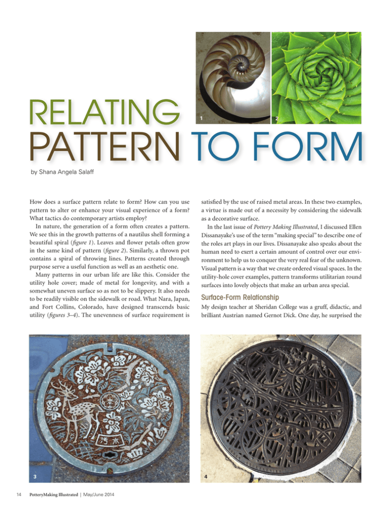
RELATING 1 2 PATTERN TO FORM by Shana Angela Salaff How does a surface pattern relate to form? How can you use pattern to alter or enhance your visual experience of a form? What tactics do contemporary artists employ? In nature, the generation of a form often creates a pattern. We see this in the growth patterns of a nautilus shell forming a beautiful spiral (figure 1). Leaves and flower petals often grow in the same kind of pattern (figure 2). Similarly, a thrown pot contains a spiral of throwing lines. Patterns created through purpose serve a useful function as well as an aesthetic one. Many patterns in our urban life are like this. Consider the utility hole cover; made of metal for longevity, and with a somewhat uneven surface so as not to be slippery. It also needs to be readily visible on the sidewalk or road. What Nara, Japan, and Fort Collins, Colorado, have designed transcends basic utility (figures 3–4). The unevenness of surface requirement is 3 14 PotteryMaking Illustrated | May/June 2014 satisfied by the use of raised metal areas. In these two examples, a virtue is made out of a necessity by considering the sidewalk as a decorative surface. In the last issue of Pottery Making Illustrated, I discussed Ellen Dissanayake’s use of the term “making special” to describe one of the roles art plays in our lives. Dissanayake also speaks about the human need to exert a certain amount of control over our environment to help us to conquer the very real fear of the unknown. Visual pattern is a way that we create ordered visual spaces. In the utility-hole cover examples, pattern transforms utilitarian round surfaces into lovely objects that make an urban area special. Surface-Form Relationship My design teacher at Sheridan College was a gruff, didactic, and brilliant Austrian named Gernot Dick. One day, he surprised the 4 class by displaying close-up images of his terrier as a slide lecture. It wasn’t until he pointed out the various ways that the growth patterns of the dog’s hair responded to different parts of the body that I realized how closely nature observes the concept of “surfaceform relationship.” Transitions between the dog’s ears and the neck were especially interesting, with straight hair growing forward on the side of the ear flowing toward a spiraling transition area then to straight growth in the opposite direction on the neck. Artists’ Solutions to Relating Pattern and Form Each of us will come up with personal solutions when pairing pattern with form, solutions that are more than just a consequence of growth pattern or utility alone. The pattern choices may simply enhance the form, or go further to change or manipulate the perception of the form. Forrest Lesch-Middelton uses patterns from a range of historical cultures. His forms are delineated clearly with crisp changes in direction. Darker bands between sections help to separate neck from body, body from foot. In this piece (figure 5), he applies different patterns to both main components of the body of the forms. His technique involves screen-printing a pattern onto a flat surface that is then wrapped around and transferred onto a cylinder, which is then altered to create the final form. This selective application of pattern highlights the different shapes of the sections that make up the form. Lesch–Middelton is able to contrast a pattern from one culture with one from another by placing them on separate areas of the same form. He adds to this a specific sepia color that appears to be quoting traditional printing or photographic process in monotone. There is a layered complexity to his work. Using Pattern to Alter or Enhance Form Pattern can also be used as a way to divide space, as in this large vase by Paul Morris (figure 11), where one form becomes subdivided by the patterned areas. One’s eye loses the ability to focus on the form as a whole because it is constantly informed 5 1 The growth patterns of the Nautilus shell create a striking spiral. Courtesy of Wikimedia Commons. 2 The aloe plant has a similar spiral growth. Courtesy of Wikimedia Commons. 3 Utility-hole cover, Nara, Japan. Nara is known for the wild deer that roam around the temple areas. 4 Utility-hole cover, Fort, Collins, Colorado. The city undertakes a number of urban beautification projects. 5 Forrest LeschMiddelton’s bottles, stoneware with transferred slip patterns. 6 Julia Galloway’s teapot, porcelain, slip, glaze, lusters. Photo: Robert Brady. 7 Sanam Emami’s patterned jar, Meissen brown stoneware, silkscreen transfers. All images of artwork are courtesy of the artists. 6 7 PotteryMaking Illustrated | May/June 2014 15 and distracted by the visual surface movement. What makes the piece work as a whole is the way that the handles mimic the curves on the surface, and that the main form is bookended by the similar shapes of the top and the base that are also mimicked by the smaller protrusions. Complicating a Surface with Layers Other artists use pattern and surface to complicate the surface of a form and to contrast decorative styles drawn from several different cultures with their own contemporary forms and materials. Julia Galloway contrasts different types of surfaces on the same pot (figure 6), using different materials (glaze, slip, and luster). She creates shapes within her forms that feel like puzzle pieces. Sanam Emami contrasts the textured pattern around the body of this covered jar (figure 7) with the applied decal pattern superimposed on the surface and looping around the form. Both vessels feature layers of pattern that are like the layers of cultural artifacts found in an archaeological dig. The upper layers sit on the surface because they are applied post-firing, but because of this they feel “newer”—underscoring that artist-created and computer-generated decals, and our metallic luster application methods really are “newer” techniques. Thus the contemporary is contrasted with the age-old in one object. The functions of the patterns here are informative as well as decorative. Galloway and Emami bring pattern from one area to another within the vessel, but another way that pattern can mess with one’s perception is to continue it outside the vessel itself, or across many forms. Molly Hatch exploits this with her wall installations (figure 8). Hatch continues the various patterns from one plate to another, with an approach that seems to have more in common with wallpaper than ceramics; completely confusing our expectations of where one form should end and another begins. I’m going to leave you with one last pair of images—an image of pattern created by the weathering of tree bark and Kristen Kieffer’s vase (figures 9–10). The tree’s beautiful textured surface emerges through natural processes in the way that Gernot Dick’s terriers fur grew. Kristen Kieffer’s work, with its pattern-as-texture shares this kind of feeling—the surface and the form feel completely connected. Kieffer uses a stamping technique to apply the main textured pattern, and this changes the form as well as decorates it. The pattern functions to create differing surface depths in which the glaze will pool and provide different levels of intensity of color, while simultaneously referring to both lace and metalwork. In the interior of the vase, one sees Kieffer’s fingerprints, and we are reminded that a real person’s hand made these marks in a specific time and place. These traces bring the vessel to life. In all these artworks, the artists have used pattern in a conscious way to both complement the form as well as to communicate through it. Pattern here functions in so many ways … and of course, always “making special.” Shana Angela Salaff is an artist and instructor living in Fort Collins, Colorado. To see her work, visit www.shanasalaff.com. 8 9 10 11 8 Molly Hatch’s plates from a solo exhibition at the King’s Road Anthropologie Gallery in London, England. The patterns on the plates source the historic textile collections at the Victoria & Albert Museum, London. 9 Pattern created by weathered tree bark. 10 Kristen Kieffer’s vase with stamped patterns. 11 Paul Morris’ large vase with form subdivided by pattern. 16 PotteryMaking Illustrated | May/June 2014
