CLICK HERE for FINAL MANUSCRIPT PREPARATION GUIDELINES
advertisement
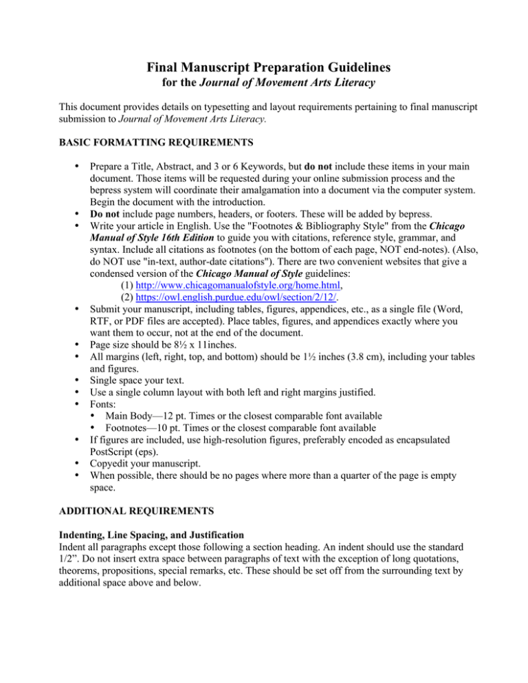
Final Manuscript Preparation Guidelines for the Journal of Movement Arts Literacy This document provides details on typesetting and layout requirements pertaining to final manuscript submission to Journal of Movement Arts Literacy. BASIC FORMATTING REQUIREMENTS • • • • • • • • • • • • Prepare a Title, Abstract, and 3 or 6 Keywords, but do not include these items in your main document. Those items will be requested during your online submission process and the bepress system will coordinate their amalgamation into a document via the computer system. Begin the document with the introduction. Do not include page numbers, headers, or footers. These will be added by bepress. Write your article in English. Use the "Footnotes & Bibliography Style" from the Chicago Manual of Style 16th Edition to guide you with citations, reference style, grammar, and syntax. Include all citations as footnotes (on the bottom of each page, NOT end-notes). (Also, do NOT use "in-text, author-date citations"). There are two convenient websites that give a condensed version of the Chicago Manual of Style guidelines: (1) http://www.chicagomanualofstyle.org/home.html, (2) https://owl.english.purdue.edu/owl/section/2/12/. Submit your manuscript, including tables, figures, appendices, etc., as a single file (Word, RTF, or PDF files are accepted). Place tables, figures, and appendices exactly where you want them to occur, not at the end of the document. Page size should be 8½ x 11inches. All margins (left, right, top, and bottom) should be 1½ inches (3.8 cm), including your tables and figures. Single space your text. Use a single column layout with both left and right margins justified. Fonts: • Main Body—12 pt. Times or the closest comparable font available • Footnotes—10 pt. Times or the closest comparable font available If figures are included, use high-resolution figures, preferably encoded as encapsulated PostScript (eps). Copyedit your manuscript. When possible, there should be no pages where more than a quarter of the page is empty space. ADDITIONAL REQUIREMENTS Indenting, Line Spacing, and Justification Indent all paragraphs except those following a section heading. An indent should use the standard 1/2”. Do not insert extra space between paragraphs of text with the exception of long quotations, theorems, propositions, special remarks, etc. These should be set off from the surrounding text by additional space above and below. 2 Don't "widow" or "orphan" text (i.e., ending a page with the first line of a paragraph or beginning a page with the last line of a paragraph). All text should be left and right-justified (i.e., flush with the left and right margins—except where indented). Right-justification is ideal, unless it creates awkward intra- and inter-word spacing, as in some references, citations, and Figure and Table headings. Wherever possible, please use right-justification (i.e., flush with the right margin). For example, LaTeX and TeX do an excellent job of justifying text. Word does a reasonable job. But some word processors do a lousy job (e.g., they achieve right justification by inserting too much white space within and between words). We prefer flush right margins. However, it is better to have jagged right margins than to have flush right margins with awkward intra- and inter-word spacing. Make your decision on whichever looks best. http://www.latex-project.org/http://www.tug.org/ Language & Grammar All submissions must be in English. Except for common foreign words and phrases, the use of foreign words and phrases should be avoided. Please use the English spellings expected of the English used in your home country or region, but use punctuation of American style publications, e.g., commas inside quotation marks. Authors should use proper, standard English grammar. The Chicago Manual of Style 16th Edition, University of Chicago Press) is a good "standard" guide. Article Length Because this journal publishes electronically, page limits are not as relevant as they are in the world of print publications. We are happy, therefore, to let authors take advantage of this greater "bandwidth" to include material that they might otherwise have to cut to get into a print journal. This being said, authors should exercise some discretion with respect to length. Colored text Set the font color to black for the majority of the text. We encourage authors to take advantage of the ability to use color in the production of figures, maps, etc.; however, you need to appreciate that this will cause some of your readers’ problems when they print the document on a black & white printer. For this reason, you are advised to avoid the use of colors in situations where their translation to black and white would render the material illegible or incomprehensible. Please ensure that there are no colored mark-ups or comments in the final version, unless they are meant to be part of the final text. (You may need to "accept all changes" in track changes or set your document to "normal" in final markup.) Emphasized text Whenever possible, use italics to indicate text you wish to emphasize rather than underlining it. The use of color to emphasize text is discouraged. Font faces Except, possibly, where special symbols are needed, use Times or the closest comparable font available. If you desire a second font, for instance for headings, use a sans serif font (e.g., Arial or Computer Modern Sans Serif). Font size The main body of text should be set in 12pt. Avoid the use of fonts smaller than 6pt for Tables. 3 Foreign terms Foreign terms should be set in italics, rather than underlined. Headings (e.g., start of sections) should use Chicago Manual of Style 16th Edition guidelines. Leave a space above and below the heading. The first paragraph after a heading should NOT be indented. Level Format 1 Centered, Boldface or Italic Type, Headline-style Capitalization 2 Centered, Regular Type, Headline-style Capitalization 3 Flush Left, Boldface or Italic Type, Headline-style Capitalization 4 Flush left, roman type, sentence-style capitalization 5 Run in at beginning of paragraph (no blank line after), boldface or italic type, sentence-style capitalization, terminal period. Main text The font for the main body of text must be black and, if at all possible, in Times or closest comparable font available. Titles of works of art, etc. Titles of works of art, dances, books, movies, etc., should be set in italics. Footnotes should appear at the bottom of the page on which they are referenced rather than at the end of the paper. Footnotes should be in 10 pt. Times or closest comparable font available, they should be single spaced, and there should be a footnote separator rule (line). Footnote numbers or symbols in the text must follow, rather than precede, punctuation. Excessively long footnotes are probably better handled in an appendix. All footnotes should be left and right- justified (i.e., flush with the right margin), unless this creates awkward spacing. Tables and Figures All Table and Figures should have a caption. Table captions should be placed above their tables. Figure captions should be placed below their figures. To the extent possible, tables and figures should appear in the document near where they are referenced in the text. Large tables or figures should be put on pages by themselves. If you need help turning large tables into landscape format, please contact the editors. Avoid the use of overly small type in tables. In no case should tables or figures be in a separate document or file. All tables and figures must fit within 1½ " margins on all sides (top, bottom, left, and right) in both portrait and landscape view. Video clips may be included in papers submitted to the Journal of Movement Arts Literacy. Insert a comment in the body of the text when the reader should access the video clip. Example: "See video clip 1". Video files may be no longer than 1 minute each, and should be clearly named. Up to five minutes of video may be included in each article. Labanwriter Notation, Movement Notation, and Mathematics Symbols and Notation are welcome in this journal in text and also in figures and tables; however, you must make every effort possible to ensure line spacing consistency is maintained and that each of your symbols converts properly when the bepress system generates the final PDF. You may submit your entire article as a pdf, which will likely help keep Labanwriter notation stable. You must examine your bepress system-created PDF carefully, and work closely with the editors until you 4 achieve a document that is satisfactory to you and the editors. We wish to enhance the clarity of your manuscript and insure that it displays correctly on the reader's screen and prints correctly on his/her printer. When proofing your bepress system-created pdf document, pay particular attention to the rendering of symbols and notation drawn from other than standard fonts. Roman letters used in mathematical expressions as variables should be italicized. Roman letters used as part of multi-letter function names should not be italicized. Whenever possible, subscripts and superscripts should be a smaller font size than the main text. Short mathematical expressions should be typed inline. Longer expressions should appear as display math. Also expressions using many different levels (e.g., such as the fractions) should be set as display math. Important definitions or concepts can also be set off as display math. Equations should be numbered sequentially. Whether equation numbers are on the right or left is the choice of the author(s). However, you are expected to be consistent in this. References It is the author's obligation to provide complete references with the necessary information. Please use the Chicago Manual of Style 16th Edition for reference citations. After the last sentence of your submission, please insert a line break—not a page break—and begin your references on the same page, if possible. References should appear right after the end of the document, beginning on the last page if possible. References should have margins that are both left and right justified. You may choose not to right-justify the margin of one or more references if the spacing looks too awkward. For long URL citations, please place a line break at the appropriate place in the citation, which will allow the citation to fill the line of text and resume on the next.
