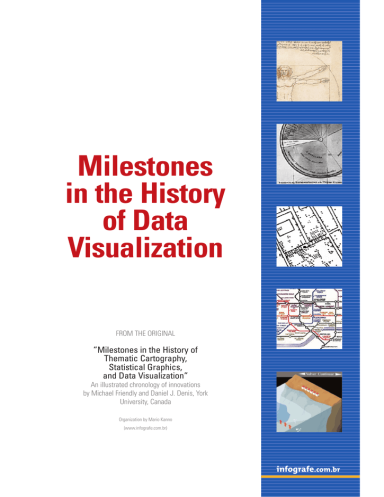
Milestones in the History of Data Visualization
advertisement

infografe.com.br Milestones in the History of Data Visualization FROM THE ORIGINAL ”Milestones in the History of Thematic Cartography, Statistical Graphics, and Data Visualization” An illustrated chronology of innovations by Michael Friendly and Daniel J. Denis, York University, Canada Organization by Mario Kanno (www.infografe.com.br) infografe.com.br infografe.com.br Milestones in the History of Data Visualization • Up to the 17th century: Maps and diagrams The origins of visualization are in geometric diagrams, in tables of the positions of stars and maps. In the 16th century, with the maritime expansion of Europe, new techniques and instruments were developed and, with such, new and more precise forms of visual presentation of knowledge. In 1436, Johannes Gutenberg invents the press c.6200 b.C. c. 550 a.C. The oldest map? Representation of a city in Babylon found in the region of Kirkuk, Iraque. The original was carved in stone. The first world map? There are no copies, just descriptions in the books of Herodotus. Anaximander of Miletus (c.610BC-546BC). c. 150 Spherical projection of the Earth using latitudes and longitudes, by Ptolomy (c. 85-c. 165), Alexandria, Egypt. The above map is a reproduction of the world map of Ptolomy made by Johan Scotus in 1505. 1375 c. 950 c. 1350 First known record of showing variables graphically (position of the sun, moon and planets during the year). The French Bishop Nicole Oresme (1323-1382) proposes the use of bar graphics to demonstrate a variable that depends on another value. Catalan book gathers an astonishing visual, cosmography, perpetual calendar and thematic representations of the known world. Abraham Cresques 91325-1387), Mallorca, Spain, 1569 c. 1500 The Italian Leonardo da Vinci (1452-1519) records his knowledge in detailed illustrations to portray anatomy, machines and movements Invention of the cylindrical projection to portray the globe. The Belgian Gerardus Mercator (1512-1594), also divided his world map in pages to facilitate the use and printed the image of the god Atlas on the cover 1595 Rumold Mercator (1545-1599) son of Gerardus continues his work and publishes this world map in 1595, one year after his father’s death infografe.com.br • 1600 to 1699: Measurements and theories The biggest problems of the century referred to physical measurement- of time, distance, and space- for astronomy, navigation and territorial expansion. Estimation, probability, demography and the whole field of statistics advance. By the end of the century, the elements to initiate a “visual thinking” are ready. 1644 Graphic made by Michael van Langren of the 12 determinations of longitude from Toledo to Rome 1686 First known meteorological map shows the prevalence of winds on a geographical map. Edmond Halley (1656-1742), England 1669 Graphic of a function shows how to find the years of life remaining according to the current age, by Christiaan Huygens (1629-1695) • 1700 to 1799: New graphic forms Cartographers begin to show more than geographical position. Until the end of the century attempts to map geology, economics, demography and health data appear. As the volume of data advances, new forms of visualization appear. Technological innovations like color, lithography and press open new ways. 1765 1799 Timeline: Life of 2000 famous people from 1200 b.C. until 1750. The lifetime was represented in bars. Joseph Priestley (17331804), England Graphical analysis of the periodic variation in soil temperature. Johann Heinrich Lambert (17281777), Germany 1782 The first topographic map. Marcellin du Carla-Boniface, France 1786 1782 Use of geometry, proportional figures (squares) to compare demographic data in superposition. Charles de Fourcroy, France Bar and lines chart with economic data. William Playfair (1759-1823), England infografe.com.br • 1800-1849: The beginning of modern infographics The first half of the 19th century was responsible for an explosion in the growth of statistical graphics and thematic mapping, thanks to the innovations obtained in the previous century. All forms of statistic graphics known today were developed at this time; in cartography, simpler maps were transformed in complex atlases based on the great variety of data. 1801 The first geological map of England and Wales developed a standard for geological cartography. Also known as the “map that changed the world” (at least for cartographers). Drawn in 1801, final version of 1815. William Smith (1769-1839). 1819 Cartogram, map with shades in black and white, showing the distribution of illiteracy in France. Maybe the first statistical map. Baron Pierre Charles Dupin (1784-1873), France 1801 Circular pie chart- William Playfair (1759-1823), England 1838 Physical atlas with the distribution of plants, animals, climate, etc., one of the most extensive and detailed thematic atlases. Includes tables and illustrated graphics. Heinrich Berghaus (17971884), Germany 1820 An increasing number of scientific publications begin to contain graphs and diagrams which describe, but do not analyze, natural phenomena (magnetic variation, weather, tides, etc.). Michael Faraday (1791-1867), England 1836 Mapping of prostitutes in Paris. Alexandre Jean Baptiste ParentDuchatelet (1790-1836), France 1843 1844 The use of polar coordinates in a graphic (direction of the frequency of winds). Léon Lalanne (1811-1892), France “Tableau-graphique” showing commercial transportation with the variables distance (horizontal), quantity (divided bars) and cost per area. Charles Joseph Minardi (1781-1870), France infografe.com.br • 1850 to 1900: Golden Age of data graphics Around 1850 all conditions to a rapid growth of visualization were established. Analysis offices were splattered over Europe with the growth of the importance of numeric information for the social, industrial, commercial and transportation planning. The statistic theory initiated by Gauss and Laplace gave the means to make sense of a greater variety of data 1855 Mapping the cases of the cholera epidemics in London, Dr. John Snow concluded that they concentrated close to one water pump, which was closed 1869 The best graphic ever made? The French engineer, Charles Minardi (1781-1870), illustrated graphically the disastrous campaign of Napoleon against Russia in 1812. The width of the course is proportional to the number of surviving soldiers in the war campaign. In beige for the way in and in black for the return. 1872 Recording of the movement of a horse race by means of cameras activated by wires. Eadweard Muybridge (1830-1904), USA 1857 The deaths by illness were more numerous than the deaths due to injuries in combat. This graphic was used in the campaign for the enhancement of sanitary conditions in the army. Florence Nightingale (1820-1910), England 1861 Modern weather map showing areas of pressure through icons that resemble the current ones. Francis Galton (1822-1911), United Kingdom 1879 Three-dimensional stereogram of the population in form of pyramid, based on the data of the Swedish Census (17501875). Luigi Perozzo, Italy 1896 Use of rectangles in map to represent two variables and their product (population of the surroundings of Paris, percentage of foreigners; rectangle area = absolute number of foreigners). Jacques Bertillon (1851-1922), France infografe.com.br • 1900 to 1949: Modern Dark Ages Few graphic innovations happened and the enthusiasm that lived in the last century was surpassed by the growth in quantification and formal models. During this period, however, all that has been achieved gets to be popularized, be it in government, in commerce and in science. Graphic visualization is consecrated to explain new discoveries in theories in astronomy, physics, biology, etc. 1911 The first Hygiene exhibit in Dresden gathers 259 statistic graphic figures by 35 national and international exhibitors. Emil Eugen Roesle (organizer) (18751962), Germany 1920 Invention of the diagram in arrows to show the relation among variables, forming a structural system. Sewall Wright (1889-1988), USA 1933 Map of the London subway became a worldrecognized symbol for its simplicity and clarity. Harry Beck based the map on a diagram of circuits that he used in the day-to-day 1924 Otto Neurath (1882-1945) organizes the Social Museum of Statistic Graphics and creates the Isotype (International System of Typographic Picture Education). Vienna, Austria • 1950 to 1974: Re-birth of visualization Data visualization begins to rise from dormancy around 1960. In the US, John W. Turkey recognizes the importance of the graphical analysis of data and develops new methods and innovations. In France, Jacques Bertin publishes his Semilogie Graphique, organizing vision and perception of graphical elements. Computers start to show their potential 1965 Improvements in histograms for the analysis of frequencies, new proposals for visual comparison. John W. Tukey (1915-2000), USA 1971 1967 Theory of symbols and models of graphic representation. Jacques Bertin, France Irregular polygon to represent multivariate data (with vertices of equal intervals, distanced from the centre proportionally to the value of the variable). J.H. Siegel, R. M. Goldwyn and Herman P. Friedman, USA infografe.com.br • From 1975 until today: The computer as a new frontier The innovations that occurred in this time were many and in diverse areas: the development of software and computer systems, highly interactive and easily used, was the hook for everything. The new paradigms of data manipulation, the invention of graphic techniques and methods of multidimensional visualization also left their marks 1982 Weather forecast page of the American paper USA Today, developed by George Rorick. The daily publication inaugurates an era of color printing in newspapers that spreads to the world. Soon, visual graphics are part of the day-today of the press 1981 Fisheye view: allows more focus and detail in areas of interest area, while retaining the surrounding context with less detail. George W. Furnas, USA 1993 1999 Xplane is established in the USA, company specializing in data visualization applied to commerce and business management Some of the best graphic artists of the US are gatherd by Richard Saul Wurman in the book “Understanding USA”, a visual compendium of socialeconomic data of the country. Page by Nigel Holmes 1999 Leland Wilkinson writes “Grammar of Graphics” in this year, a kind of systematic dictionary, with grammatical rules for data and graphics. Below, 3D outlined map in computerized structure. Leland Wilkinson (1944-), USA 1999 1996 Cartographic data software, with tools that allow various types of simultaneous mapping. Jason Dykes, United Kingdom Internet boom and new technologies allow visualization to become interactive and or animated. The Spanish papers “El País” and “El Mundo” become international references in the segment
