How to Make a Run Chart in Excel
advertisement

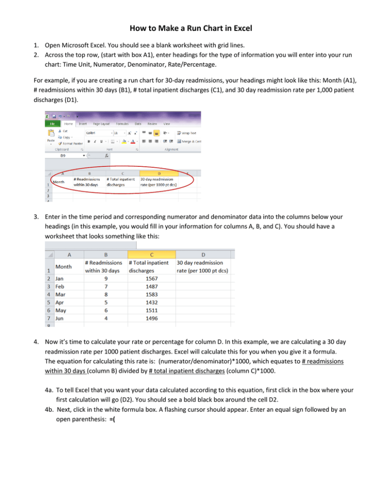
How to Make a Run Chart in Excel 1. Open Microsoft Excel. You should see a blank worksheet with grid lines. 2. Across the top row, (start with box A1), enter headings for the type of information you will enter into your run chart: Time Unit, Numerator, Denominator, Rate/Percentage. For example, if you are creating a run chart for 30-day readmissions, your headings might look like this: Month (A1), # readmissions within 30 days (B1), # total inpatient discharges (C1), and 30 day readmission rate per 1,000 patient discharges (D1). 3. Enter in the time period and corresponding numerator and denominator data into the columns below your headings (in this example, you would fill in your information for columns A, B, and C). You should have a worksheet that looks something like this: 4. Now it’s time to calculate your rate or percentage for column D. In this example, we are calculating a 30 day readmission rate per 1000 patient discharges. Excel will calculate this for you when you give it a formula. The equation for calculating this rate is: (numerator/denominator)*1000, which equates to # readmissions within 30 days (column B) divided by # total inpatient discharges (column C)*1000. 4a. To tell Excel that you want your data calculated according to this equation, first click in the box where your first calculation will go (D2). You should see a bold black box around the cell D2. 4b. Next, click in the white formula box. A flashing cursor should appear. Enter an equal sign followed by an open parenthesis: =( 4c. Select cell B2 (the border should light up blue) 4d. Type a forward slash: / 4e. Select cell C2 (it should light up green) 4f. Type a closed parenthesis: ) 4g. Type a star (hold the SHIFT and 8 keys down at the same time): * 4h. Type the number 1000: 1000 The whole equation should look like this: =(B2/C2)*1000 4i. Hit the “Enter” key. You will see a number with decimals appear in cell D2. Formula explanation: You’ve essentially told Excel that you want it to follow the formula: # readmissions within 30 days (column B) divided by # total inpatient discharges (column C) multiplied by 1000 patient discharges. Just like the order of operations in math, the parentheses tell Excel that you want it to divide the numerator and denominator first before multiplying by 1000. 5. To copy this formula into the rest of your cells, click on the cell with your original equation entered (cell D2). You should see a bold box appear around D2, with a small black box at the bottom right-hand corner of the cell. 5a. Click on the little black box (you should see a cross symbol appear in the bottom right-hand corner as soon as you move your cursor over the black box). 5b. With the cross icon appearing, drag the little black box down through the rest of the empty columns (to cell D7). Your chart should look like this: Hint: You can reduce the number of decimal points by clicking on this button in the “Number” menu: 6. Select the information you want to include in your run chart. This is usually the time unit and rate/percentage, which in this example, would be month and 30 day readmission rate. 6a. To select both of these columns at the same time, select your info in column A first, then hold down the CTRL key while you select your info in column D. Both columns should be highlighted blue. 7. Click on the “Insert” tab, Select the “Line” graph option, then click on the “Line with Markers” box 1 2 3 8. A run chart should appear on the screen that looks like this: Congratulations- you just made a run chart!
