lines of best fit - Thinking Mathematics!
advertisement

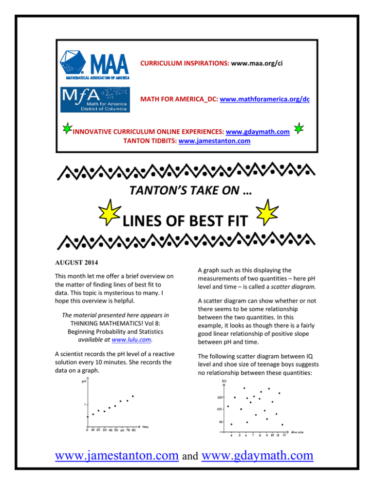
CURRICULUM INSPIRATIONS: www.maa.org/ci MATH FOR AMERICA_DC: www.mathforamerica.org/dc INNOVATIVE CURRICULUM ONLINE EXPERIENCES: www.gdaymath.com TANTON TIDBITS: www.jamestanton.com TANTON’S TAKE ON … LINES OF BEST FIT AUGUST 2014 This month let me offer a brief overview on the matter of finding lines of best fit to data. This topic is mysterious to many. I hope this overview is helpful. A graph such as this displaying the measurements of two quantities – here pH level and time – is called a scatter diagram. The material presented here appears in THINKING MATHEMATICS! Vol 8: Beginning Probability and Statistics available at www.lulu.com. A scatter diagram can show whether or not there seems to be some relationship between the two quantities. In this example, it looks as though there is a fairly good linear relationship of positive slope between pH and time. A scientist records the pH level of a reactive solution every 10 minutes. She records the data on a graph. The following scatter diagram between IQ level and shoe size of teenage boys suggests no relationship between these quantities: www.jamestanton.com and www.gdaymath.com If a scatter diagram suggests a linear relationship of positive slope, then we say that the two quantities depicted are positively correlated. If the relationship seems to be linear of negative slope, then we say that they are negatively correlated. Thus, deviations of a data points from a line of best fit should be measured as vertical segments – variations of the y -values – with no deviation horizontally. For this reason, people look for lines that minimize vertical deviations only. Now deviations are naturally measured in terms of absolute values. But as we saw in last months’ essay, mathematically working with absolute values is nightmarish! To avoid these difficulties, statisticians work with the squares of the vertical deviations instead. LINES OF BEST FIT Suppose some “bivariate” data, data for a pair of x and y values say, looks as though it is linearly correlated. We want to determine an equation for the line that fits the data well. There are two approaches: 1. Just “eyeball” one. Simply get out a ruler and plonk it down on the graph to give a line that seems to fit the data reasonably well! Thus one way to define a “line of best fit” is to find the line that gives the smallest sum of vertical deviations squared. Such a line is called the line of least squares. Most statistics courses wait until students have calculus under the belts before they describe, and prove, the general methods for finding least squares lines. (This also links to why statisticians prefer squares over absolute values – one can apply the power of calculus to squares.) However, with one reasonable assumption, there is a way to explain and justify the least squares method without calculus! A NON-CALCULUS APPROACH TO LEAST SQUARES FOR HIGH-SCHOOL STUDENTS We’ll explain the method with through example. EXAMPLE: Consider the three data points: (1, 2 ) , ( 2,5 ) , and ( 6,8) . 2. Use mathematics to derive the equation of the line that fits the data in some good sense. In conducting an experiment, one usually has complete control of one variable, the x variable, say. For example, in measuring pH levels, one has control of the times that the measurements are taken, but not of the pH levels one reads. www.jamestanton.com Find a line that minimizes the squares of the vertical deviations. and www.gdaymath.com It seems reasonable (and it turns out to be a true property of the general theory) that a line of best fit should go through the “most average” point of the data. The average x value of the data is: 1+ 2 + 6 = 3. 3 The average y -value of the data is: 2+5+8 y= = 5. 3 x= The sum of the deviations squared is: ( 5 − 2m − 2 ) So the line we seek should go through the point ( 3,5 ) . 2 2 + ( 5 − m − 5 ) + ( 5 + 3m − 8 ) = 14m 2 − 30m + 18. This has smallest value when “ m = that is, when m = −b ”, 2a 30 15 = . 28 14 So the line of best fit (by minimizing squared differences) is: y= 15 ( x − 3) + 5 . 14 Now the question is: What should the slope of this line be? That’s it! If we call the slope m , then the equation of the line will be: Comment: The process of finding a line of best fit is called regression. We have just found the regression line for the data by the method of least squares. y −5 = m. x−3 That is: y = m( x − 3) + 5 . Let’s work out the y -values for points on this line with x -values matching the data, and compare these to the actual y -values of the data points. (That is, let’s look at the vertical deviations of each data point from the line.) www.jamestanton.com The work with more than three data points is no different—the sum of deviations squared always reduces to a quadratic in the unknown slope m . To minimize the sum of squares is to simply minimize the value of a quadratic. This is very much within the reach of high-school students. If one is game, one can follow the method we just outlined for N abstract data points and obtain the general formula for the line of best fit. Here it is in its full abstract glory. and www.gdaymath.com 2 Example: For our three data points: LEAST SQUARES METHOD IN GENERAL: Suppose we have N data points in a scatter diagram: we have: 1+ 2 + 6 x= =3 3 2+5+8 y= =5 3 (1 − 3) 2 + (2 − 3) 2 + (6 − 3) 2 S xx = =7 2 (2 − 5) 2 + (5 − 5) 2 + (8 − 5) 2 S yy = =9 2 (1 − 3)(2 − 5) + (2 − 3)(5 − 5) + (6 − 3)(8 − 5) S xy = = 7.5 2 Let: x1 + x2 + L + xN N y + y2 + L + y N y= 1 N x= Let: 2 S xx ( x − x) + ( x = 1 2 −x ) 2 ( + L + xN − x ) 2 N −1 (following last months’ essay, this is called the variance of the x -values), S yy (y = 1 −y 2 ) +(y 2 −y ) 2 ( + L + yN − y ) The line of best fit goes through (3,5) and has slope 2 Teaser: Why did we compute S yy ? N −1 (this is the variance of the y -values), S xy = ( x − x )( y − y ) + ( x 1 1 2 )( ) ( 7.5 15 = , as expected. 7 14 )( − x y2 − y + L + xN − x y N − y ) N −1 Answer: It is involved in answering the question: How good is the fit really? Read on! (this is called the covariance of the x - and y -values). Then the line of best fit goes through the point ( x , y ) and has slope Its equation is: y − y = S xy S xx S xy S xx . ( x − x) . www.jamestanton.com and www.gdaymath.com MEASURING THE DEGREE OF FIT: THE CORRELATION COEFFICIENT. T −D equals 0 , then this is saying that T T = D . That is, the amount of scatter If Here are some data values: about the best regression line is no different than the amount of scatter in general. There is no relationship between the x - and y -values of any significance. Since T −D is always a positive number T we give it a name that is always a positive quantity: We chose a line y = mx + b that made the sum of deviations squared: 2 The quantity 2 D = ( y1 − ( mx1 + b ) ) + ( y2 − ( mx2 + b ) ) + L + ( yN − ( mxN + b ) ) 2 as small as it can be. This quantity reflects the amount of variation of the points about the regression line. ( 2 ) +(y 2 −y ) 2 ( + L + yN − y ) A tedious (but not difficult) exercise in algebra shows that this quantity is given by the formula: R2 Now: T = y1 − y T −D is denoted R 2 . T 2 represents the amount of variation of the y -values in general: it measures the amount of variation about the mean. But we can also think of T as giving the sum a deviations squared about the horizontal line (S ) = 2 xy S xx S yy . Usually people take the square root of this quantity: R=± (S ) 2 xy S xx S yy choosing the + sign to indicate data has a y = y. positive slope Since the regression line is designed to be better than any other line, we necessarily have: D ≤ T . This prompts one to think of the proportion: T −D . T This is a number guaranteed to be between 0 and 1 . to indicate negative slope and the – sign . The number R is called the correlation coefficient of the data. We hope to see R values close to 1 or −1 to indicate good linear fit. T −D equals 1 , then this is saying that T D = 0 , which means that there is no If scatter about the regression line. That is, all data points lie exactly on a line. www.jamestanton.com and www.gdaymath.com Example: Let’s compute the correlation coefficient of our data: We can perform a linear regression (via the methods of this essay) to the table of data values shown … Since the data has positive slope: We can then convert a line of best fit log y = mx + b back to an exponential R=+ (S ) 2 xy S xx S yy = ( 7.5 ) 7⋅9 2 ≈ 0.95 . This is very good. (Of course, with just three data points there is little information to go on. ) Challenge: Show that with just two data points we are sure to have R 2 = 1 . Comment: Statisticians tend to agree that a correlation value of 0.85 and higher, or −0.85 and lower, indicates some reasonable linear association. One wouldn’t want to make predictions based on poor linear fits for data. A WORD OF WARNING It is always wise to LOOK at a data a set before diving in and completing a linear regression. For example, although we can certainly find a line of best fit to the data shown, it would have little meaning. (We might wish to find an exponential or a quadratic curve to fit the data.) ( equation: y = 10b ⋅ 10m ) x . If you suspect data follows a curve of the form y = ax 2 , take square roots and fit a line to the data y and x . And so forth. Comment: With the power of calculus one can minimize the sum of deviations squared to any curve – not just a line - and so perform direct “exponential regressions” or “quadratic regressions,” and the like. One can avoid this intermediate step of performing a linear regression on modified data. © 2014 James Tanton tanton.math@gmail.com If you suspect data fits a curve of the form y = ac x , say, taking logarithms gives log y = x log c + log a , which is a straight line relationship between x and log y . www.jamestanton.com and www.gdaymath.com


