Step-by-step guide to making a simple graph in Excel
advertisement
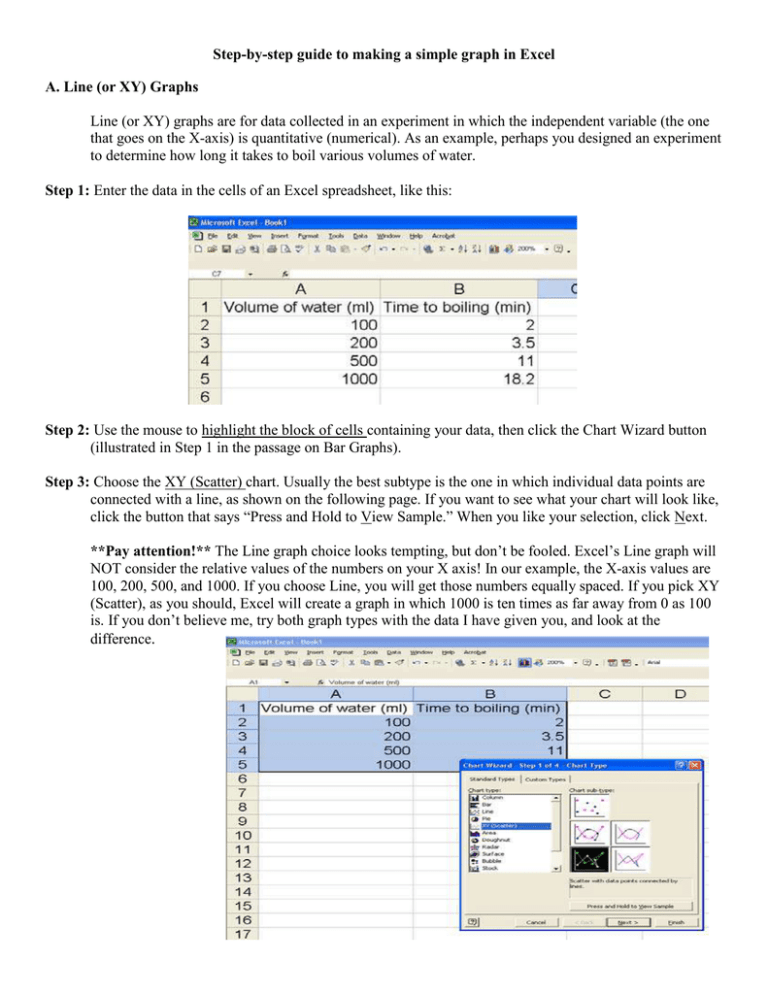
Step-by-step guide to making a simple graph in Excel A. Line (or XY) Graphs Line (or XY) graphs are for data collected in an experiment in which the independent variable (the one that goes on the X-axis) is quantitative (numerical). As an example, perhaps you designed an experiment to determine how long it takes to boil various volumes of water. Step 1: Enter the data in the cells of an Excel spreadsheet, like this: Step 2: Use the mouse to highlight the block of cells containing your data, then click the Chart Wizard button (illustrated in Step 1 in the passage on Bar Graphs). Step 3: Choose the XY (Scatter) chart. Usually the best subtype is the one in which individual data points are connected with a line, as shown on the following page. If you want to see what your chart will look like, click the button that says “Press and Hold to View Sample.” When you like your selection, click Next. **Pay attention!** The Line graph choice looks tempting, but don’t be fooled. Excel’s Line graph will NOT consider the relative values of the numbers on your X axis! In our example, the X-axis values are 100, 200, 500, and 1000. If you choose Line, you will get those numbers equally spaced. If you pick XY (Scatter), as you should, Excel will create a graph in which 1000 is ten times as far away from 0 as 100 is. If you don’t believe me, try both graph types with the data I have given you, and look at the difference. Step 4: Excel will then show you what it thinks is the correct chart, like this: If it looks right to you, click Next. Otherwise, go Back. Step 5: The Chart Wizard next gives you a series of options for changing the look of your chart. In the example on the following page, I have added axis labels and a title. I also went to the Legend tab and deleted the default legend. When you’ve messed with your graph to your heart’s content, click Next. Step 6: As shown in Step 6 of the bar graph example, your last task is to choose where you want Excel to put your new graph. I think it looks best when Excel puts the chart in a new sheet. The default name of the sheet is Chart 1; change it if you like, and when you’re done, click Finish. That’s it!
