Principles of Design Excersise: Directions Shmerykowsky
advertisement

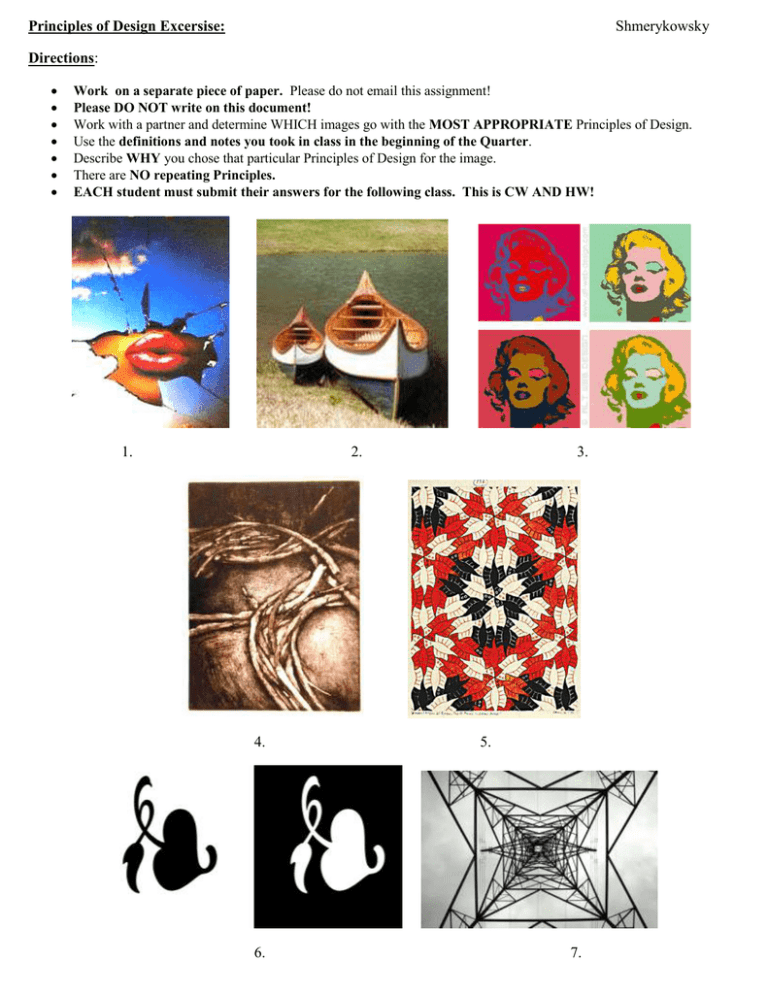
Principles of Design Excersise: Shmerykowsky Directions: Work on a separate piece of paper. Please do not email this assignment! Please DO NOT write on this document! Work with a partner and determine WHICH images go with the MOST APPROPRIATE Principles of Design. Use the definitions and notes you took in class in the beginning of the Quarter. Describe WHY you chose that particular Principles of Design for the image. There are NO repeating Principles. EACH student must submit their answers for the following class. This is CW AND HW! 1. 2. 4. 6. 3. 5. 7. TERMS: Unity or harmony is the quality of wholeness or oneness that is achieved through the effective use of the elements and principles of art. The arrangement of elements and principles to create a feeling of completeness Variety (also known as alternation) is the quality or state of having different forms or types. The differences which give a design visual and conceptual interest: notably use of contrast, emphasis, difference in size and color. Balance is arranging elements so that no one part of a work overpowers, or seems heavier than any other part. Three different kinds of balance are symmetrical, asymmetrical and radial. Symmetrical (or formal) balance is when both sides of an artwork, if split down the middle, appear to be the same. (Think of a mirror image) The human body is an example of symmetrical balance. Asymmetrical is uneven on both sides. Radial is a design that goes outwards or vice versa. It ‘radiates’ from a point of origin. Emphasis (also called focal point) is where the focus is concentrated through design principles or meaning. To do this one develops points of interest to pull the viewer's eye to important parts of the body of the work. It is to make one part of an artwork dominant over the other parts. It makes an element or object in a work stand out. To use emphasis in an artwork is to attract the viewer's eyes to a place of special importance in an artwork. Contrast to show difference and diversity in an artwork by combining elements to create interest. Contrast is to provide an artwork with something interesting to break the repetitions. Proportion (sometimes called scale) describes the relative sizes and locations of objects in the artwork. It refers to the relationships of the size of objects in a body of work. Proportion gives a sense of size seen as a relationship of objects, such as smallness or largeness. Rhythm/ Movement: Action, or alternatively, the path the viewer's eye follows throughout an artwork. Movement is caused by using elements under the rules of the principles in art to give the feeling of action and to guide the viewer's eyes throughout the artwork.

