RESULTS INFO
advertisement

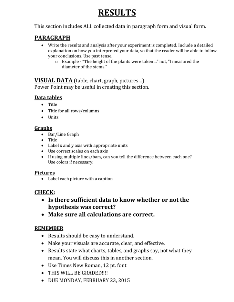
RESULTS This section includes ALL collected data in paragraph form and visual form. PARAGRAPH Write the results and analysis after your experiment is completed. Include a detailed explanation on how you interpreted your data, so that the reader will be able to follow your conclusions. Use past tense. o Example - “The height of the plants were taken…” not, “I measured the diameter of the stems.” VISUAL DATA (table, chart, graph, pictures…) Power Point may be useful in creating this section. Data tables Title Title for all rows/columns Units Graphs Bar/Line Graph Title Label x and y axis with appropriate units Use correct scales on each axis If using multiple lines/bars, can you tell the difference between each one? Use colors if necessary. Pictures Label each picture with a caption CHECK: Is there sufficient data to know whether or not the hypothesis was correct? Make sure all calculations are correct. REMEMBER Results should be easy to understand. Make your visuals are accurate, clear, and effective. Results state what charts, tables, and graphs say, not what they mean. You will discuss this in another section. Use Times New Roman, 12 pt. font THIS WILL BE GRADED!!!! DUE MONDAY, FEBRUARY 23, 2015 Introduction to Science Research 2014-2015 Results Name____________________________________________________ SECTION Paragraph Detailed explanation of how data was interpreted. Pictures Pictures are included All pictures are labeled with a caption Graphs/Charts/Data Tables Appropriate graphs/charts/data tables selected to display data All charts, data tables, and graphs have a title All charts, data tables, graphs are labeled with the corrects scales, labels and units Has the data been summarized with an average, if appropriate? Are all calculations (if any) correct? Is there sufficient data to know whether or not the hypothesis was correct? Times New Roman font, 12 pt, double spaced Spelling/grammar TOTAL GRADE __________ TOTAL POINTS POINTS EARNED 10 10 25 5 5 5 60 Rules for Good Graph Making: 1. Always give your graph a title in the following form: "The dependence of (your dependent variable) on (your independent variable). 2. The x-axis of a graph is always your independent variable and the y-axis is the dependent variable. 3. Always label the x and y axes and give units. 4. Always make a best fit line graph! A bad graph! A good graph. Graph 1: Let's see what's wrong with this graph: There's no title. What's it a graph of? Who knows? There are no labels on the x or y axis. What are those numbers? Who knows? There are no units on the x or y axis. Is this a graph of speed in miles per hour or a graph of temperature in Kelvins? Who can tell? Somebody played "connect the dots". This should be a nice straight line which goes through the points or a curve that tends to follow them. Results The results shown above were obtained by taking a daily sample of both toluene and benzene from each group. This process mainly involved pulling back the handle of a gas detector pump attached to color metric gas detection tubes. After pulling back the handle, the pump was locked into place and held horizontally for a total of 2 minutes. Depending on the chemical concentration, a visible color change from white to light brown would be seen. Looking at the markings on the tubes, the concentrations of both benzene and toluene were taken. Afterward, using the cross sensitivity table given, data was converted into an accurate form. Throughout the experiment, it was found that Group B, the experimental group did generally have a lower concentration of both benzene and toluene. As shown in Figure 1 and Figure 2, the toluene readings of Group B were drastically lower than those of Group A. While these results did shown a reduction in toluene, the rate of change in Group B over time was not extremely high. A similar pattern was shown in the benzene reading as well as seen in Figure 3 and Figure 4. Figure 1 Amount of Toluene (ppm) Group A Group B Day 1 50 ppm 26 ppm Figure 2 Figure 2 Day 2 49 ppm 17 ppm Day 3 45 ppm 12 ppm Day 4 44ppm 9 ppm Day 5 43 ppm 6 ppm of Biofiltrationon on the Reduction of Tolueneof Toluene The EffectThe of Effect Biofiltration the Reduction Amount of Toluene (ppm) Day of Experiment Figure 3 Amount of Benzene (ppm) Group A Group B Day 1 8.6 ppm 3.2 ppm Day 2 8.5 ppm 1.8 ppm Day 3 8.3 ppm 0.9 ppm Day 4 8.1 ppm 0.3 ppm Day 5 8.0 ppm 0.1 ppm Figure 4 Figure 4 The Effect of Biofiltration on Benzene Reduction The Effect of Biofiltration on Benzene Reduction 10 9 Amount of Benzene (ppm) 8 7 6 5 Group A 4 Group B 3 2 1 0 Day 1 Day 2 Day 3 Day 4 Day 5 Day of Experiment Figure 5- A vinyl tube connected the measurement chamber to the biofilter chamber. The paint thinner vapors diffused from the biofilter chamber to the measurement chamber. The outer portion of the tube was sealed using window sealant tape. Figure 6 – Benzene and toluene detector tubes were used in measuring the chemical concentrations. Chemical reactions cause a color change to take place. Directions and details were listed on a data sheet which accompanied the tubes. Figure 7- A P. Aeruginosa bacteria culture with growth medium was added to potting soil to simulate an average soil bed. Figure 8- Measurements were taken daily over a five day period using a gas detection pump and a set of gas detection tubes. Figure 9- This biofilter design contains all necessary components of a biofilter.


