Writing and Design Criteria
advertisement
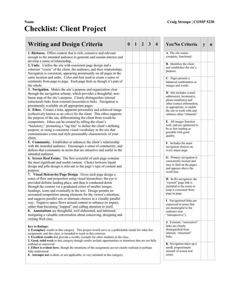
Name Craig Stroupe | COMP 5230 Checklist: Client Project Writing and Design Criteria 0 1 2 3 4 1. Richness. Offers content that is rich, extensive and relevant enough to the intended audience to generate and sustain interest and develop a sense of relationship. 2. Unity. Unifies the site with consistent page design and a coherent “vision” of the client, the audience, and their relationships. Navigation is consistent, appearing prominently on all pages in the same location and order. Color and font used to create a sense of continuity from page to page. Each page feels as though it’s part of the whole. 3. Navigation. Makes the site’s purpose and organization clear through the navigation scheme, which provides a thoughtful, nonlinear map of the site’s purpose. Clearly distinguishes internal (structural) links from external (associative) links. Navigation is prominently available on all appropriate pages. 4. Ethos. Creates a tone, apparent personality and achieved image (collectively known as an ethos) for the client. This ethos supports the purpose of the site, differentiating the client from would-be competitors. Ethos can be created by telling the client’s “backstory,” promoting a “tag line” to define the client’s defining purpose, or using a consistent visual vocabulary in the site that communicates a tone and style presumably characteristic of your client. 5. Community. Establishes or enhances the client’s relationship with the intended audience. Encourages a sense of community, and defines that community in terms that are attractive and useful to the intended audience. 6. Screen Real Estate. The first screenful of each page contains the most significant and useful content. Choice between liquid design and jello design is relevant to the page’s type of content and purpose. 7. Visual Heirarchy/Page Design. Gives each page design a sense of flow and proportion using visual hierarchies: the eye is provided definite landing place, and then is conducted down through the content via a graduated series of smaller images, headings, icons and eventually to the text. Design permits no unwanted competition among elements for the viewer’s attention, and suggests parallel sets or alternate choices in a visually parallel way. Negative space flows around content to enhance its impact, rather than becoming “trapped” and calling attention to itself. 8. Annotations are thoughtful, well elaborated, and informed, instigating a valuable conversation about conceiving, designing and writing Web sites. Key to Ratings: 4. Exemplary results in this category. This project would serve as a publishable model for what this assignment, and this class, is intended to teach in this criterion. 3. Excellent results that provide a worthy example for other students in the class. 2. Good, solid work in this category though results include opportunities or intentions that are not fully realized or conceived. 1. Effort is evident here, though the intentions of the assignment are not clearly realized or perhaps fully understood. 0. Attempts not evident, or not applicable, or very minimal in this category. Yes/No Criteria A. The site seems complete, functional. B. Identifies the client and establishes the site’s purpose. C. Pages present a balanced combination or images and words. D. Site includes e-mail address(es), location(s), phone number(s) and other contact information, as appropriate, to enable the site to work with and enhance other “channels” E. All images function well, and are optimized to be as fast loading as possible with good quality. F. Includes the main navigation choices on every major page. G. Primary navigation is consistently located and easy to find on the pages, and appears above the scroll line. H. In the navigation, the “current” page link is included in the menu to keep it consistent from page to page. I. Navigational links are expressed in terms that are meaningful to the audience (not “introspective”). J. External, “associative” links are clearly distinguished from internal, “structural” links. K. Navigation takes up a small, proportionate amount of screen real estate. y n
