From: KDD-98 Proceedings. Copyright © 1998, AAAI (www.aaai.org). All rights reserved.
Independence
Diagrams:
A Technique for Visual Data Mining
Stefan
Berchtold
AT&T Laboratories
H. V. Jagadish
AT&T Laboratories
Abstract
An important issue in data mining is the recognition
of complex dependencies between attributes.
Past
techniques for identifying
attribute
dependence include correlation coefficients, scatterplots, and equiwidth histograms.
These techniques are sensitive to
outliers, and often are not sufficiently informative to
identify the kind of attribute dependence present.
We propose a new approach, which we call independence diagrams.
We divide each attribute into
ranges; for each pair of attributes, the combination of
these ranges defines a two-dimensional
grid. For each
cell of this grid, we store the number of data items
in it. We display the grid, scaling each attribute axis
so that the displayed width of a range is proportional
to the total number of data items within that range.
The brightness of a cell is proportional
to the density
of data items in it.
As a result, both attributes are independently
normalized by frequency, ensuring insensitivity
to outliers and skew, and allowing specific focus on attribute dependencies. Furthermore, independence diagrams provide quantitative measures of the interaction between two attributes, and allow formal reasoning about issues such as statistical significance.
Visualization,
Histogram, Scatter Plot
KEYWORDS:
Two-Dimensional,
Introduction
A correlation coefficient can often capture concisely
the dependence between two attributes. However, it
is possible for two attributes to be highly dependent,
and yet have a small correlation coefficient. For example, consider a data set with data points that take
values from the set {(-l,O), (0, l), (1,O)) with equal
probability. The correlation coefficient is zero. Yet,
there is a strong dependence: given the value of the
X-attribute, the Y-attribute is determined uniquely.
There is much information obtainable through visual
inspection that cannot be condensed into a single
Copyright 01998, American Association for Artificial
Intelligence (www.aaai.org). All rights reserved.
Kenneth
A. Ross
Columbia University
parameter, leading to the popularity of scatterplots
among statisticians.
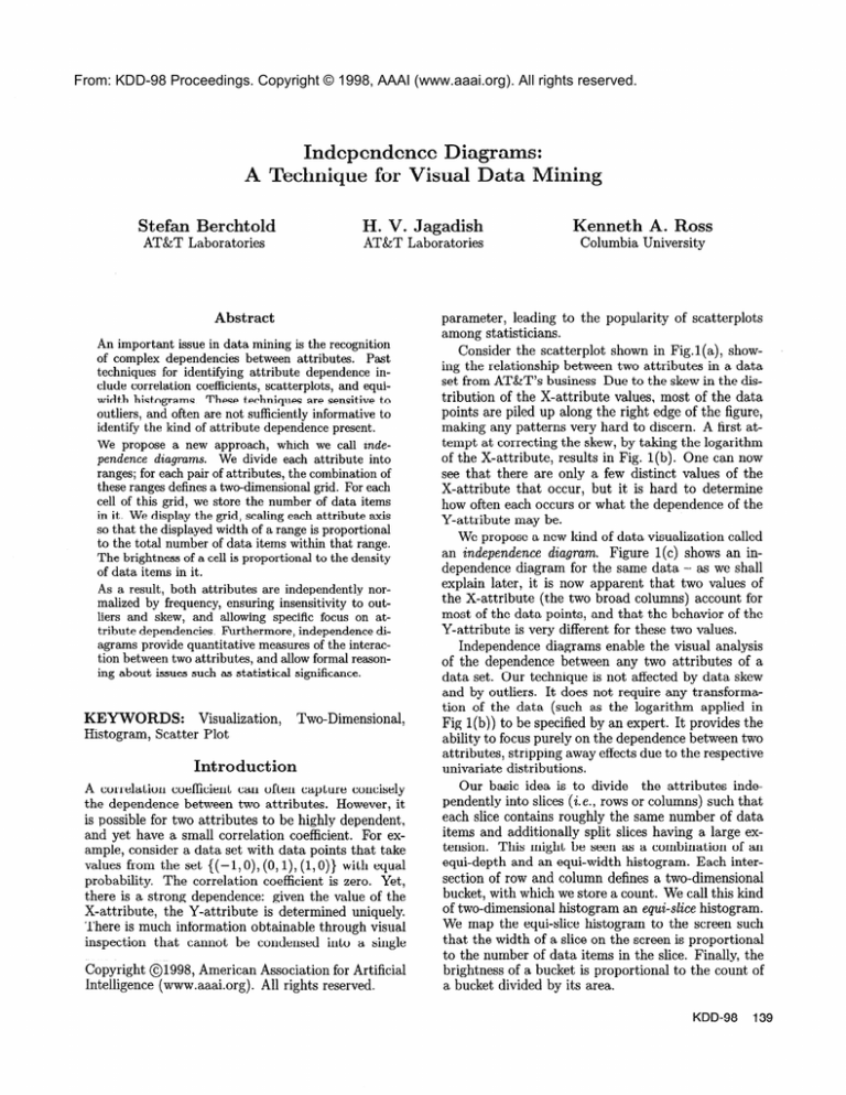
Consider the scatterplot shown in Fig.1 (a), showing the relationship between two attributes in a data
set from AT&T’s business Due to the skew in the distribution of the X-attribute values, most of the data
points are piled up along the right edge of the figure,
making any patterns very hard to discern. A first attempt at correcting the skew, by taking the logarithm
of the X-attribute, results in Fig. l(b). One can now
see that there are only a few distinct values of the
X-attribute that occur, but it is hard to determine
how often each occurs or what the dependence of the
Y-attribute may be.
We propose a new kind of data visualization called
an independence
diagram.
Figure 1 (c) shows an independence diagram for the same data - as we shall
explain later, it is now apparent that two values of
the X-attribute (the two broad columns) account for
most of the data points, and that the behavior of the
Y-attribute is very different for these two values.
Independence diagrams enable the visual analysis
of the dependence between any two attributes of a
data set. Our technique is not affected by data skew
and by outliers. It does not require any transformation of the data (such as the logarithm applied in
Fig 1 (b)) to be specified by an expert. It provides the
ability to focus purely on the dependence between two
attributes, stripping away effects due to the respective
univariate distributions.
Our basic idea is to divide the attributes independently into slices (i.e., rows or columns) such that
each slice contains roughly the same number of data
items and additionally split slices having a large extension. This might be seen as a combination of an
equi-depth and an equi-width histogram. Each intersection of row and column defines a two-dimensional
bucket, with which we store a count. We call this kind
of two-dimensional histogram an equi-slice histogram.
We map the equi-slice histogram to the screen such
that the width of a slice on the screen is proportional
to the number of data items in the slice. Finally, the
brightness of a bucket is proportional to the count of
a bucket divided by its area.
KDD-98
139
(b) Log scale on X
(a) A scatter plot
Figure 1: Finding Dependencies Between Two Attributes
This kind of visualization is amenable to interpreting dimension dependence effects, because the onedimensional distributions have already been “normalized” by depicting the slices in an equi-depth fashion.
Equally populated slices occupy equal space in the image, meaning that resolution is spent-in proportion to
the data population, and that the image is not sensitive to outliers. Returning to Figure l(c), we see
that there are two values for the X-attribute that account for roughly 40% of the data each. The left one
of the two has a higher concentration of Y-attribute
values in the lower half of all Y-attribute values, while
the right one has a higher concentration in the upper
third of Y-attribute values.
Our approach is to generate images for all combinations of attributes. Given d attributes there are
(d2 - d)/2 images. These images could be shown together as thumbnails, lining up the images along the
same attributes. This is our preferred mode for initial analysis. Images that show interesting effects can
be enlarged and analyzed further. Cross-figure comparisons are possible since each attribute is scaled and
bucketized identically in each figure in which it occurs.
Independence
Diagrams
There are several steps to generating an independence
diagram. First, we determine the boundaries of the
slices used in each dimension, and count the number
of data items in each grid cell (and slice). Second,
we scale each dimension and obtain a mapping from
buckets to pixels. Third, we determine the brightness
for the pixels in each grid cell. We describe each step
in turn below.
Attribute
Partitioning.
There is considerable
literature on choosing a good histogram (Jagadish
et al. 1998; Ioannidis & Poosala 1995; Poosala et
al. 1996). However, “good” in this context means
that the reconstruction error of the histogram is minimized. Unfortunately, for visualization purposes, this
may not be a good optimality criterion.
We propose a modified equi-depth histogram that
also handles categorical attributes appropriately. The
basic idea is to create an equi-depth partition inde140
Berchtold
(c) Independence Diagram
in a Real Data Set
pendently in each dimension, but to be flexible about
placement of bucket boundaries to allow for categorical attributes and for large differences. Our two criteria are: (a) The width of any bucket should be smaller
than a given constant wmaa:. This is the criterion
used to build an equi-width histogram. (b) The depth
(count of items) in any bucket should be smaller than
a given constant pma,. This is the criterion used to
build an equi-depth histogram. Exceptions to this
rule are allowed when the number of data items with
a single value of the attribute exceeds this limit.
The basic idea of the algorithm is first to sort
the database according to attribute, j, of interest.
(Approximate quantiles could also be used (Alsabti,
Ranka, & Singh 1997; Agrawal & Swami 1995).)
Then, in one pass, we consider each data item in turn,
and place it in the current bucket, if we can do so without violating the criteria above. When either criterion
is violated, a new bucket must be started (and marked
the current bucket). To handle the situation that a
value occurs more frequently than the specified minimum depth, we delay finalizing the bucket boundary
until we see a larger value of the attribute. At this
point, we can move the bucket boundary to the left
or right, if needed, to obtain buckets closest to even
without splitting points with identical values.
Scaling.
Data distributions are often skewed, and
it isear
that having each axis in the visualization linearly represent the attribute value space is
ideal. It is common for a statistician to transform an
attribute value by applying some mathematical function, such as taking the logarithm, the square root,
or the exponential of a data value, so that attribute
values are “properly scaled” to produce the maximum
information value to the (visual) analyst. The specific
function used is selected subjectively based on the circumstances - there is limited formal procedure.
A better alternative is an equi-depth scaling of each
axis. The idea is that each unit of length along the
axis represents an equal number of data points, rather
than an equal range in attribute value. Thus, outliers
get squeezed into a small portion of the visual space,
and the bulk of the area is devoted to the bulk of
the points, even if these are clustered tightly. A desirable consequence is that patterns and correlations
within this bulk of points now become easily visible
- something that is just not possible in the presence
of outliers. Another benefit is that all dimensions can
be interpreted in a similar fashion.
Given a bucketization for an attribute, we would
like to display the bucket with a width proportional
to the number of data points in it. However, we are
constrained in electronic displays to widths measurable as integral numbers of pixels. Utmost care is
required in this quantization, particularly since one is
often working in a regime where the number of buckets along an attribute dimension is comparable to the
number of pixels.
Among some alternatives, the following algorithm
showed the best results: For each bucket, we compute the exact (fractional) pixel width, and the corresponding density (of data points per pixel). Pixels completely included in the bucket all are assigned
the same data point count. Pixels at the boundary
get partial contributions from two (or more) buckets.
The result is to “soften” the bucket boundaries by
one-pixel wide “transitions”.
Shading
Pixels.
We now need to map a count
value for a cell into a grey-scale value for the display.
Our goals are as follows. (a) There should be a single, simple grey-scale map for the whole picture. (b)
This grey-scale map should adapt to the distribution
of the relative populations in the buckets. (c) The
grey-scale value should be more perceptible if the relative population is higher or lower than the average
relative population. (d) Grey-scale values should not
be wasted: an all-black image with a single white spot
should not occur.
The most straightforward way to scale from counts
to pixels is to map the highest count to white, the
lowest count to black, and scale all other counts in
linear proportion. In practice, this approach leads to
mostly-black images because often there are counts
that are outliers in the count-space. To overcome this
effect, we sort the counts in an image, and use the
5% and 95% quantile count values as the darkest and
lightest values respectively. The precise quantiles can
be adjusted; in a production-quality interactive tool
these values should be adjustable via the user interface. The 5% and 95% quantile values gave good results on most (but not all) of our data sets.
A more sophisticated approach might be to use a
grey-scale mapping table as proposed in (Levkowitz
1997). Such tables have been constructed so that visual gradations in brightness correspond subjectively
to humans as linear gradations in some scale. We tried
such mappings, but found that they did not give sufficiently good grey-scale distinction between buckets.
Good grey-scale distinction is more critical in this application than subjective interpretation of grey-scales.
Similar issues arise if we attempt to create a color image rather than a grey-scale image.
A legend is generated to explain the numerical
value of each grey-scale value. This legend associates
a grey-scale value with a ratio of the number of data
points in a bucket to the number of points that would
be expected in that bucket if the dimensions were independent. Both high ratios (white) and low ratios
(black) are potentially interesting. Fig. 2 shows an
independence diagram for a synthetic data set, along
with its legend. The attributes are independent, except for a range of X-attribute values. The black “finger” in the upper half of the range indicates the very
low ratio in that region. The brightening of the lower
half shows that there are more points than expected.
Morphing.
We could choose to map a given twodimensional equi-slice histogram in an equi-width
In fact, we
manner, or an equi-depth manner.
could map to an image in which the width for the
given bucket is interpolated between two visualization modes. By generating a sequence of images between an equi-width and an equi-depth mapping, we
can “morph” one image into another. Morphing the
images can aid the interpretation of the data. Details
will be given in the full version of this paper.
Figure 2: An independence diagram with legend.
Experiments
In this section we present several examples, including
an extended example based on a large AT&T data set
of more than 800,000 tuples. The system was implemented in C++ on an SGI Unix machine. The time
to compute the one-dimensional partitions of the 13dimensional data set was about 5 minutes (including
a sort and one pass through the data set for each dimension, followed by one pass to compute counts for
all grid cells in all 78 (=13*12/2) independence diagrams). After this preprocessing step, the time to
produce a single independence diagram and write it
to disk in PPM format was about 0.23 seconds. Thus,
KDD-98
141
it took about 5.5 minutes to produce all 78 independence diagrams. Displaying a single image on screen
can be done in less than a second.
To interpret independence diagrams, we must remember that each vertical slice of the image having
width w (measured as a fraction of the image width)
exactly represents the same number of data items,
namely a proportion w of the total data set. A similar
property holds for horizontal slices. This makes independence diagrams amenable to a quantitative analysis and can even be used to extract rules of the form:
“While a fraction z of all points lie in range
RA in attribute A, among those data points lying
in range RB in attribute B, the fraction is y.”
In contrast to other techniques, even exotic correlations and arbitrarily shaped dependencies can be
observed. Figure 4 shows an example: Obviously, the
two attributes are strongly correlated and this could
be captured even by means of a simple correlation
coefficient. However, there is more information contained in the image. As one can see, the correlation
is much stronger at the boundary of the data space.
Furthermore, there is a second process appearing as
a smooth line. These complex dependencies are not
likely to be captured by any simple metric.
Even more complex distributions exist. Look at
Figure 5(a). From a scatterplot or even an equi-width
presentation, one would get the impression that we
have a simple Zipfian distribution with some outliers.
However, as one can see from the independence diagram in Figure 5 (b) , the dependency is much more
complex. Note that one can see: clusters, empty regions in space, a lower bound for a process as a sharp
line (right bottom of the image), etc. Little of this information could be conveyed by a scatterplot or equiwidth histogram under presence of outliers and skew.
Related
Figure 3: An independence diagram showing real
independent data.
In order to get such a rule, a user selects - based
on visual characteristics - a rectangular “interesting”
region of the image; for example one might choose RA
and RB to define a region around a bright spot (or a
dark spot) in the image. The brightness of this region
directly gives us Pr(RA n RB)/(Pr(RA)
* Pr(RB))
= Pr(RAjRB)/Pr(RA)
= y/x. The width of
the region gives us x = Pr( RA). Thus, one can also
generate the counts for each range and the intersection region, which allows one to estimate the statistical significance of the difference between x and y.
(See (DuMouchel et al. 1996) for an example of a
technique for evaluating statistical significance in a
two-dimensional matrix.)
In a first example, we show what an uninteresting
independence diagram looks like. Recall that uninteresting in our sense means “contains no attribute
dependencies”. Figure 3(b) contains an example of a
real data set having two attributes, one of which has
some outliers, the other is very skewed. The image,
however, does not show any interesting patterns, only
random noise, because the attributes are independent.
142
Berchtold
Work
A variety of data visualization techniques such as
scatterplots
(Andrews 1972)) hyperslice (van Wijk &
van Liere 1993), parallel coordinates (Inselberg 1985)
and circle segments (Ankerst, Keim, & Kriegel 1996)
have been proposed. No previous technique specifically addressed visualizing attribute dependence effects while normalizing out the one-dimensional distributions. See (Keim 1997) for a survey.
There is much literature on finding histogram
bucket boundaries (Ioannidis & Poosala 1995; Poos1996; Jagadish et al.
1998). There
ala et al.
is even some literature on creating histogram bins
in multiple dimensions (Poosala 8z Ioannidis 1997;
Berchtold, Jagadish, & Ross 1998). However, all of
this work is focused on finding histograms that minimize the error in the estimate of the attribute value,
and our objective is quite different in this paper.
The quantitative rules we can generate resemble
association rules (Agrawal, Imielinski, & Swami 1993;
Srikant & Agrawal 1996). A fundamental difference
between our approach and the association-rule approach is that we aim to communicate regions that are
either above or below the expected cardinality of a cell
assuming independence. Association-rule algorithms
try to find regions RA and Rg such that Pr(RA IRB)
(the “confidence”) is above a threshold, whether or
not the confidence measure is close to the expected
value assuming independence.
Visual techniques for finding association rules are
presented in (Keim, Kriegel, & Seidl 1994; Fukuda et
al. 1996). These techniques also look for confidence
above a certain threshold, and do not normalize the
space to focus on attribute dependence effects alone.
Figure 4: Independence diagram.
Conclusions
We introduced independence diagrams as a means
to visually determine dependencies between two attributes. Finding such dependencies is at the heart of
most data mining.
Our approach is computationally tractable, even
when computing images for all combinations of dimensions. We have implemented it and evaluated it
using a large AT&T data set, from which the images
in this paper are drawn. It is easy to identify when
no two-dimensional effects are present. This task may
be performed by a nonexpert. Large effects occupy a
correspondingly large fraction of an image. With a little training in how to read the pictures, it is possible
to make quantitative judgements based on the images
without extensive domain knowledge. These quantitative judgements can be supported by measures of
statistical significance. Our approach is insensitive to
outliers, and is robust under extreme distributions.
References
Agrawal, R., and Swami, A.
1995. A OnePass Space-Efficient Algorithm for Finding Quantiles. Proceedings of COMAD.
Agrawal, R.; Imielinski, T.; and Swami, A. 1993.
Mining Association Rules Between Sets of Items in
Large Databases. Proceedings of ACM SIGMOD
207-216.
Alsabti, K.; Ranka, S.; and Singh, V. 1997. A OnePass Algorithm for Accurately Estimating Quantiles
for Disk-Resident Data. Proceedings of VLDB 346355.
Andrews, D. 1972. Plots of High-Dimensional Data.
Biometrics
29:125-136.
Ankerst, M.; Keim, D.; and Kriegel, H.-P. 1996.
Circle Segments: A Technique for Visually Exploring Large Multidimensional Data Sets. Visualization
‘96.
Berchtold, S.; Jagadish, H. V.; and Ross, K. A. 1998.
Approximate High-Dimensional Aggregate Queries
Using Boxes. unpublished mansucript.
Figure 5: A complex distribution.
DuMouchel, W.; Friedman, C.; Hripcsak, G.; Johnson, S. B.;’ and Clayton, P. D. 1996. Two Applications of Statistical Modeling to Natural Language
Processing. AI and Statistics V. (Chapter 39).
Fukuda, T.; Morimoto, Y.; Morishita, S.; and
Tokuyama, T. 1996. Data Mining Using TwoDimensional Optimized Association Rules: Scheme,
Algorithms and Visualization. Proceedings of A CM
SIGMOD
13-23.
Inselberg, A. 1985. The Plane with Parallel Coordinates, Special Issue on Computational Geometry.
The Visual Computer 1:29-97.
Ioannidis, Y., and Poosala, V. 1995. Balancing Histogram Optimality and Practicality for Query Result
Size Estimation. Proceedings of ACM SIGMOD 233244.
Jagadish, H. V.; Koudas, N.; Muthukrishnan, S.;
Poosala, V.; Sevcik, K. C.; and Suel, T. 1998. Optimal Histograms with Quality Guarantees. Proceedings of VLDB.
Keim, D.; Kriegel, H.; and Seidl, T. 1994. Supporting Data Mining of Large Databases by Visual
Feedback Queries. Proceedings of ICDE 302-313.
Keim, D. 1997. Visual Data Mining. Proceedings of
VLDB.
Levkowitz, H. 1997. Color Theory and Modeling
for
Computer
Graphics,
Visualization,
and Multimedia
Applications.
Kluwer Academic Publishers.
Poosala, V., and Ioannidis, Y. 1997. Selectivity Estimation Without the Attribute Value Independence
Assumption. Proceedings of VLDB 486-495.
Poosala, V.; Ioannidis, Y.; Haas, P.; and Shekita,
E. 1996. Improved Histograms for Selectivity Estimation of Range Predicates. Proceedings of ACM
SIGMOD
294-305.
Srikant, R., and Agrawal, R. 1996. Mining Quantitative Association Rules in Large Relational Tables.
Proceedings of A CM SIGMOD
1-12.
van Wij k, J., and van Liere, R. 1993. Hyperslice.
Visualization
‘93 119-125.
KDD-98
143


