VUE (Visualisation Using Emails)
Linda Leung, Tania Humphreys, Alastair Weakley
Institute for Interactive Media & Learning; Creativity & Cognition Studios
University of Technology Sydney
PO Box 123, Broadway, Sydney, NSW 2007, Australia
Linda.leung@uts.edu.au, tania.humphreys-1@uts.edu.au, aweakley@weakley.org.uk
The research questions distilled from mapping organisational processes and relationships, and interviews with directors are as follows:
• What are the processes by which a distributed organisation manages knowledge?
• How can email be leveraged for knowledge management?
• What value can be added to a standard email search
function?
Given the client organization had a large archive of email
messages, the project attempted to design interaction and
an interface to uncover organizational knowledge that was
hidden there. It sought to reveal information that would be
hard to find by searching. To complement the searching
approach, which requires one to know what to search for,
the application gives directors the ability to browse, so that
unexpected material might be discovered.
Abstract
The paper details the preliminary results of a research and design
project for the Australasian Centre for Interaction Design’s Virtual Communities program. The project aims to mine knowledge
from an email archive through a 3D user interface and interaction.
Working with a client organization, the project seeks to address
the knowledge management needs of a small distributed company.
The project is currently about to release its first beta version for
testing. |
Introduction
The project examines e-mail as more than just a communication tool, but rather an information database and a potential system for knowledge management. This was in response to the needs of the client organization for which
ninety percent of communication with their customers is
through email with support requests coming through a central email address.
The client organisation consists of seven Sydney-based
directors working in a distributed fashion with no physical
shopfront. The company is engaged in software development but its ‘bread and butter’ income is the provision of
support to their clients in the use of the company’s software. Directors are rostered to provide ‘on-call’ support to
clients for periods of two weeks. With the virtual organisation of the company and geographic spread of the directors,
there is no centralised system for logging email support requests and the respective responses given. Some directors
have more specialised knowledge of particular protocols
than others but all directors on support have extensive
technical experience of many computing environments.
This has led to a problem of no electronic, central repository or reference point for problems or solutions that may
have previously occurred that an ‘on-call’ director can access. The process is dependent on the company knowledge
base of the directors remaining the same. Therefore, one of
the key areas identified for improvement is knowledge
sharing and management within the organisation.
Competitor Analysis
Before any attempt at design, other examples of software
which represent large amounts of email data and relational
elements within that data were explored. These included
Enronic and Visual Thesaurus.
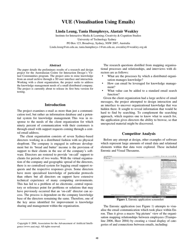
Figure 1. Enronic application screenshot
The Enronic application (see Figure 1) attempts to visualise the email communication which took place within Enron. Thus it gives a macro ‘big picture’ view of the organisation mapping relationships between employees (Trampoline 2006, Heer 2004) by creating a visual display of categories of and connections between emails, including:
|
Copyright © 2008, Association for the Advancement of Artificial Intelligence (www.aaai.org). All rights reserved.
48
•
people who were communicating with each other in
Enron
•
communities/clusters of people who communicated via
email in Enron
•
the types of emails between individuals – represented
by pie charts.
VT has a ‘Free Association Mode’ in which the designers
have intervened in emphasising which words are deemed
more important to show. However, it is harder to see many
of the words. In this case it is another example of trying to
provide more information aspects visually yet imparting a
lot less information.
VT allows people to wander along similar words or terms
which are connected to the starting word. It is an exploration of the English language that starts at one point and
meanders through the database with words triggering different ideas. Reviews of the website (ThinkMap 2007) often indicate it is not a definitive replacement for a good
thesaurus but they do add it is a great visual tool especially
for users who are more often drawn to visual organisation.
Through competitive analyses of applications such as Enronic and Visual Thesaurus, the ways in which the project
could improve upon these with consideration to the needs
of the organisation became more evident. Such enhancements included:
• more sophisticated means of filtering emails
An evaluation of the software demonstrated that its visualisation of groups/emailing communities as a mass of ever
moving grey lines and names was daunting and required
time to interpret and become meaningful. A colour grading
scale from red through to yellow and finally darker purple
and blue was useful in categorising the types of sent emails.
Colour-coding of emails was clearly labelled but was confusing when applied to the community analysis tool. It was
also difficult to reproduce the case studies described by
Heer. Indeed, the constraints of the Enronic application are
acknowledged by Heer himself as he recommends improved organisation of data according to time:
‘A range slider allowing users to filter data based on the
dates of the messages would undoubtedly be useful. Furthermore, it would be nice to animate the evolution of the
network, showing how the message traffic evolves...’
Visual Thesaurus (VT – see Figure 2) visually displays
all words connected with the word typed by the user. Drawing from a database of over 145,000 words and 115,000
meanings (Heer 2004) and displaying the correlations, it
gives a ‘visual’ representation of the data [3]. However, no
images are included: the application simply arranges synonyms, antonyms and related words in a tree-like structure.
Like Enronic, colour is used as a classification tool: coloured circles suggest the type of word with red, for example, denoting a noun. Both applications are similar in that
they attempt to strike a balance between how much information is displayed and what is to be omitted. Too much
information may be as confusing as far too little.
• greater microscopic representation of data
• better temporal depiction of the data.
Key Functionalities & Interface Design
Using a conventional text-based programming language
that would facilitate use of sophisticated graphics libraries,
such as Open Scene Graph (http://www.openscenegraph
.org), a 3D graphic representation of an email box was initially developed to depict data organised by people (who
gets and sends the most email within any one company).
In Figure 3, the application represents each person as a
column. Each person/column was linked together via
emails sent between each person. Colours were used to indicate that emails were sent (green) from one person and
received (red) by another. The above image shows it is easy
to see who is receiving and sending a high volume of
emails.
Figure 2. Visual Thesaurus application screenshot
Figure 3. People/columns connected by email ‘lines’
49
Next, the prototype sought to organise data by time
(chronologically showing the pathways of email interactions). The lines that connect the white columns, which represent the emails, are initially ordered from the newest at
the top to oldest at the bottom.
Following this (see Figure 4), each person/column was
clustered according to people from the same organisation.
These clusters were then placed at even intervals around a
circle. Previously, people were randomly placed within an
area on the screen. This more structured layout gives a
clearer indication of organisations with high email activity
but is also the first step towards identifying people within
the same company who have email activity. Each larger organisational column is transparent so that the user can see
the number of people within with whom they have corresponded by email. The display of domain names for each
organisation are added as well.
Figure 5. Client company in the centre, different heights for columns
As one of the directors of the client company is colour
blind, the contrast of colours was adjusted so that difference could be perceived. Thus, a light green was used to
indicate where the emails were sent from to the dark red to
represent the arrival.
An alternative means of displaying the direction of email
correspondence using greyscale images was adopted in accordance with Hoffmann’s (1999) suggestions. Experiments in pattern and movement were also used to indicate
the direction of email correspondence.
Given that there were now two possible options for viewing the flow of email correspondence, customisation of the
application was explored. This was implemented as a preferences panel that could be hidden behind the main window
(see Figures 6 and 7).
Figure 4. People/columns ‘clumped’ into larger organizational
columns
In the next iteration, it was suggested that the client organisation should be represented in the centre of the circle,
given that the company was the ‘common denominator’ in
all these relationships. Additionally more information was
visually shown about the emails. The heights of the columns were adjusted to represent the period of time over
which emails were sent: the shorter the column, the shorter
the period of time. Arrowheads proportionate to the number
and direction of emails sent were also implemented into the
display (see Figure 5).
Figure 6. Replacement of static colours for animation to indicate
email direction
The preferences panel allows the user to choose how they
would like the directional flow of email to be displayed.
The user has a choice of colour or animation. If the user
opts for the former, they can also nominate the colours used
to depict emails sent and received.
50
Technical
The application opens any ‘.mbox’ file type. This is a standard file type by which email programs store email messages. This means that the application can simply be
pointed to an ‘.mbox’ file on the user’s computer which
then acts as a database for the application.
Technical development is concentrating on integrating
the application with standard email programs like Entourage and AppleMail. The first versioned release will be for
Mac only.
Results
Figure 7. Preferences panel which can be hidden
Whilst developing this prototype VUE was shown to the
client company directors and their response has been very
positive. In particular they felt that the quality of the image
is one aspect of the application that makes it much more attractive as a tool. From the first demonstration the directors
quickly understood the depiction of communications between different companies within the client company email
environment. As many of the directors also perform work
outside the client company environment they could easily
see how this tool could also be used with other companies
or environments.
In addition, the user can choose from a dropdown menu
which domain name out of all available in the emailbox
they would like to be at the centre of the visualization.
Furthermore, the user can adjust the height of the columns. As the height of the columns represent the time over
which email correspondence occurred, the slide tool enables the user to focus in on a short period of time. In being
able to ‘zoom in’, that is, to magnify the visualization, the
user can then select particular emails or email threads (see
Figure 8).
Future Developments
Following the first release at the beginning of 2008, further development of the application will include providing
such features as the ability to ‘invisibilise’ selected organizations/columns, as well as certain people within those organizations. In addition, the email line selection feature will
be enhanced to enable the user to select whole threads of
emails. Accessibility issues will be investigated to allow
the application to be used entirely through keyboard control. This will include improving the way the application
handles email attachments.
Conclusion
The paper has been concerned with disseminating the
findings of the research and development of VUE (Visualisation Using Emails), a email program plug-in which displays the contents of an email archive in 3D. The application has resulted from collaboration between the client organization which has acted as a testbed environment, and
the Australasian Centre for Interaction Design’s (ACID)
Virtual Communities program.
Figure 8. Selected email line displays contents of message in an
adjacent window
Once an email line is selected in the main window, it is
differentiated by becoming animated (if colour is selected
as the preferred way of displaying email directional flow).
Conversely, if the email lines are animated, then selecting
one will make it coloured. When the selection is made, the
contents of the email are displayed in an adjacent window.
In Figure 8, an email is selected which originates from the
domain digimatter.com and has been sent to two recipients
at the domains uts.edu.au and ozemail.com.au. The contents of that email are displayed on the left.
The alpha release due in 2008 will include instructional
keyboard shortcuts that allow users to zoom in and out of
the visualization, move and rotate it.
References
Heer, J. (2004) ‘Exploring Enron – Visualizing ALNP results’ [Online]
Available: http://jheer.org/enron/v1/
Hoffman, P. (1999) ‘Usability Interface - Accommodating Color Blindness’ [Online] Available: http://www.stcsig.org/usability/newsletter/9910color-blindness.html
Murphy, R. (1998) ‘A Burglar in the Treasure House: Plumb Design's
"Visual
Thesaurus"’
[Online]
Available:
http://artnetweb.com/iola/journal/history/IA/IAsummer98_thesaurus.html
ThinkMap, (2007) ‘What isthe Visual Thesaurus?’ [Online] Available:
http://www.visualthesaurus.com/howitworks/
Trampoline
(2006)
‘Enron
Explorer’
http://enron.trampolinesystems.com/
51
[Online]
Available:


