ggmap: Spatial Visualization with ggplot2 C R
advertisement
C ONTRIBUTED R ESEARCH A RTICLES
144
ggmap: Spatial Visualization with
ggplot2
by David Kahle and Hadley Wickham
Abstract In spatial statistics the ability to visualize data and models superimposed with their basic
social landmarks and geographic context is invaluable. ggmap is a new tool which enables such
visualization by combining the spatial information of static maps from Google Maps, OpenStreetMap,
Stamen Maps or CloudMade Maps with the layered grammar of graphics implementation of ggplot2.
In addition, several new utility functions are introduced which allow the user to access the Google
Geocoding, Distance Matrix, and Directions APIs. The result is an easy, consistent and modular
framework for spatial graphics with several convenient tools for spatial data analysis.
Introduction
Visualizing spatial data in R can be a challenging task. Fortunately the task is made a good deal easier
by the data structures and plot methods of sp, RgoogleMaps, and related packages (Pebesma and
Bivand, 2006; Bivand et al., 2008; Loecher and Berlin School of Economics and Law, 2013). Using
those methods, one can plot the basic geographic information of (for instance) a shape file containing
polygons for areal data or points for point referenced data. However, compared to specialized
geographic information systems (GISs) such as ESRI’s ArcGIS, which can plot points, polygons, etc.
on top of maps and satellite imagery with drag-down menus, these visualizations can be pretty
disappointing. This article details some new methods for the visualization of spatial data in R using
the layered grammar of graphics implementation of ggplot2 in conjunction with the contextual
information of static maps from Google Maps, OpenStreetMap, Stamen Maps or CloudMade Maps
(Wickham, 2009, 2010). The result is an easy to use R package named ggmap. After describing the nuts
and bolts of ggmap, we showcase some of its capabilities in a simple case study concerning violent
crimes in downtown Houston, Texas and present an overview of a few utility functions.
Plotting spatial data in R
29.0
29.0
29.5
29.5
latitude
latitude
30.0
30.0
30.5
30.5
Areal data is data which corresponds to geographical extents with polygonal boundaries. A typical
example is the number of residents per zip code. Considering only the boundaries of the areal units,
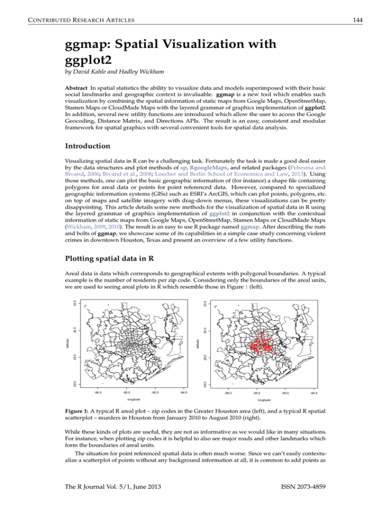
we are used to seeing areal plots in R which resemble those in Figure 1 (left).
-96.0
-95.5
-95.0
longitude
-94.5
-96.0
-95.5
-95.0
-94.5
longitude
Figure 1: A typical R areal plot – zip codes in the Greater Houston area (left), and a typical R spatial
scatterplot – murders in Houston from January 2010 to August 2010 (right).
While these kinds of plots are useful, they are not as informative as we would like in many situations.
For instance, when plotting zip codes it is helpful to also see major roads and other landmarks which
form the boundaries of areal units.
The situation for point referenced spatial data is often much worse. Since we can’t easily contextualize a scatterplot of points without any background information at all, it is common to add points as
The R Journal Vol. 5/1, June 2013
ISSN 2073-4859
C ONTRIBUTED R ESEARCH A RTICLES
145
an overlay of some areal data—whatever areal data is available. The resulting plot looks like Figure 1
(right).
In most cases the plot is understandable to the researcher who has worked on the problem for
some time but is of hardly any use to his audience, who must work to associate the data of interest
with their location. Moreover, it leaves out many practical details—are most of the events to the east
or west of landmark x? Are they clustered around more well-to-do parts of town, or do they tend
to occur in disadvantaged areas? Questions like these can’t really be answered using these kinds of
graphics because we don’t think in terms of small scale areal boundaries (e.g. zip codes or census
tracts).
With a little effort better plots can be made, and tools such as maps, maptools, sp, or RgoogleMaps
make the process much easier; in fact, RgoogleMaps was the inspiration for ggmap (Becker et al.,
2013; Bivand and Lewin-Koh, 2013).
Moreover, there has recently been a deluge of interest in the subject of mapmaking in R—Ian
Fellows’ excellent interactive GUI-driven DeducerSpatial package based on Bing Maps comes to
mind (Fellows et al., 2013). ggmap takes another step in this direction by situating the contextual
information of various kinds of static maps in the ggplot2 plotting framework. The result is an easy,
consistent way of specifying plots which are readily interpretable by both expert and audience and
safeguarded from graphical inconsistencies by the layered grammar of graphics framework. The result
is a spatial plot resembling Figure 2. Note that map images and information in this work may appear
slightly different due to map provider changes over time.
murder <- subset(crime, offense == "murder")
qmplot(lon, lat, data = murder, colour = I('red'), size = I(3), darken = .3)
●
●
●
●
●
●
●
●
●
●
●
●
●
●
●
●
●
●
●
●
●●
●
●
●
●
●
●
●
●
●
●●
●●
●
●
●
● ●
●
●
● ●●
● ●
●
●
●
●
●
●
●
●
●
●
●
●
●●
●
●
●
●
●
●
●
●
●●
● ●
●
●●
●
●
●
●
●
●
●
●
●
●
●●
●
●
●
●
●● ●
●
●
●
●
●●
●
●● ●
●
●
●●
●
●
●
●
●
●
●
●
●
●
●
●
●
●
●
●
●
●●
●
●
●
● ●
● ●
●●
● ●
●
●
●
●
●
●
●
●
●
●
●
●
Figure 2: A spatial scatterplot based on Stamen Maps’ terrain tile set made with the qmplot function,
an experimental amalgamation of the functions presented in this article.
The layered grammar of graphics
One advantage of making the plots with ggplot2 is the layered grammar of graphics on which ggplot2
is based (Wickham, 2010; Wilkinson, 2005). By definition, the layered grammar demands that every
plot consist of five components :
• a default dataset with aesthetic mappings,
• one or more layers, each with a geometric object (“geom”), a statistical transformation (“stat”),
and a dataset with aesthetic mappings (possibly defaulted),
• a scale for each aesthetic mapping (which can be automatically generated),
• a coordinate system, and
• a facet specification.
The R Journal Vol. 5/1, June 2013
ISSN 2073-4859
C ONTRIBUTED R ESEARCH A RTICLES
146
Since ggplot2 is an implementation of the layered grammar of graphics, every plot made with ggplot2
has each of the above elements. Consequently, ggmap plots also have these elements, but certain
elements are fixed to map components : the x aesthetic is fixed to longitude, the y aesthetic is fixed to
latitude, and the coordinate system is fixed to the Mercator projection.1
The major theoretical advantage of using the layered grammar in plotting maps is that aesthetic
scales are kept consistent. In the typical situation where the map covers the extent of the data, in
ggmap the latitude and longitude scales key off the map (by default) and one scale is used for those
axes. The same is true of colors, fills, alpha blendings, and other aesthetics which are built on top of
the map when other layers are presented—each is allotted one scale which is kept consistent across
each layer of the plot. This aspect of the grammar is particularly important for faceted plots in order
to make a proper comparison across several plots. Of course, the scales can still be tricked if the user
improperly specifies the spatial data, e.g. using more than one projection in the same map, but fixing
such errors is beyond any framework.
The practical advantage of using the grammar is even better. Since the graphics are done in ggplot2
the user can draw from the full range of ggplot2’s capabilities to layer elegant visual content—geoms,
stats, scales, etc.—using the usual ggplot2 coding conventions. This was already seen briefly in Figure
2 where the arguments of qmplot are identical to that of ggplot2’s qplot; much more will be seen
shortly.
How ggmap works
The basic idea driving ggmap is to take a downloaded map image, plot it as a context layer using
ggplot2, and then plot additional content layers of data, statistics, or models on top of the map. In
ggmap this process is broken into two pieces – (1) downloading the images and formatting them
for plotting, done with get_map, and (2) making the plot, done with ggmap. qmap marries these two
functions for quick map plotting (c.f. ggplot2’s ggplot), and qmplot attempts to wrap up the entire
plotting process into one simple command (c.f. ggplot2’s qplot).
The get_map function
In ggmap, downloading a map as an image and formatting the image for plotting is done with the
get_map function. More specifically, get_map is a wrapper function for the underlying functions
get_googlemap, get_openstreetmap, get_stamenmap, and get_cloudmademap which accepts a wide
array of arguments and returns a classed raster object for plotting with ggmap.
As the most important characteristic of any map is location, the most important argument of
get_map is the location argument. Ideally, location is a longitude/latitude pair specifying the center
of the map and accompanied by a zoom argument, an integer from 3 to 20 specifying how large the
spatial extent should be around the center, with 3 being the continent level and 20 being roughly the
single building level. location is defaulted to downtown Houston, Texas, and zoom to 10, roughly a
city-scale.
While longitude/latitude pairs are ideal for specifying a location, they are somewhat inconvenient
on a practical level. For this reason, location also accepts a character string. The string, whether
containing an address, zip code, or proper name, is then passed to the geocode function which then
determines the appropriate longitude/latitude coordinate for the center. In other words, there is
no need to know the exact longitude/latitude coordinates of the center of the map—get_map can
determine them from more colloquial (“lazy”) specifications so that they can be specified very loosely.
For example, since
> geocode("the white house")
lon
lat
-77.03676 38.89784
works, "the white house" is a viable location argument. More details on geocode and other utility
functions are discussed at the end of this article.
In lieu of a center/zoom specification, some users find a bounding box specification more convenient. To accommodate this form of specification, location also accepts numeric vectors of length four
following the left/bottom/right/top convention. This option is not currently available for Google
Maps.
While each map source has its own web application programming interface (API), specification
of location/zoom in get_map works for each by computing the appropriate parameters (if necessary)
1 Note that because of the Mercator projection limitations in mapproject, anything above/below ±80◦ cannot be
plotted currently.
The R Journal Vol. 5/1, June 2013
ISSN 2073-4859
C ONTRIBUTED R ESEARCH A RTICLES
147
and passing them to each of the API specific get_* functions. To ensure that the resulting maps are
the same across the various sources for the same location/zoom specification, get_map first grabs the
appropriate Google Map, determines its bounding box, and then downloads the other map as needed.
In the case of Stamen Maps and CloudMade Maps, this involves a stitching process of combining
several tiles (small map images) and then cropping the result to the appropriate bounding box. The
result is a single, consistent specification syntax across the four map sources as seen for Google Maps
and OpenStreetMap in Figure 3.
baylor <- "baylor university"
qmap(baylor, zoom = 14)
qmap(baylor, zoom = 14, source = "osm")
Figure 3: get_map provides the same spatial extent for Google Maps (top) and OpenStreetMaps
(bottom) with a single simple syntax, even though their APIs are quite different.
Before moving into the source and maptype arguments, it is important to note that the underlying
API specific get_* functions for which get_map is a wrapper provide more extensive mechanisms for
downloading from their respective sources. For example, get_googlemap can access almost the full
range of the Google Static Maps API as seen in Figure 4.
Tile style – the source and maptype arguments of get_map
The most attractive aspect of using different map sources (Google Maps, OpenStreetMap, Stamen
Maps, and CloudMade Maps) is the different map styles provided by the producer. These are specified
The R Journal Vol. 5/1, June 2013
ISSN 2073-4859
C ONTRIBUTED R ESEARCH A RTICLES
148
set.seed(500)
df <- round(data.frame(
x = jitter(rep(-95.36, 50), amount = .3),
y = jitter(rep( 29.76, 50), amount = .3)
), digits = 2)
map <- get_googlemap('houston', markers = df, path = df, scale = 2)
ggmap(map, extent = 'device')
Figure 4: Accessing Google Maps API features with get_googlemap.
The R Journal Vol. 5/1, June 2013
ISSN 2073-4859
C ONTRIBUTED R ESEARCH A RTICLES
149
with the maptype argument of get_map and must agree with the source argument. Some styles
emphasize large roadways, others bodies of water, and still others political boundaries. Some are
better for plotting in a black-and-white medium; others are simply nice to look at. This section gives a
run down of the various map styles available in ggmap.
Google provides four different familiar types—terrain (default), satellite (e.g. Figure 13), roadmap,
and hybrid (e.g. Figure 12). OpenStreetMap, on the other hand, only provides the default style shown
in Figure 3.
Style is where Stamen Maps and CloudMade Maps really shine. Stamen Maps has three available
tile sets—terrain (e.g. Figures 2 or 13), watercolor, and toner (for the latter two see Figure 5).
qmap(baylor, zoom = 14, source = "stamen", maptype = "watercolor")
qmap(baylor, zoom = 14, source = "stamen", maptype = "toner")
Figure 5: Stamen tile sets maptype = "watercolor" and maptype = "toner".
Stamen’s terrain tile set is quite similar to Google’s, but obviously the watercolor and toner tile
sets are substantially different than any of the four Google tile sets. The latter, for example, is ideal for
black-and-white plotting.
CloudMade Maps takes the tile styling even further by allowing the user to either (1) select among
thousands of user-made sets or (2) create an entirely new style with a simple online editor where the
user can specify colors, lines, and so forth for various types of roads, waterways, landmarks, etc.,
all of which are generated by CloudMade and accessible in ggmap. ggmap, through get_map (or
get_cloudmademap) allows for both options. This is a unique feature of CloudMade Maps which really
boosts their applicability and expands the possibilities with ggmap. The one minor drawback to using
CloudMade Maps is that the user must register with CloudMade to obtain an API key and then pass
the API key into get_map with the api_key argument. API keys are free of charge and can be obtained
in a matter of minutes. Two low-light CloudMade map styles are seen in Figure 6. Note that map
styles are only available to the user that owns them.
Both Stamen Maps and CloudMade Maps are built using OpenStreetMap data. These data are
contributed by an open community of online users in much the same way Wikipedia is—both are free,
both are user-contributed, and both are easily edited. Moreover, OpenStreetMap has data not only on
roadways and bodies of water but also individual buildings, fountains, stop signs and other apparent
minutiae. The drawback is that (like Google Maps) not all locations are mapped with the same degree
of precision, and imperfections may be observed in small-scale out of the way features.2
The ggmap function
Once get_map has grabbed the map of interest, ggmap is ready to plot it. The result of get_map is a
specially classed raster object (a matrix of colors as hexadecimal character strings) –
> paris <- get_map(location = "paris")
> str(paris)
2 As an example, the reader is referred to look at Google Maps satellite images of northwest tributaries to Lake
Waco and search for them in the Stamen watercolor tile set.
The R Journal Vol. 5/1, June 2013
ISSN 2073-4859
C ONTRIBUTED R ESEARCH A RTICLES
150
qmap(baylor, zoom = 14, maptype = 53428, api_key = api_key,
source = "cloudmade")
qmap("houston", zoom = 10, maptype = 58916, api_key = api_key,
source = "cloudmade")
Figure 6: Two out of thousands of user made CloudMade Maps styles. The left is comparable to
Figures 3 and 5, and the right contains the bodies of water in Figure 4.
chr [1:1280, 1:1280] "#C6DAB6" "#C2D6B3" "#C2D6B3" ...
- attr(*, "class")= chr [1:2] "ggmap" "raster"
- attr(*, "bb")='data.frame':
1 obs. of 4 variables:
..$ ll.lat: num 48.6
..$ ll.lon: num 1.91
..$ ur.lat: num 49.1
..$ ur.lon: num 2.79
The purpose of ggmap is to take the map from the raster object to the screen, and it fulfills this purpose
by creating a ggplot object which, when printed, draws the desired map in the graphics device. This is
illustrated in Figure 7.
While ggmap requires a ggmap object, it accepts a handful of other arguments as well—extent,
base_layer, maprange, legend, padding, and darken. With none of these additional arguments, ggmap
effectively returns the following ggplot object
ggplot(aes(x = lon, y = lat), data = fourCorners) +
geom_blank() + coord_map("mercator") +
annotation_raster(ggmap, xmin, xmax, ymin, ymax)
where fourCorners is the data frame resulting from applying expand.grid to the longitude and
latitude ranges specified in the bb attribute of the ggmap object. Thus, the default base layer of the
ggplot2 object created by ggmap is ggplot(aes(x = lon,y = lat),data = fourCorners), and the
default x and y aesthetic scales are calculated based on the longitude and latitude ranges of the map.
The extent argument dictates how much of the graphics device is covered by the map. It
accepts three possible strings: "normal" shown in Figure 7, "panel" shown in Figures 10 and
12, and "device" shown in every other figure. "normal" situates the map with the usual axis
padding provided by ggplot2 and, consequently, one can see the panel behind it. "panel" eliminates this, setting the limits of the plot panel to be the longitude and latitude extents of the map with
scale_[x,y]_continuous(expand = c(0,0)). "device" takes this to the extreme by eliminating the
axes themselves with the new exported theme_nothing.
base_layer is a call which substitutes the default base layer to the user’s specification. Thus,
in the above code the user can change ggplot(aes(x = lon,y = lat),data = fourCorners) to a
different call. This is essential for faceting plots since the referent of ggplot2 functions facet_wrap and
facet_grid is the base layer. Since changing the base layer changes the base scales and therefore limits
of the plot, it is possible that when the base layer is changed only part of the map is visible. Setting
the maprange argument to TRUE (it defaults to FALSE) ensures that the map determines the x and y axis
The R Journal Vol. 5/1, June 2013
ISSN 2073-4859
C ONTRIBUTED R ESEARCH A RTICLES
151
ggmap(paris, extent = "normal")
Figure 7: Setting extent = "normal" in ggmap illustrates how maps in ggmap are simply ggplot2
graphics.
limits (longitude and latitude) via the bb attribute of the ggmap object itself, and not the base_layer
argument.
The legend-related arguments of ggmap are legend and padding, and they are only applicable
when extent = "device". The legend argument determines where a legend should be drawn on the
map if one should be drawn. Its options are "left", "right" (default), "bottom", "top", "topleft",
"bottomleft", "topright", "bottomright" and "none". The first four draw the legend according to
ggplot2’s normal specifications (without any axes); the next four draw the legend on top of the map
itself similar to ArcGIS; and the last eliminates the legend altogether. padding governs how far from
the corner the legend should be drawn.
The darken argument, a suggestion by Jean-Olivier Irisson, tints the map image. The default,
c(0,"black"), indicates a fully translucent black layer, i.e. no tint at all. Generally, the first argument
corresponds to an alpha blending (0 = invisible, 1 = opaque) and the second argument the color of the
tint. If only a number is supplied to the darken argument ggmap assumes a black tint. The tint itself is
made by adding a geom_rect layer on top of the map. An example is provided by Figure 2, where a
black tint was added to the map to enhance the visibility of the points.
Since ggmap returns a ggplot object, the product of ggmap can itself act as a base layer in the ggplot2
framework. This is an incredibly important realization which allows for the full range of ggplot2
capabilities. We now illustrate many of the ways in which this can be done effectively through a case
study of violent crime in downtown Houston, Texas.
ggmap in action
Data
Crime data were compiled from the Houston Police Department’s website over the period of January
2010–August 2010. The data were lightly cleaned and aggregated using plyr (Wickham, 2011) and
geocoded using Google Maps (to the center of the block, e.g., 6150 Main St.); the full data set is
available in ggmap as the data set crime.
> str(crime)
'data.frame':
86314 obs. of 17 variables:
$ time
: POSIXt, format: "2010-01-01 0...
$ date
: chr "1/1/2010" "1/1/2010" "1...
The R Journal Vol. 5/1, June 2013
ISSN 2073-4859
C ONTRIBUTED R ESEARCH A RTICLES
$
$
$
$
$
$
$
$
$
$
$
$
$
$
$
hour
:
premise :
offense :
beat
:
block :
street :
type
:
suffix :
number :
month :
day
:
location:
address :
lon
:
lat
:
152
int 0 0 0 0 0 0 0 0 0 0 ...
chr "18A" "13R" "20R" "20R" ...
chr "murder" "robbery" "aggr...
chr "15E30" "13D10" "16E20" ...
chr "9600-9699" "4700-4799" ...
chr "marlive" "telephone" "w...
chr "ln" "rd" "ln" "st" ...
chr "-" "-" "-" "-" ...
int 1 1 1 1 1 1 1 1 1 1 ...
Factor w/ 12 levels "january"...
Factor w/ 7 levels "monday" ...
chr "apartment parking lot" ...
chr "9650 marlive ln" "4750 ...
num -95.4 -95.3 -95.5 -95.4 ...
num 29.7 29.7 29.6 29.8 29.7...
Since we are only interested in violent crimes which take place downtown, we restrict the data
set to those qualifiers. To determine a bounding box, we first use gglocator, a ggplot2 analogue
of base’s locator function exported from ggmap. gglocator works not only for ggmap plots, but
ggplot2 graphics in general.
>
>
>
>
>
>
>
>
>
+
>
>
>
+
>
>
>
+
+
# find a reasonable spatial extent
qmap('houston', zoom = 13)
gglocator(2)
lon
lat
1 -95.39681 29.78400
2 -95.34188 29.73631
# only violent crimes
violent_crimes <- subset(crime,
offense != "auto theft" & offense != "theft" & offense != "burglary")
# order violent crimes
violent_crimes$offense <- factor(violent_crimes$offense,
levels = c("robbery", "aggravated assault", "rape", "murder"))
# restrict to downtown
violent_crimes <- subset(violent_crimes,
-95.39681 <= lon & lon <= -95.34188 &
29.73631 <= lat & lat <= 29.78400)
The analysis performed only concerns data on the violent crimes of aggravated assault, robbery,
rape and murder. Note that while some effort was made to ensure the quality of the data, the data
were only leisurely cleaned and the data set may still contain errors.
Analysis
The first step we might want to take is to look at where the individual crimes took place. Modulo some
simple ggplot2 styling changes (primarily in the fonts and key-styles of the legends via ggplot2’s
guide function), Figure 8 contains the code to produce the spatial bubble chart shown on the left.
One of the problems with the bubble chart is overplotting and point size—we can’t really get a feel
for what crimes are taking place and where. One way around this is to bin the points and drop the
bins which don’t have any samples in them. The result (Figure 8 right) shows us where the crimes are
happening at the expense of knowing their frequency.
The binned plot is the first time we really begin to see the power of having the maps in the ggplot2
framework. While it is actually not a very good plot, it illustrates the practical advantage of the
ggplot2 framework with the contextual information of the map—the process of splitting the data
frame violent_crimes into chunks based on the offense variable, binning the points of each, and
aggregating back into one data set to plot is all done entirely behind the scenes by ggplot2.
What about violent crimes in general? If we neglect the type of offense, we can get a good idea of
the spatial distribution of violent crimes by using a contour plot. Since the map image itself is based
on ggplot2’s annotation_raster, which doesn’t have a fill aesthetic, we can access the fill aesthetic to
make a filled contour plot. This is seen in Figure 9 (left).
The R Journal Vol. 5/1, June 2013
ISSN 2073-4859
C ONTRIBUTED R ESEARCH A RTICLES
153
theme_set(theme_bw(16))
HoustonMap <- qmap("houston", zoom = 14, color = "bw", legend = "topleft")
HoustonMap +
geom_point(aes(x = lon, y = lat, colour = offense, size = offense),
data = violent_crimes)
HoustonMap +
stat_bin2d(
aes(x = lon, y = lat, colour = offense, fill = offense),
size = .5, bins = 30, alpha = 1/2,
data = violent_crimes
)
Figure 8: Violent crime bubble chart of downtown Houston (left) and the same binned (right).
The R Journal Vol. 5/1, June 2013
ISSN 2073-4859
C ONTRIBUTED R ESEARCH A RTICLES
154
houston <- get_map("houston", zoom = 14)
HoustonMap <- ggmap("houston", extent = "device", legend = "topleft")
HoustonMap +
stat_density2d(
aes(x = lon, y = lat, fill = ..level.., alpha = ..level..),
size = 2, bins = 4, data = violent_crimes,
geom = "polygon"
)
overlay <- stat_density2d(
aes(x = lon, y = lat, fill = ..level.., alpha = ..level..),
bins = 4, geom = "polygon",
data = violent_crimes
)
HoustonMap + overlay + inset(
grob = ggplotGrob(ggplot() + overlay + theme_inset()),
xmin = -95.35836, xmax = Inf, ymin = -Inf, ymax = 29.75062
)
Figure 9: Filled contour plot of violent crimes (left), and the same with an inset (right).
The R Journal Vol. 5/1, June 2013
ISSN 2073-4859
C ONTRIBUTED R ESEARCH A RTICLES
155
These kinds of overlays can be incredibly effective; however, their ability to communicate information can be hindered by the fact that the map overlay can be visually confused with the map itself.
This is particularly common when using colored maps. To get around this problem the inset function
can be used to insert map insets containing the overlay on a white background with major and minor
axes lines for visual guides made possible by the exported function theme_inset; this is seen in Figure
9 (right).
The image indicates that there are three main hotspots of activity. Each of these three corresponds
to locations commonly held by Houstonians to be particularly dangerous locations. From east to west,
the hotspots are caused by (1) a county jail which releases its inmates twice daily, who tend to loiter in
the area indicated, (2) a commercial bus station in an area of substantial homelessness and destitution,
and (3) a prostitution hotspot in a very diverse and pedestrian part of town.
In addition to single plots, the base_layer argument to ggmap or qmap allows for faceted plots (see
Figure 10). This is particularly useful for spatiotemporal data with discrete temporal components (day,
month, season, year, etc.).
This last plot displays one of the known issues with contour plots in ggplot2—a “clipping” or
“tearing” of the contours. Aside from that fact (which will likely be fixed in subsequent ggplot2
versions), we can see that in fact most violent crimes happen on Monday, with a distant second being
Friday. Friday’s pattern is easily recognizable—a small elevated dot in the downtown bar district and
an expanded region to the southwest in the district known as midtown, which has an active nightlife.
Monday’s pattern is not as easily explainable.
houston <- get_map(location = "houston", zoom = 14, color = "bw",
source = "osm")
HoustonMap <- ggmap(houston, base_layer = ggplot(aes(x = lon, y = lat),
data = violent_crimes))
HoustonMap +
stat_density2d(aes(x = lon, y = lat, fill = ..level.., alpha = ..level..),
bins = 5, geom = "polygon",
data = violent_crimes) +
scale_fill_gradient(low = "black", high = "red") +
facet_wrap(~ day)
Figure 10: Faceted filled contour plot by day.
ggmap’s utility functions
ggmap has several utility functions which aid in spatial exploratory data analysis.
The R Journal Vol. 5/1, June 2013
ISSN 2073-4859
C ONTRIBUTED R ESEARCH A RTICLES
156
The geocode function
The ability to move from an address to a longitude/latitude coordinate is virtually a must for visualizing spatial data. Unfortunately however, the process is almost always done outside R by using
a proper geographic information system (GIS), saving the results, and importing them into R. The
geocode function simplifies this process to a single line in R.
geocode is a vectorized function which accepts character strings and returns a data frame of
geographic information. In the default case of output = "simple", only longitudes and latitudes are
returned. These are actually Mercator projections of the ubiquitous unprojected 1984 world geodetic
system (WGS84), a spheroidal earth model used by Google Maps. When output is set to "more", a
larger data frame is returned which provides much more Google Geocoding information on the query:
> geocode("baylor university", output = "more")
lon
lat
type
loctype
address
north
south
east
1 -97.11441 31.54872 university approximate [long address] 31.55823 31.53921 -97.0984
west postal_code
country administrative_area_level_2
1 -97.13042
76706 united states
mclennan
administrative_area_level_1 locality street streetNo point_of_interest
1
texas
waco s 5th st
1311
<NA>
In particular, administrative bodies at various levels are reported. Going further, setting output =
"all" returns the entire JavaScript Object Notation (JSON) object given by the Google Geocoding API
parsed by rjson (Couture-Beil, 2013).
The Geocoding API has a number of request limitations in place to prevent abuse. An unspecified
short-term rate limit is in place (see mapdist below) as well as a 24-hour limit of 2,500 requests. These
are monitored to some extent by the hidden global variable .GoogleGeocodeQueryCount and exported
function geocodeQueryCheck. geocode uses these to monitor its own progress and will either (1) slow
its rate depending on usage or (2) throw an error if the query limit is exceeded. Note that revgeocode
shares the same request pool and is monitored by the same variable and function. To learn more about
the Google Geocoding, Distance Matrix, and Directions API usage regulations, see the websites listed
in the bibliography.
The revgeocode function
In some instances it is useful to convert longitude/latitude coordinates into a physical address. This is
made possible (to the extent to which it is possible) with the revgeocode function which also relies on
the Google Geocoding API.
> gc <- geocode("baylor university")
> (gc <- as.numeric(gc))
[1] -97.11441 31.54872
> revgeocode(gc)
[1] "S 1st St, Baylor University, Waco, TX 76706, USA"
Like geocode, more output can be provided as well –
> revgeocode(gc, output = "more")
address
route
establishment neighborhood locality
1 [long address] S 1st St Baylor University
Baylor
Waco
administrative_area_level_2 administrative_area_level_1
country postal_code
1
McLennan
Texas United States
76706
Thus, in addition to the physical where of a reverse geocode (i.e., the address), revgeocode can report
the what at various levels of granularity. Finally, an output = "all" option is available which returns
the entire JSON object reported by Google.
The mapdist function
The ability to compute colloquial distances in a spatial setting is another invaluable commodity which
typically sends analysts to a GIS. Using the Google Distance Matrix API, ggmap is able to provide
distances for Google-determined routes for driving, bicycling, or walking. In addition to the distances,
Google reports estimated travel durations as well. The full output is placed in an easy-to-use data
frame. For example,
The R Journal Vol. 5/1, June 2013
ISSN 2073-4859
C ONTRIBUTED R ESEARCH A RTICLES
157
> from <- c("houston", "houston", "dallas")
> to <- c("waco, texas", "san antonio", "houston")
> mapdist(from, to)
from
to
m
km
miles seconds minutes
hours
1 houston waco, texas 298004 298.004 185.1797 11907 198.45 3.307500
2 houston san antonio 320764 320.764 199.3227 11997 199.95 3.332500
3 dallas
houston 387389 387.389 240.7235 14592 243.20 4.053333
The default mode of transportation is driving; however, the other modes are also available. The input
forms of from and to can be either physical addresses (ideal), lazy ("the white house"), or geographic
coordinates (which are reverse geocoded). While the output defaults to the data frame format seen
above, setting output = "all" provides the full JSON object from Google.
The Distance Matrix API limits users to 100 requests per query, 100 requests per 10 seconds, and
2500 requests per 24 hours. To the extent to which these can be easily monitored, the exported function
distQueryCheck helps the user keep track of their remaining balance of queries. It relies on the hidden
global variable .GoogleDistQueryCount –
> distQueryCheck()
2495 distance queries remaining.
> .GoogleDistQueryCount
time
url elements
1 2012-03-16 00:12:11 [url used]
1
2 2012-03-16 00:16:10 [url used]
2
If the user exceeds the limitations, mapdist either (1) pauses until the short-term request limit has
lapsed or (2) errors if no queries are remaining. Thus, it is almost identical to the mechanism in
place for geocoding. If the user believes this to be incorrect, an override is available with the mapdist
specification override_limit = TRUE.
The data frame output of mapdist is very convenient for use with ggplot2. An example is provided
by Figure 11, where travel times from one location ("My Office") to several nearby locations are
(1) determined using mapdist, (2) binned into categories using cut, and then (3) plotted using a
combination of qmap, geom_text, and geom_rect with the fill aesthetic set to the category of travel time.
The full code is in the examples section of the documentation of ggmap.
Buzzard Billy's
Ninfa's Mexican
Cafe Cappuccino
Dr Pepper Museum
Mayborn Museum
Baseball Stadium
My Office
Basketball Arena
Administration
Salvation Army
HEB Grocery
Flea Market
Minutes
Away
0−3 3−5 5−7 7−10 10+
by Bike
Figure 11: Distances by time provided by mapdist.
The route function
The route function provides the map distances for the sequence of “legs” which constitute a route
between two locations. Each leg has a beginning and ending longitude/latitude coordinate along with
a distance and duration in the same units as reported by mapdist. The collection of legs in sequence
The R Journal Vol. 5/1, June 2013
ISSN 2073-4859
C ONTRIBUTED R ESEARCH A RTICLES
158
constitutes a single route (path) most easily plotted with geom_leg, a new exported ggplot2 geom
which is simply geom_segment with rounded ends.3
A nice illustration of plotting routes with geom_leg can be seen in Figure 12 where three routes
are plotted between the same two locations. These can be obtained using the alternatives = TRUE
specification in route. alternatives requests more than one route from the origin to the destination;
the returned value is again a data frame with an additional variable which serves as a route identifier
(A, B, C, etc.).
legs_df <- route(
'marrs mclean science, baylor university',
'220 south 3rd street, waco, tx 76701',
alternatives = TRUE
)
qmap('424 clay avenue, waco, tx', zoom = 15, maptype = 'hybrid',
base_layer = ggplot(aes(x = startLon, y = startLat), data = legs_df)) +
geom_leg(
aes(x = startLon, y = startLat, xend = endLon, yend = endLat,
colour = route),
alpha = 3/4, size = 2, data = legs_df
) +
labs(x = 'Longitude', y = 'Latitude', colour = 'Route') +
facet_wrap(~ route, ncol = 3) + theme(legend.position = 'top')
Figure 12: Three routes returned by route plotted with geom_leg.
Like map distances, there are restrictions on the limit of routes which can be requested in a given
period of time as well. The number of queries left is monitored by the .GoogleRouteQueryCount
variable with the routeQueryCheck function.
Plotting shape files
As a final example which is perhaps too common to ignore, plotting shape files with ggmap is a
breeze and can be done in several ways. The easiest way is to convert the shape file to a data frame
with fortify (ggplot2) and then add a point/path/polygon layer to the map, depending on what
the contents of the shape file are (note that fortify does not yet have methods for all shape files).
Additional layers can be added by simply layering on more geom layers. Figure 13 shows a basic
example of plotting the U.S. Census 2000 census tracts along with complete code (U.S. Census Bureau,
Geography Division, Cartographic Products Management Branch, 2001).
3 This was inspired by the beautiful work of J. Cheshire available at http://spatialanalysis.co.uk/2012/02/
great-maps-ggplot2/.
The R Journal Vol. 5/1, June 2013
ISSN 2073-4859
C ONTRIBUTED R ESEARCH A RTICLES
159
# get an example shape file
download.file('http://www.census.gov/geo/cob/bdy/tr/tr00shp/tr48_d00_shp.zip',
destfile = 'census.zip')
# unzip, and load tools
unzip('census.zip'); library(maptools); library(gpclib); library(sp);
gpclibPermit()
# read data into R
shapefile <- readShapeSpatial('tr48_d00.shp',
proj4string = CRS("+proj=longlat +datum=WGS84"))
# convert to a data.frame for use with ggplot2/ggmap and plot
data <- fortify(shapefile)
qmap('texas', zoom = 6, maptype = 'satellite') +
geom_polygon(aes(x = long, y = lat, group = group), data = data,
colour = 'white', fill = 'black', alpha = .4, size = .3)
Figure 13: Plotting shape files – Census tracts in Texas from the 2000 U.S. Census.
The R Journal Vol. 5/1, June 2013
ISSN 2073-4859
C ONTRIBUTED R ESEARCH A RTICLES
160
Conclusion and future directions
Building on top of ggplot2, ggmap provides several new useful tools for visualizing spatial data.
Theoretically speaking, the layered grammar of graphics attempts to enforce plotting consistency and
therefore good plotting practice. Practically speaking, building ggmap on ggplot2 makes the result
even better as the full range of ggplot2 capabilities can be brought to bear.
There are a number of future directions in store for ggmap. The new osmar package integrates
R and the OpenStreetMap data structures with which OpenStreetMap maps, Stamen Maps, and
CloudMade Maps are rendered, thereby opening a floodgate of possibilities for plotting geographic
objects on top of maps or satellite imagery all within R using ggmap (Eugster and Schlesinger, 2013).
Alternatively, integration with other spatial packages in R could provide several incredibly useful
practical tools for spatial data analysis. Finally, the Google Elevation API and Places API provide
additional interesting frontiers which can be incorporated into the ggmap framework just like the
other Google APIs to give users additional capabilities though freely available geographical data.
Acknowledgment
The authors would like to thank Jean-Olivier Irisson for his comments.
Bibliography
R. A. Becker, A. R. Wilks, R. Brownrigg, and T. P. Minka. maps: Draw Geographical Maps, 2013. URL
http://CRAN.R-project.org/package=maps. R package version 2.3-2. [p145]
R. Bivand and N. Lewin-Koh. maptools: Tools for Reading and Handling Spatial Objects, 2013. URL
http://CRAN.R-project.org/package=maptools. R package version 0.8-23. [p145]
R. S. Bivand, E. J. Pebesma, and V. G. Rubio. Applied Spatial Data: Analysis with R. Springer, New York,
2008. URL http://www.asdar-book.org/. [p144]
A. Couture-Beil. rjson: JSON for R, 2013. URL http://CRAN.R-project.org/package=rjson. R package
version 0.2.12. [p156]
M. J. A. Eugster and T. Schlesinger. osmar: Openstreetmap and R. The R Journal, 5(1), 2013. [p160]
I. Fellows, A. Rickett, and N. Fultz. DeducerSpatial: A Deducer Plug-in for Spatial Data Analysis, 2013.
URL http://CRAN.R-project.org/package=DeducerSpatial. R package version 0.6. [p145]
M. Loecher and Berlin School of Economics and Law. RgoogleMaps: Overlays on Google Map Tiles in R,
2013. URL http://CRAN.R-project.org/package=RgoogleMaps. R package version 1.2.0.3. [p144]
E. J. Pebesma and R. S. Bivand. Classes and methods for spatial data in R. R News, 5(2), 2006. URL
http://cran.r-project.org/doc/Rnews/. [p144]
U.S. Census Bureau, Geography Division, Cartographic Products Management Branch. Census 2000:
Census Tract Cartographic Boundary Files, 2001. URL http://www.census.gov/geo/www/cob/tr2000.
html. [p158]
H. Wickham. ggplot2: Elegant Graphics for Data Analysis. Springer, New York, 2009. URL http:
//had.co.nz/ggplot2/book. [p144]
H. Wickham. A layered grammar of graphics. Journal of Computational and Graphical Statistics, 19(1):
3–28, 2010. [p144, 145]
H. Wickham. The split-apply-combine strategy for data analysis. Journal of Statistical Software, 40(1):
1–29, 2011. URL http://www.jstatsoft.org/v40/i01/. [p151]
L. Wilkinson. The Grammar of Graphics. Springer, New York, 2005. [p145]
David Kahle
Baylor University
Department of Statistical Science
One Bear Place #97140
The R Journal Vol. 5/1, June 2013
ISSN 2073-4859
C ONTRIBUTED R ESEARCH A RTICLES
161
Waco, TX 77005
david_kahle@baylor.edu
Hadley Wickham
Rice University
Department of Statistics, MS 138
6100 Main St.
Houston, TX 77005
hadley@rice.edu
The R Journal Vol. 5/1, June 2013
ISSN 2073-4859
