Document 10817038
advertisement
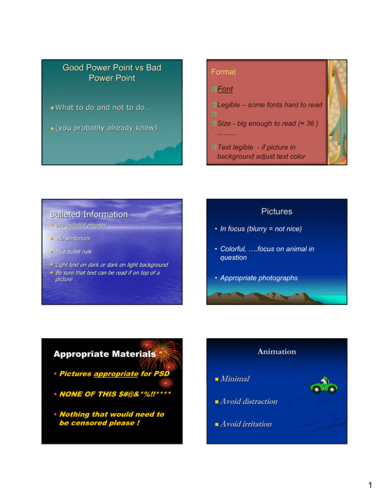
Good Power Point vs Bad Power Point Format Font What (you to do and not to do… do… probably already know) Legible – some fonts hard to read Size - big enough to read (≈ 36 ) Can you read this well ? (8) Text legible - if picture in background adjust text color Pictures Bulleted Information • Use bulleted phrases • In focus (blurry = not nice) • No sentences • Five bullet rule • Light text on dark or dark on light background • Be sure that text can be read if on top of a picture • Colorful, ….focus on animal in question • Appropriate photographs Animation Appropriate Materials • Pictures appropriate for PSD • NONE OF THIS $#@&*%!!**** • Nothing that would need to be censored please ! Minimal Avoid distraction Avoid irritation 1 Sound Effects • Minimal • Avoid distraction • Avoid irritation To submit power point ¾ My Computer, fchnet, fchnet, Class Data, Science,Hunter, Science,Hunter, (Class name), Period (_) ¾ Name file including your name, drop in file BEFORE due date ¾ OR bring to class on cd or flashdrive ¾ Bring print out of ppt, ppt, greyscale, greyscale, 4-6 slides / page ¾ 2
