Data Visualizations: Drawing Actionable Insights from Science and Technology Data
advertisement
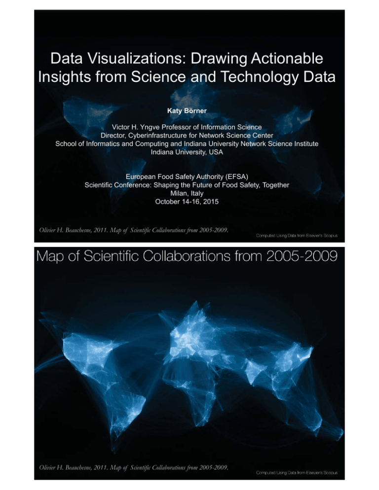
Data Visualizations: Drawing Actionable Insights from Science and Technology Data Katy Börner Victor H. Yngve Professor of Information Science Director, Cyberinfrastructure for Network Science Center School of Informatics and Computing and Indiana University Network Science Institute Indiana University, USA European Food Safety Authority (EFSA) Scientific Conference: Shaping the Future of Food Safety, Together Milan, Italy October 14-16, 2015 Olivier H. Beauchesne, 2011. Map of Scientific Collaborations from 2005-2009. Olivier H. Beauchesne, 2011. Map of Scientific Collaborations from 2005-2009. Analyzing and Visualizing S&T 3 Mapping the Evolution of Co-Authorship Networks Ke, Visvanath & Börner. 2004. Won 1st prize at the IEEE InfoVis Contest. 4 Mapping the Evolution of Co-Authorship Networks Ke, Visvanath & Börner. 2004. Won 1st prize at the IEEE InfoVis Contest. 5 Mapping Transdisciplinary Tobacco Use Research Centers Publications Compare R01 investigator-based funding with TTURC Center awards in terms of number of publications and evolving co-author networks. Stipelman, Hall, Zoss, Okamoto, Stokols, Börner, 2014. Supported by NIH/NCI Contract HHSN261200800812 6 The Global 'Scientific Food Web' Mazloumian, Amin, Dirk Helbing, Sergi Lozano, Robert Light, and Katy Börner. 2013. "Global Multi-Level Analysis of the 'Scientific Food Web'". Scientific Reports 3, 1167. http://cns.iu.edu/docs/publications/2013-mazloumian-food-web.pdf Contributions: Comprehensive global analysis of scholarly knowledge production and diffusion on the level of continents, countries, and cities. Quantifying knowledge flows between 2000 and 2009, we identify global sources and sinks of knowledge production. Our knowledge flow index reveals, where ideas are born and consumed, thereby defining a global ‘scientific food web’. While Asia is quickly catching up in terms of publications and citation rates, we find that its dependence on knowledge consumption has further increased. 7 8 Long-Distance Interdisciplinarity Leads to Higher Scientific Impact Larivière, Vincent, Stefanie Haustein, and Katy Börner. 2015. PLOS ONE DOI: 10.1371. Data: 9.2 million interdisciplinary research papers published between 2000 and 2012 . Results: majority (69.9%) of co-cited interdisciplinary pairs are “win-win” relationships, i.e., papers that cite them have higher citation impact and there are as few as 3.3% “loselose” relationships. UCSD map of science is used to compute “distance.” 9 10 11 Bollen, Johan, Herbert Van de Sompel, Aric Hagberg, Luis M.A. Bettencourt, Ryan Chute, Marko A. Rodriquez, Lyudmila Balakireva. 2008. A Clickstream Map of Science. 12 Science Phylomemy - David Chavalarias and Jean-Philippe Cointet - 2013 Council for Chemical Research. 2009. Chemical R&D Powers the U.S. Innovation Engine. Washington, DC. Courtesy of the Council for Chemical Research. 14 Ward Shelley . 2011. History of Science Fiction. 15 Language Communities of Twitter - Eric Fischer - 2012 16 PREDICT: HealthMap - John Brownstein, Damien Joly, William Karesh, Peter Daszak, Nathan Wolfe, Tracey Goldstein, Susan Aman, Clark Freifeld, Sumiko Mekaru, Tammie O'Rourke, Stephen Morse, Christine Kreuder Johnson, Jonna Mazet, and the PREDICT Consortium - 2014 Impact of Air Travel on Global Spread of Infectious Diseases - Vittoria Colizza, Alessandro Vespignani - 2007 Logicland Participative Global Simulation - Michael Ashauer, Maia Gusberti, Nik Thoenen - 2002 Visualization Frameworks 21 Places & Spaces Exhibit at the David J. Sencer CDC Museum, Atlanta, GA January 25-June 17, 2016 22 Illuminated Diagram Display on display at the Smithsonian in DC. http://scimaps.org/exhibit_info/#ID 23 24 25 http://scimaps.org/call 26 Modelling Science 28 Science 7 February 2014: Vol. 343 no. 6171 p. 598 DOI: 10.1126/science.343.6171.598 http://www.sciencemag.org/content/343/6171/598.full?sid=4f40a7f0-6ba2-4ad8-a181-7ab394fe2178 From funding agencies to scientific agency: Collective allocation of science funding as an alternative to peer review Bollen, Johan, David Crandall, Damion Junk, Ying Ding, and Katy Börner. 2014. EMBO Reports 15 (1): 1-121. Existing (left) and proposed (right) funding systems. Reviewers in blue; investigators in red. In the proposed system, all scientists are both investigators and reviewers: every scientist receives a fixed amount of funding from the government and discretionary distributions from other scientists, but each is required in turn to redistribute some fraction of the total they received to other investigators. 30 Assume Total funding budget in year y is ty Number of qualified scientists is n Each year, the funding agency deposits a fixed amount into each account, equal to the total funding budget divided by the total number of scientists: ty/n. Each scientist must distribute a fixed fraction of received funding to other scientists (no self-funding, COIs respected). Result Scientists collectively assess each others’ merit based on different criteria; they “fund-rank” scientists; highly ranked scientists have to distribute more money. 31 Example: Total funding budget in year is 2012 NSF budget Given the number of NSF funded scientists, each receives a $100,000 basic grant. Fraction is set to 50% In 2013, scientist S receives a basic grant of $100,000 plus $200,000 from her peers, i.e., a total of $300,000. In 2013, S can spend 50% of that total sum, $150,000, on her own research program, but must donate 50% to other scientists for their 2014 budget. Rather than submitting and reviewing project proposals, S donates directly to other scientists by logging into a centralized website and entering the names of the scientists to donate to and how much each should receive. 32 Model Run and Validation: Model is presented in http://arxiv.org/abs/1304.1067 It uses citations as a proxy for how each scientist might distribute funds in the proposed system. Using 37M articles from TR 1992 to 2010 Web of Science (WoS) database, we extracted 770M citations. From the same WoS data, we also determined 4,195,734 unique author names and we took the 867,872 names who had authored at least one paper per year in any five years of the period 2000–2010. For each pair of authors we determined the number of times one had cited the other in each year of our citation data (1992–2010). NIH and NSF funding records from IU’s Scholarly Database provided 347,364 grant amounts for 109,919 unique scientists for that time period. Simulation run begins in year 2000, in which every scientist was given a fixed budget of B = $100k. In subsequent years, scientists distribute their funding in proportion to their citations over the prior 5 years. The model yields funding patterns similar to existing NIH and NSF distributions. 33 Model Efficiency: Using data from the Taulbee Survey of Salaries Computer Science (http://cra.org/resources/taulbee ) and the National Science Foundation (NSF) the following calculation is illuminating: If four professors work four weeks full-time on a proposal submission, labor costs are about $30k. With typical funding rates below 20%, about five submission-review cycles might be needed resulting in a total expected labor cost of $150k. The average NSF grant is $128k per year. U.S. universities charge about 50% overhead (ca. $42k), leaving about $86k. In other words, the four professors lose $150k-$86k=$64k of paid research time by obtaining a grant to perform the research. That is, U.S. universities should forbid professors to apply for grants—if they can afford to forgo the indirect dollars. To add: Time spent by researchers to review proposals. In 2012 alone, NSF convened more than 17,000 scientists to review 53,556 proposals. 34 Information Visualization Framework & IVMOOC 35 Tasks See page 5 36 See pages 6-7 37 See page 24 38 See pages 36-39 39 Register for free at http://ivmooc.cns.iu.edu. Class restarts January 12, 2016. 40 References Börner, Katy, Chen, Chaomei, and Boyack, Kevin. (2003). Visualizing Knowledge Domains. In Blaise Cronin (Ed.), ARIST, Medford, NJ: Information Today, Volume 37, Chapter 5, pp. 179-255. http://ivl.slis.indiana.edu/km/pub/2003borner-arist.pdf Shiffrin, Richard M. and Börner, Katy (Eds.) (2004). Mapping Knowledge Domains. Proceedings of the National Academy of Sciences of the United States of America, 101(Suppl_1). http://www.pnas.org/content/vol101/suppl_1/ Börner, Katy (2010) Atlas of Science: Visualizing What We Know. The MIT Press. http://scimaps.org/atlas Scharnhorst, Andrea, Börner, Katy, van den Besselaar, Peter (2012) Models of Science Dynamics. Springer Verlag. Katy Börner, Michael Conlon, Jon Corson-Rikert, Cornell, Ying Ding (2012) VIVO: A Semantic Approach to Scholarly Networking and Discovery. Morgan & Claypool. Katy Börner and David E Polley (2014) Visual Insights: A Practical Guide to Making Sense of Data. The MIT Press. Börner, Katy (2015) Atlas of Knowledge: Anyone Can Map. The MIT Press. http://scimaps.org/atlas2 41 All papers, maps, tools, talks, press are linked from http://cns.iu.edu These slides are at http://cns.iu.edu/docs/presentations CNS Facebook: http://www.facebook.com/cnscenter Mapping Science Exhibit Facebook: http://www.facebook.com/mappingscience 42
