Forms and Input
advertisement
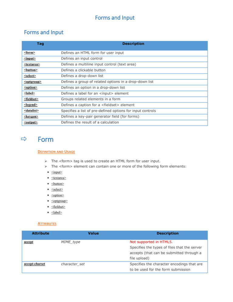
Forms and Input Forms and Input Tag Description <form> Defines an HTML form for user input <input> Defines an input control <textarea> Defines a multiline input control (text area) <button> Defines a clickable button <select> Defines a drop-down list <optgroup> Defines a group of related options in a drop-down list <option> Defines an option in a drop-down list <label> Defines a label for an <input> element <fieldset> Groups related elements in a form <legend> Defines a caption for a <fieldset> element <datalist> Specifies a list of pre-defined options for input controls <keygen> Defines a key-pair generator field (for forms) <output> Defines the result of a calculation Form DEFINITION AND USAGE The <form> tag is used to create an HTML form for user input. The <form> element can contain one or more of the following form elements: <input> <textarea> <button> <select> <option> <optgroup> <fieldset> <label> ATTRIBUTES Attribute accept Value MIME_type Description Not supported in HTML5. Specifies the types of files that the server accepts (that can be submitted through a file upload) accept-charset character_set Specifies the character encodings that are to be used for the form submission Forms and Input URL action Specifies where to send the form-data when a form is submitted autocomplete enctype method on Specifies whether a form should have off autocomplete on or off application/x-www-form-urlencoded Specifies how the form-data should be multipart/form-data encoded when submitting it to the server text/plain (only for method="post") get Specifies the HTTP method to use when post sending form-data name text Specifies the name of a form novalidate novalidate Specifies that the form should not be validated when submitted target _blank Specifies where to display the response _self that is received after submitting the form _parent _top INPUT DEFINITION AND USAGE The <input> tag specifies an input field where the user can enter data. <input> elements are used within a <form> element to declare input controls that allow users to input data. An input field can vary in many ways, depending on the type attribute. ATTRIBUTES Attribute accept Value Description audio/* Specifies the types of files that the video/* server accepts (only for type="file") image/* MIME_type align left Not supported in HTML5. right Specifies the alignment of an image input top (only for type="image") middle bottom alt text Specifies an alternate text for images (only for type="image") autocomplete autofocus on Specifies whether an <input> element off should have autocomplete enabled autofocus Specifies that an <input> element should automatically get focus when the page Forms and Input loads checked checked Specifies that an <input> element should be pre-selected when the page loads (for type="checkbox" or type="radio") disabled disabled Specifies that an <input> element should be disabled form form_id Specifies one or more forms the <input> element belongs to formaction URL Specifies the URL of the file that will process the input control when the form is submitted (for type="submit" and type="image") formenctype formmethod application/x-www-form-urlencoded Specifies how the form-data should be multipart/form-data encoded when submitting it to the server text/plain (for type="submit" and type="image") get Defines the HTTP method for sending post data to the action URL (for type="submit" and type="image") formnovalidate formnovalidate Defines that form elements should not be validated when submitted formtarget _blank Specifies where to display the response _self that is received after submitting the form _parent (for type="submit" and type="image") _top framename height pixels Specifies the height of an <input> element (only for type="image") list datalist_id Refers to a <datalist> element that contains pre-defined options for an <input> element max maxlength number Specifies the maximum value for an date <input> element number Specifies the maximum number of characters allowed in an <input> element min multiple number Specifies a minimum value for an date <input> element multiple Specifies that a user can enter more than one value in an <input> element name text pattern regexp Specifies the name of an <input> element Specifies a regular expression that an <input> element's value is checked against Forms and Input placeholder text Specifies a short hint that describes the expected value of an <input> element readonly readonly Specifies that an input field is read-only required required Specifies that an input field must be filled out before submitting the form size number Specifies the width, in characters, of an <input> element src URL Specifies the URL of the image to use as a submit button (only for type="image") step number Specifies the legal number intervals for an input field type button Specifies the type <input> element to checkbox display color date datetime datetime-local email file hidden image month number password radio range reset search submit tel text time url week value text Specifies the value of an <input> element width pixels Specifies the width of an <input> element (only for type="image") Forms and Input Textarea DEFINITION AND USAGE The <textarea> tag defines a multi-line text input control. A text area can hold an unlimited number of characters, and the text renders in a fixedwidth font (usually Courier). The size of a text area can be specified by the cols and rows attributes, or even better; through CSS' height and width properties. ATTRIBUTES Attribute Value autofocus autofocus Description Specifies that a text area should automatically get focus when the page loads cols number Specifies the visible width of a text area disabled disabled Specifies that a text area should be disabled form form_id Specifies one or more forms the text area belongs to maxlength number Specifies the maximum number of characters allowed in the text area name text Specifies a name for a text area placeholder text Specifies a short hint that describes the expected value of a text area readonly readonly Specifies that a text area should be read-only required required Specifies that a text area is required/must be filled out rows number Specifies the visible number of lines in a text area wrap hard Specifies how the text in a text area is to be wrapped when soft submitted in a form Button DEFINITION AND USAGE The <button> tag defines a clickable button. Inside a <button> element you can put content, like text or images. This is the difference between this element and buttons created with the <input> element. Tip: Always specify the type attribute for a <button> element. Different browsers use different default types for the <button> element. Forms and Input ATTRIBUTES Attribute autofocus Value autofocus Description Specifies that a button should automatically get focus when the page loads disabled disabled Specifies that a button should be disabled form form_id formaction URL Specifies one or more forms the button belongs to Specifies where to send the formdata when a form is submitted. Only for type="submit" formenctype formmethod application/x-www-form-urlencoded Specifies how form-data should be multipart/form-data encoded before sending it to a text/plain server. Only for type="submit" get Specifies how to send the form- post data (which HTTP method to use). Only for type="submit" formnovalidate formnovalidate Specifies that the form-data should not be validated on submission. Only for type="submit" formtarget _blank Specifies where to display the _self response after submitting the _parent form. Only for type="submit" _top framename name name Specifies a name for the button type button Specifies the type of button reset submit value text Specifies an initial value for the button Forms and Input Select DEFINITION AND USAGE The <select> element is used to create a drop-down list. The <option> tags inside the <select> element define the available options in the list. ATTRIBUTES Attribute Value autofocus autofocus Description Specifies that the drop-down list should automatically get focus when the page loads disabled disabled Specifies that a drop-down list should be disabled form form_id Defines one or more forms the select field belongs to multiple multiple Specifies that multiple options can be selected at once name name Defines a name for the drop-down list required required Specifies that the user is required to select a value before size number submitting the form Defines the number of visible options in a drop-down list Optgroup DEFINITION AND USAGE The <optgroup> is used to group related options in a drop-down list. If you have a long list of options, groups of related options are easier to handle for a user. ATTRIBUTES Attribute Value Description disabled disabled Specifies that an option-group should be disabled label text Specifies a label for an option-group Option DEFINITION AND USAGE The <option> tag defines an option in a select list. <option> elements go inside a <select> or <datalist> element. Note: The <option> tag can be used without any attributes, but you usually need the value attribute, which indicates what is sent to the server. Tip: If you have a long list of options, you can group related options with the <optgroup> tag. Forms and Input ATTRIBUTES Attribute Value Description disabled disabled Specifies that an option should be disabled label text Specifies a shorter label for an option selected selected Specifies that an option should be pre-selected when the page loads text value Specifies the value to be sent to a server Label DEFINITION AND USAGE The <label> tag defines a label for an <input> element. The <label> element does not render as anything special for the user. However, it provides a usability improvement for mouse users, because if the user clicks on the text within the <label> element, it toggles the control. The for attribute of the <label> tag should be equal to the id attribute of the related element to bind them together. ATTRIBUTES Attribute Value Description for element_id Specifies which form element a label is bound to form form_id Specifies one or more forms the label belongs to <form action="demo_form.asp"> <label for="male">Male</label> <input type="radio" name="sex" id="male" value="male"><br> <label for="female">Female</label> <input type="radio" name="sex" id="female" value="female"><br> <input type="submit" value="Submit"> </form> Fieldset <form> <fieldset> <legend>Personalia:</legend> Name: <input type="text"><br> Email: <input type="text"><br> Date of birth: <input type="text"> </fieldset> </form> The <fieldset> tag is used to group related elements in a form. The <fieldset> tag draws a box around the related elements. Forms and Input ATTRIBUTES Attribute Value disabled disabled Description Specifies that a group of related form elements should be disabled form form_id Specifies one or more forms the fieldset belongs to name text Specifies a name for the fieldset Legend <form> <fieldset> <legend>Personalia:</legend> Name: <input type="text" size="30"><br> Email: <input type="text" size="30"><br> Date of birth: <input type="text" size="10"> </fieldset> </form> DEFINITION AND USAGE The <legend> tag defines a caption for the <fieldset> element. Datalist DEFINITION AND USAGE The <datalist> tag specifies a list of pre-defined options for an <input> element. The <datalist> tag is used to provide an "autocomplete" feature on <input> elements. Users will see a drop-down list of pre-defined options as they input data. Use the <input> element's list attribute to bind it together with a <datalist> element. Keygen DEFINITION AND USAGE The <keygen> tag specifies a key-pair generator field used for forms. When the form is submitted, the private key is stored locally, and the public key is sent to the server. Forms and Input ATTRIBUTES Attribute Value autofocus autofocus Description Specifies that a <keygen> element should automatically get focus when the page loads challenge challenge Specifies that the value of the <keygen> element should be challenged disabled disabled Specifies that a <keygen> element should be disabled form form_id Specifies one or more forms the <keygen> element belongs to keytype rsa Specifies the security algorithm of the key when submitted dsa ec name name Defines a name for the <keygen> element KEYTYPE DEFINITION AND USAGE The keytype attribute specifies a key type to be used. Note: The support for key types may vary between browsers. SYNTAX <keygen keytype="rsa|dsa|ec"> ATTRIBUTE VALUES Value Description rsa Default. Specifies an RSA security algorithm. The user may be given a choice of RSA key strengths dsa Specifies a DSA security algorithm. The user may be given a choice of DSA key sizes ec Specifies an EC security algorithm. The user may be given a choice of EC key strengths Output DEFINITION AND USAGE The <output> tag represents the result of a calculation (like one performed by a script). ATTRIBUTES = Attribute Value for element_id Description Specifies the relationship between the result of the calculation, and the elements used in the calculation form form_id Specifies one or more forms the output element belongs to name name Specifies a name for the output element Forms and Input
