Document
Stat 101
Majmaah University College of Engineering
STAT 101 1432/2011
---------------------------------------------------------------------------------------------------------------------------------------
Sheet (2)
1.
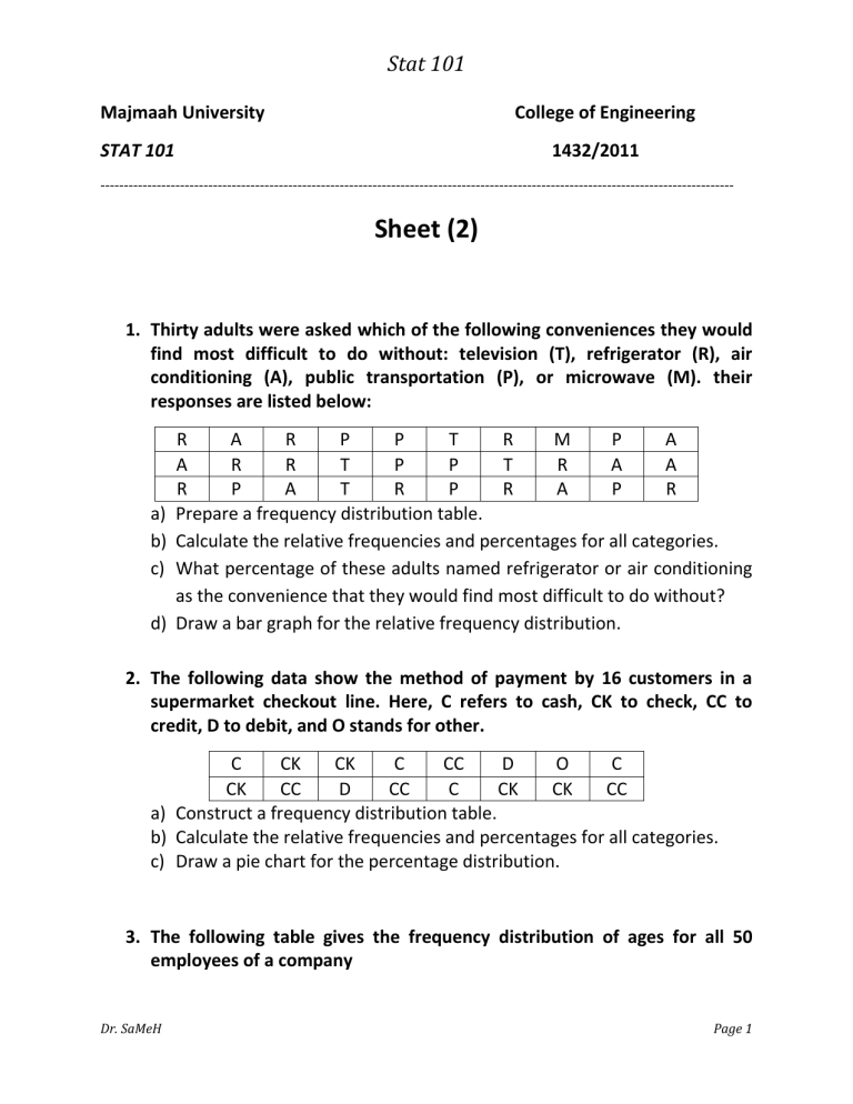
Thirty adults were asked which of the following conveniences they would find most difficult to do without: television (T), refrigerator (R), air conditioning (A), public transportation (P), or microwave (M). their responses are listed below:
R A R
A R R
P
T
P
P
T
P
R
T
M
R
P
A
R P A T R P R A P a) Prepare a frequency distribution table.
A
A
R b) Calculate the relative frequencies and percentages for all categories. c) What percentage of these adults named refrigerator or air conditioning as the convenience that they would find most difficult to do without? d) Draw a bar graph for the relative frequency distribution.
2.
The following data show the method of payment by 16 customers in a supermarket checkout line. Here, C refers to cash, CK to check, CC to credit, D to debit, and O stands for other.
C CK CK C CC D O C
CK CC D CC C CK CK CC a) Construct a frequency distribution table. b) Calculate the relative frequencies and percentages for all categories. c) Draw a pie chart for the percentage distribution.
3.
The following table gives the frequency distribution of ages for all 50 employees of a company
Dr. SaMeH Page 1
Stat 101
Age
18 to 30
31 to 43
44 to 56
57 to 69
Number of Employees
12
19
14
5 a) Find the class boundaries and class midpoints. b) Do all classes have the same width? If yes, what is that width? c) Prepare the relative frequency and percentage distribution columns. d) What percentage of employees of this company is age 43 or younger?
4.
The following table gives the number of computer keyboards assembled at the Twentieth Century Electronic Company for a sample of 25 days.
45 52 48 41 56 46 44 42 48 53
51 53 51 48 46 43 52 50 54 47
50 49 52 a) Make the frequency distribution table for these data. b) Calculate the relative frequencies for all classes. c) Construct a histogram for relative frequency distribution. d) Construct a polygon for relative frequency distribution.
5.
The following data give the amounts spent on video rentals (in dollars) during by 30 households randomly selected from those households that rented videos in 2002.
595 24 6 100 100 40 622 405 90 55
155 760 405 90 205 70 180 88 808 100
240 127 83 310 350 160 22 111 70 15 a) Construct a frequency distribution table. Take $1 as the lower limit of the first class and $200 as the width of each class. b) Calculate the relative frequencies and percentages for all classes. c) What percentage of the households in this sample spent more than
$400 on video rentals in 2002?
Dr. SaMeH Page 2
Stat 101
6.
The following data give the time (in minutes) that each of 20 students waited in line at their book store to pay their textbooks in the beginning of Spring 2008 semester.
15 8 23 21 5 17 31 22 34 6
5 10 14 17 16 25 30 3 31 19 a) Construct a stem-and leaf display for these data. Arrange the leaves of the stem in increasing order.
7.
The following data give the times saved (in months) by 35 prison inmates who were released recently.
37 6 20 5 25 30 24 10 12 20
24 8 26 15 13 22 72 80 96 33
84 86 70 40 92 36 28 90 36 32
72 45 38 18 9 a) Prepare a stem-and leaf display for these data. b) Condense the stem-and-leaf display by grouping the stems as 0-2, 3-5, and 6-9.
8.
Excel (Training exercise)
1) To create a frequency distribution for a range of numerical data in Excel, decide how many categories you will have. Choose class boundaries between the categories so that you will one fewer boundary than classes. Type the class boundaries into Excel.
2) Select where you want the class frequencies to appear, and select a range of as cells as you have categories.
3) Type = frequency(.
4) Select the range of cells of numerical data, and then type a comma.
5) Select the range of class boundaries, and then type a right parenthesis.
6) Press Control-Shift-Enter. The frequencies should appear.
7) If you would prefer relative frequencies, replace step 5) by the following steps: i.
Type )/count(. ii.
Select the range of data.
iii.
Type a right parenthesis, and then press Control-Shift-Enter. The relative frequencies should appear.
8) To plot frequencies as bar chart, pie chart, select Insert>Chart and follow the instructions in the Chart wizard.
Dr. SaMeH Page 3
