CS2340 Fall 2006
advertisement
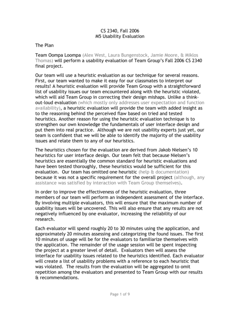
CS 2340, Fall 2006 M5 Usability Evaluation The Plan Team Oompa Loompa (Alex West, Laura Bungenstock, Jamie Moore, & Miklos Thomas) will perform a usability evaluation of Team Group’s Fall 2006 CS 2340 final project. Our team will use a heuristic evaluation as our technique for several reasons. First, our team wanted to make it easy for our classmates to interpret our results! A heuristic evaluation will provide Team Group with a straightforward list of usability issues our team encountered along with the heuristic violated, which will aid Team Group in correcting their design mishaps. Unlike a thinkout-loud evaluation (which mostly only addresses user expectation and function availability), a heuristic evaluation will provide the team with added insight as to the reasoning behind the perceived flaw based on tried and tested heuristics. Another reason for using the heuristic evaluation technique is to strengthen our own knowledge the fundamentals of user interface design and put them into real practice. Although we are not usability experts just yet, our team is confident that we will be able to identify the majority of the usability issues and relate them to any of our heuristics. The heuristics chosen for the evaluation are derived from Jakob Nielsen’s 10 heuristics for user interface design. Our team felt that because Nielsen’s heuristics are essentially the common standard for heuristic evaluations and have been tested thoroughly, these heuristics would be sufficient for this evaluation. Our team has omitted one heuristic (help & documentation) because it was not a specific requirement for the overall project (although, any assistance was satisfied by interaction with Team Group themselves). In order to improve the effectiveness of the heuristic evaluation, three members of our team will perform an independent assessment of the interface. By involving multiple evaluators, this will ensure that the maximum number of usability issues will be uncovered. This will also ensure that any results are not negatively influenced by one evaluator, increasing the reliability of our research. Each evaluator will spend roughly 20 to 30 minutes using the application, and approximately 20 minutes assessing and categorizing the found issues. The first 10 minutes of usage will be for the evaluators to familiarize themselves with the application. The remainder of the usage session will be spent inspecting the project at a greater level of detail. Evaluators then will assess the interface for usability issues related to the heuristics identified. Each evaluator will create a list of usability problems with a reference to each heuristic that was violated. The results from the evaluation will be aggregated to omit repetition among the evaluators and presented to Team Group with our results & recommendations. Page 1 of 9 CS 2340, Fall 2006 M5 Usability Evaluation The Heuristics Adopted from Jakob Nielsen’s 10 Usability Heuristics 1. Visibility of system status The system should always keep users informed about what is going on, through appropriate feedback within reasonable time. 2. Match between system and real world The system should speak the user’s language, with words, phrases and concepts familiar to the user, rather than system-oriented terms. Follow real-world conventions, making information appear in a natural and logical order. 3. User control and freedom Users often choose system functions by mistake and will need a clearly marked "emergency exit" to leave the unwanted state without having to go through an extended dialogue. 4. Consistency and standards Users should not have to wonder whether different words, situations, or actions mean the same thing. Follow platform conventions. 5. Error prevention Even better than good error messages is a careful design which prevents a problem from occurring in the first place. Either eliminate error-prone conditions or check for them and present users with a confirmation option before they commit to the action. 6. Recognition rather than recall Minimize the user's memory load by making objects, actions, and options visible. The user should not have to remember information from one part of the dialogue to another. Instructions for use of the system should be visible or easily retrievable whenever appropriate. 7. Flexibility and efficiency of use Accelerators -- unseen by the novice user -- may often speed up the interaction for the expert user such that the system can cater to both inexperienced and experienced users. Allow users to tailor frequent actions. 8. Aesthetic and minimalist design Dialogues should not contain information which is irrelevant or rarely needed. Every extra unit of information in a dialogue competes with the relevant units of information and diminishes their relative visibility. 9. Help users recognize, diagnose, and recover from errors Error messages should be expressed in plain language (no codes), precisely indicate the problem, and constructively suggest a solution. 10. Help and documentation* Even though it is better if the system can be used without documentation, it may be necessary to provide help and documentation. Any such information should be easy to search, focused on the user's task, list concrete steps to be carried out, and not be too large. * Heuristic 10 will not be part of this evaluation as it was not a specific requirement for this project – although our team fully supports the compliance of this heuristic and its inclusion is intended only for its cohesiveness with the remaining heuristics. Page 2 of 9 CS 2340, Fall 2006 M5 Usability Evaluation The Results Evaluator #1 Results Usability Issue: When creating the project title My Project a cryptic error message appeared and I had to restart the application. Violated Heuristic: #9 Help users recognize, diagnose, & recover from errors Violated Heuristic: #5 Error prevention Usability Issue: I am unable to view parts of the application and I cannot resize the window to access some buttons and view some text. Violated Heuristic: #1 Visibility of system status Usability Issue: I received an error that I had created a class with the same name. The error message directed me back to the main screen – not the dialog box where I could rename the class. Violated Heuristic: #9 Help users recognize, diagnose, & recover from errors Usability Issue: Window title is not descriptive. Violated Heuristic: #1 Visibility of system status Usability Issue: It is not clear what the purpose of the red arrow is pointing from responsibility to responsibility. Violated Heuristic: #4 Consistency and standards Usability Issue: On the Analysis-Scenarios tab, I can place my cursor in the responsibility text box, but I cannot enter any text. Violated Heuristic: #3 User control and freedom Usability Issue: Accidentally deleting a scenario is too easy without a confirmation dialog box. Violated Heuristic:#9 Help users recognize, diagnose, & recover from errors Usability Issue: The text boxes for scenarios and steps take up too much space. It is unlikely that users will create such a large number of scenarios and steps. Violated Heuristic: #8 Aesthetic and minimalist design Usability Issue: The tab movements are sporadic opposed to top to down, left to right. Violated Heuristic: #7 Flexibility and efficiency of use Page 3 of 9 CS 2340, Fall 2006 M5 Usability Evaluation Evaluator #2 Results Usability Issue: I expected the label of the main window have the current project name shown. Violated Heuristic: #1 Visibility of system status. Usability Issue: Classes that are removed from the “Analysis – Goals” tab are still present in other parts of the program(“Design – Class Diagram,” “Design – Class Editor,” and “Programming”) when it is expected that they will be removed completely. Violated Heuristic: #4 Consistency and standards Usability Issue: Selecting an existing class in the “Analysis – Goals” tab creates what seems to be a separate class of the same name. When removed, both “instances” of the class disappear. Violated Heuristic: #4 Consistency and standards Usability Issue: After clicking the “Scenario” button in the “Analysis – Scenarios” the dialogue box asking me to select a Responsibility has no responsibilities to choose from. Also, the “OK” button can be clicked without selecting anything though the box won’t go away. Violated Heuristic: #3 User control and freedom Usability Issue: Responsibility text fields have a cursor when clicked on but cannot be typed in. Violated Heuristic: #3 User control and freedom Usability Issue: There is no undo feature. This would be especially helpful if a class is removed unintentionally. Violated Heuristic: #3 – User control and freedom Violated Heuristic: #9 Help users recognize, diagnose, & recover from errors Usability Issue: The program allows me to name a class anything, even a name that would be rejected by a compiler. Violated Heuristic: #5 Error prevention Page 4 of 9 CS 2340, Fall 2006 M5 Usability Evaluation Evaluator #3 Results Usability Issue: Goal name can not have spaces. Violated Heuristic: #3 User control and freedom Usability Issue: User can type a class name before they have created a new class. Violated Heuristic: #5 Error prevention Usability Issue: I can’t see all of the interface because I can’t resize the window. Violated Heuristic: #8 Aesthetic and minimalist design Usability Issue: When creating new instances, always says class1 attribute1 etc. It would be nice if it iterated this for me. Violated Heuristic: #7 Flexibility and efficiency of use Usability Issue: I cannot select a project, I have to remember its name. Violated Heuristic: #6 - Recognition rather than recall Usability Issue: Errors pop up as small talk exceptions. Violated Heuristic: #9 Help users recognize, diagnose & recover from errors Usability Issue: The text boxes are so big that they distract from the rest of the UI. Violated Heuristic: #8 Aesthetic and Minimalist Design Page 5 of 9 CS 2340, Fall 2006 M5 Usability Evaluation Total Violations per Heuristic Repeated items were only counted once unless separate evaluators recognized an issue falling under a different heuristic. Usability Heuristic # of Violations Visibility of system status 2 Match between system and real world 0 User control and freedom 4 Consistency and standards 3 Error prevention 3 Recognition rather than recall 1 Flexibility and efficiency of use 2 Aesthetic and minimalist design 3 Help users recognize, diagnose, and recover from errors 4 Page 6 of 9 CS 2340, Fall 2006 M5 Usability Evaluation The Analysis & Recommendations Our team proposes the following recommendations for Team Group to increase the usability of their final project. These recommendations are a result of our analysis using a combination of the total number of violations per heuristic, the severity level of the usability issues per heuristic, and a general consensus of the comments and opinions of the evaluators. Recommendation #1 Provide support for users to be able to recognize, diagnose, and recover from errors using clear instructions and useful features. A total of 4 violations were found for heuristic #9 – help users recognize, diagnose, and recover from errors. Our team considers these issues to be high severity for several reasons. The frequency of these issues were the greatest throughout our evaluation. Every evaluator mentioned a usability issue which violated this heuristic. Also, this issue has a high impact on the user experience. Most users will have difficulty overcoming these issues. And finally, this particular issue is persistent. If a user doesn’t know how to recover from an error once, they will continually be bothered by it and may never figure it out. Usability issues which violate this heuristic could be fixed in a number of ways. Provide the user with helpful error messages that give clear instructions for a solution. Be sure to use language carefully to make sure the user doesn’t feel foolish. Another improvement our team suggests is to make it easy for the user to correct their error. For example, if a user left the title of the class blank, after informing the user of the error, guide the user to the dialog box where they can enter the class name. This will save users a lot of time and limit frustration. Combining clear instructions and useful features to help users recognize, diagnose, and recover from errors will greatly decrease the number of usability issues in the software. Recommendation #2 Create a practical equilibrium between too much and too little user control and freedom. Our team found a total of 4 violations for the heuristic concerned with user control and freedom. These violations ranged from having too much to too little control and freedom. Our team felt as though the violations for this heuristic deserved a recommendation because the evaluators all felt as though at times they felt lost – either because their actions were limited by the system or their actions produced a negative result (an error message, for example). Page 7 of 9 CS 2340, Fall 2006 M5 Usability Evaluation There are several suggested methods that could be implemented to create an ideal equilibrium of user control. The most effective method may be to visually indicate which actions are available to the user. The common software standard is to disable or “gray out” a button, text box, or other control. In this image, the user can determine that the functionality of typing in the text button and selecting button 1 is unavailable. Also, these visual cues could be used as a navigation assistant to let the user know that a certain function is not available until the completion of some other task. In particular, this could be used in the tab implementation of this particular project. Users could see that the UML diagram tab disabled to remind them they need to assign collaborators before creating the UML diagram. Another visual cue to use to indicate user control is to show instructions that explain the limitations of the system. For example, if the user is choosing a password, describe to the user which character classes are allowed instead of making the user choose a different password over and over again. This will also aid with heuristic #5, error prevention. The use of visual cues to indicate the presence of absence of availability of controls will aid the user in knowing when certain tasks are available and reduce confusion and aggravation. Recommendation #3 Create an aesthetically pleasing, clean interface with a hierarchical information structure. Our last recommendation, although it is less severe than the others, is just as important when creating the most enjoyable user experience. Our evaluators found a total of 3 violations of heuristic #8, aesthetic and minimalist design. Although Nielsen’s explanation of this heuristic only concerns minimizing extraneous information such as directions, the evaluators felt there were additional issues related to this heuristic that needed to be addressed. A major issue that we found during our evaluation was the inability to see all the components on the screen. The window had been designed for a screen resolution above 1024x768. One way to address this problem is to design for the average. This will easily allow 98.5% of people with the average screen size to view the entire window. Another way to address this issue to accommodate everyone is to create a scalable interface. This way, no matter what the user’s screen resolution is, all the components can be easily seen. Page 8 of 9 CS 2340, Fall 2006 M5 Usability Evaluation Another recommendation to enhance the aesthetic of the interface would be to resize elements to enhance their level of importance. For example, title text should be larger than instructional copy text to ease the ability to scan for information. Also, minimize the sizes of the text boxes to a realistic size. If the average person uses 20 classes in a design, the text box shouldn’t waste that extra white space that most people won’t use (especially with the usage of the scroll bar). Also, minimize any redundant information, unless it is being used as a memory aid. If Team Group utilizes these suggestions (allowing all components on the screen for every window resolution, sizing objects with importance in mind, and minimizing information redundancy), they will be able to create a more enjoyable user experience through an aesthetic and minimalist design. In summary, here are our top 3 recommendations for Team Group. 1. Provide support for users to be able to recognize, diagnose, and recover from errors through the use of clear instructions and useful features. 2. Create a practical equilibrium between too much and too little user control and freedom with visual cues that will help users know what functionality is available. 3. Create an aesthetically pleasing, clean interface with a hierarchical information structure with visual cues such as size to indicate importance. Overall, our team feels as though any improvements in these three areas of recommendation will be worthwhile in improving the usability of their final project. Page 9 of 9
