text - Thinking with Type
advertisement
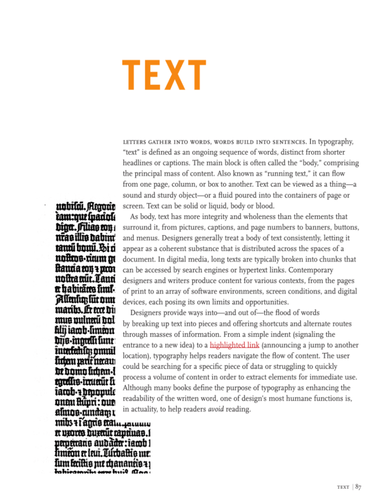
text letters gather into words, words build into sentences. In typography, “text” is defined as an ongoing sequence of words, distinct from shorter headlines or captions. The main block is often called the “body,” comprising the principal mass of content. Also known as “running text,” it can flow from one page, column, or box to another. Text can be viewed as a thing—a sound and sturdy object—or a fluid poured into the containers of page or screen. Text can be solid or liquid, body or blood. As body, text has more integrity and wholeness than the elements that surround it, from pictures, captions, and page numbers to banners, buttons, and menus. Designers generally treat a body of text consistently, letting it appear as a coherent substance that is distributed across the spaces of a document. In digital media, long texts are typically broken into chunks that can be accessed by search engines or hypertext links. Contemporary designers and writers produce content for various contexts, from the pages of print to an array of software environments, screen conditions, and digital devices, each posing its own limits and opportunities. Designers provide ways into—and out of—the flood of words by breaking up text into pieces and offering shortcuts and alternate routes through masses of information. From a simple indent (signaling the entrance to a new idea) to a highlighted link (announcing a jump to another location), typography helps readers navigate the flow of content. The user could be searching for a specific piece of data or struggling to quickly process a volume of content in order to extract elements for immediate use. Although many books define the purpose of typography as enhancing the readability of the written word, one of design’s most humane functions is, in actuality, to help readers avoid reading. text | 87 errors and ownership Marshall McLuhan, The Gutenberg Galaxy (Toronto: University of Toronto Press, 1962). On the future of intellectual property, see Lawrence Lessig, Free Culture: How Big Media Uses Technology and the Law to Lock Down Culture and Control Creativity (New York: Penguin, 2004). Typography helped seal the literary notion of “the text” as a complete, original work, a stable body of ideas expressed in an essential form. Before the invention of printing, handwritten documents were riddled with errors. Copies were copied from copies, each with its own glitches and gaps. Scribes devised inventive ways to insert missing lines into manuscripts in order to salvage and repair these laboriously crafted objects. Printing with movable type was the first system of mass production, replacing the hand-copied manuscript. As in other forms of mass production, the cost of manufacturing (setting type, insuring its correctness, and running a press) drops for each unit as the size of the print run increases. Labor and capital are invested in tooling and preparing the technology, rather than in making the individual unit. The printing system allows editors and authors to correct a work as it passes from handwritten manuscript to typographic galley. “Proofs” are test copies made before final production begins. The proofreader’s craft ensures the faithfulness of the printed text to the author’s handwritten original. Yet even the text that has passed through the castle gates of print is inconstant. Each edition of a book represents one fossil record of a text, a record that changes every time the work is translated, quoted, revised, interpreted, or taught. Since the rise of digital tools for writing and publishing, manuscript originals have all but vanished. Electronic redlining is replacing the hieroglyphics of the editor. Online texts can be downloaded by users and reformatted, repurposed, and recombined. Print helped establish the figure of the author as the owner of a text, and copyright laws were written in the early eighteenth century to protect the author’s rights to this property. The digital age is riven by battles between those who argue, on the one hand, for the fundamental liberty of data and ideas, and those who hope to protect—sometimes indefinitely—the investment made in publishing and authoring content. A classic typographic page emphasizes the completeness and closure of a work, its authority as a finished product. Alternative design strategies in the twentieth and twenty-first centuries reflect the contested nature of authorship by revealing the openness of texts to the flow of information and the corrosiveness of history. Typography tended to alter language from a means of perception and exploration to a portable commodity. —marshall mcluhan, 1962 text | 89 spacing Design is as much an act of spacing as an act of marking. The typographer’s art concerns not only the positive grain of letterforms, but the negative gaps between and around them. In letterpress printing, every space is constructed by a physical object, a blank piece of metal or wood with no raised image. The faceless slugs of lead and slivers of copper inserted as spaces between words or letters are as physical as the relief characters around them. Thin strips of lead (called “leading”) divide the horizontal lines of type; wider blocks of “furniture” hold the margins of the page. Although we take the breaks between words for granted, spoken language is perceived as a continuous flow, with no audible gaps. Spacing has become crucial, however, to alphabetic writing, which translates the sounds of speech into multiple characters. Spaces were introduced after the invention of the Greek alphabet to make words intelligible as distinct units. Tryreadingalineoftextwithoutspacingtoseehowimportantithasbecome. With the invention of typography, spacing and punctuation ossified from gap and gesture to physical artifact. Punctuation marks, which were used differently from one scribe to another in the manuscript era, became part of the standardized, rule-bound apparatus of the printed page. The communications scholar Walter Ong has shown how printing converted the word into a visual object precisely located in space: “Alphabet letterpress printing, in which each letter was cast on a separate piece of metal, or type, marked a psychological breakthrough of the first order....Print situates words in space more relentlessly than writing ever did. Writing moves words from the sound world to the world of visual space, but print locks words into position in this space.” Typography made Walter Ong, Orality and Literacy: The Technologizing text into a thing, a material object with known dimensions and fixed of the Word (London locations. and New York: Methuen, The French philosopher Jacques Derrida, who devised the theory of 1981). See also Jacques Derrida, Of Grammatology, deconstruction in the 1960s, wrote that although the alphabet represents trans. Gayatri Chakravorty sound, it cannot function without silent marks and spaces. Typography Spivak (Baltimore: Johns manipulates the silent dimensions of the alphabet, employing habits and Hopkins University Press, 1976). techniques—such as spacing and punctuation—that are seen but not heard. The Latin alphabet, rather than evolve into a transparent code for recording speech, developed its own visual resources, becoming a more powerful technology as it left behind its connections to the spoken word. That a speech supposedly alive can lend itself to spacing in its own writing is what relates to its own death. —jacques derrida, 1976 text | 91 linearity In his essay “From Work to Text,” the French critic Roland Barthes presented two opposing models of writing: the closed, fixed “work” versus the open, unstable “text.” In Barthes’s view, the work is a tidy, neatly packaged object, proofread and copyrighted, made perfect and complete by the art of printing. The text, in contrast, is impossible to contain, operating across a dispersed web of standard plots and received ideas. Barthes pictured the text as “woven entirely with citations, references, echoes, cultural languages (what language is not?), antecedent and contemporary, which cut across and through in a vast stereophony....The metaphor of the Text is that of the network.” Writing in the 1960s and 1970s, Barthes anticipated the Roland Barthes, “From Work to Text,” in Image/ Internet as a decentralized web of connections. Music/Text, trans. Stephen Barthes was describing literature, yet his ideas resonate for typography, the Heath (New York: Hill visual manifestation of language. The singular body of the traditional text and Wang, 1977), 155–64. page has long been supported by the navigational features of the book, from page numbers and headings that mark a reader’s location to such tools as the index, appendix, abstract, footnote, and table of contents. These devices were able to emerge because the typographic book is a fixed sequence of pages, a body lodged in a grid of known coordinates. All such devices are attacks on linearity, providing means of entrance and escape from the one-way stream of discourse. Whereas talking flows in a single direction, writing occupies space as well as time. Tapping that spatial dimension—and thus liberating readers from the bonds of linearity—is among typography’s most urgent tasks. Although digital media are commonly celebrated for their potential as nonlinear potential communication, linearity nonetheless thrives in the electronic realm, from the “CNN crawl” that marches along the bottom of the television screen to the ticker-style LED signs that loop through the urban environment. Film titles—the celebrated convergence of typography and cinema—serve to distract the audience from the inescapable tedium of a contractually decreed, top-down disclosure of ownership and authorship. Basic electronic book readers, such as Amazon’s Kindle (2007), provide a highly sequential, predominantly linear experience; flipping back or skipping ahead is more cumbersome in some electronic books than in paper ones. Linearity dominates many commercial software applications. Word processing programs, for example, treat documents as a linear stream. A text... is a multi-dimensional space in which a variety of writings, none of them original, blend and clash. —roland barthes, 1971 92 | thinking with type On the linearity of word processing, see Nancy Kaplan, “Blake’s Problem and Ours: Some Reflections on the Image and the Word,” Readerly/Writerly Texts, 3.2 (Spring/Summer 1996), 125. On PowerPoint, see Edward R. Tufte, “The Cognitive Style of PowerPoint,” (Cheshire, Conn.: Graphics Press, 2003). On the aesthetics of the database, see Lev Manovich, The Language of New Media (Cambridge: MIT Press, 2002). (In contrast, page layout programs such as Quark XPress and Adobe InDesign allow users to work spatially, breaking up text into columns and pages that can be anchored and landmarked.) PowerPoint and other presentation software programs are supposed to illuminate the spoken word by guiding the audience through the linear unfolding of an oral address. Typically, however, PowerPoint enforces the one-way flow of speech rather than alleviating it. While a single sheet of paper could provide a map or summary of an oral presentation, a PowerPoint show drags out in time across numerous screens. Not all digital media favor linear flow over spatial arrangement, however. The database, one of the defining information structures of our time, is a nonlinear form. Providing readers and writers with a simultaneous menu of options, a database is a system of elements that can be arranged in countless sequences. Page layouts are built on the fly from chunks of information, assembled in response to user feedback. The web is pushing authors, editors, and designers to work inventively with new modes of microcontent (page titles, key words, alt tags) that allow data to be searched, indexed, tagged, or otherwise marked for recall. Databases are the structure behind electronic games, magazines, and catalogues, genres that create an information space rather than a linear sequence. Physical stores and libraries are databases of tangible objects found in the built environment. Media critic Lev Manovich has described language itself as a kind of database, an archive of elements from which people assemble the linear utterances of speech. Many design projects call for the emphasis of space over sequence, system over utterance, simultaneous structure over linear narrative. Contemporary design often combines aspects of architecture, typography, film, wayfinding, branding, and other modes of address. By dramatizing the spatial quality of a project, designers can foster understanding of complex documents or environments. The history of typography is marked by the increasingly sophisti­cated use of space. In the digital age, where characters are accessed by keystroke and mouse, not gathered from heavy drawers of manufactured units, space has become more liquid than concrete, and typography has evolved from a stable body of objects to a flexible system of attributes. Database and narrative are natural enemies. Competing for the same territory of human culture, each claims an exclusive right to make meaning of the world. —lev manovich, 2002 text | 93 birth of the user cranbrook design: the new discourse Book, 1990. Designers: Katherine McCoy, P. Scott Makela, and Mary Lou Kroh. Publisher: Rizzoli. Photograph: Dan Meyers. Under the direction of Katherine and Michael McCoy, the graduate program in graphic and industrial design at Cranbrook Academy of Art was a leading center for experimental design from the 1970s through the early 1990s. Katherine McCoy developed a model of “typography as discourse,” in which the designer and reader actively interpret a text. Barthes’s model of the text as an open web of references, rather than a closed and perfect work, asserts the importance of the reader over the writer in creating meaning. The reader “plays” the text as a musician plays an instrument. The author does not control its significance: “The text itself plays (like a door, like a machine with ‘play’) and the reader plays twice over, playing the Text as one plays a game, looking for a practice which reproduces it.” Like an interpretation of a musical score, reading is a performance of the written word. Graphic designers embraced the idea of the readerly text in the 1980s and early 1990s, using layers of text and interlocking grids to explore Barthes’s theory of the “death of the author.” In place of the classical model of typography as a crystal goblet for content, this alternative view assumes that content itself changes with each act of representation. Typography becomes a mode of interpretation. Redefining typography as “discourse,” designer Katherine McCoy imploded the traditional dichotomy between seeing and reading. Pictures can be read (analyzed, decoded, taken apart), and words can be seen (perceived as icons, forms, patterns). Valuing ambiguity and complexity, her approach challenged readers to produce their own meanings while also trying to elevate the status of designers within the process of authorship. Another model, which undermined the designer’s new claim to power, surfaced at the end of the 1990s, borrowed not from literary criticism but from human-computer interaction (HCI) studies and the fields of interface and usability design. The dominant subject of our age has become neither reader nor writer but user, a figure conceived as a bundle of needs and impairments—cognitive, physical, emotional. Like a patient or child, the user is a figure to be protected and cared for but also scrutinized and controlled, submitted to research and testing. How texts are used becomes more important than what they mean. Someone clicked here to get over there. Someone who bought this also bought that. The interactive environment not only provides users with a degree of control and self-direction but also, more quietly and insidiously, it gathers data about its audiences. Barthes’s image of the text as a game to be played still holds, as the user responds to signals from the system. We may play the text, but it is also playing us. Design a human-machine interface in accordance with the abilities and foibles of humankind, and you will help the user not only get the job done, but be a happier, more productive person. —jef raskin, 2000 text | 97 Graphic designers can use theories of user interaction to revisit some of our basic assumptions about visual communication. Why, for example, are readers on the web less patient than readers of print? It is commonly believed that digital displays are inherently more difficult to read than ink on paper. Yet HCI studies conducted in the late 1980s proved that crisp black text on a white background can be read just as efficiently from a screen as from a printed page. The impatience of the digital reader arises from culture, not from the essential character of display technologies. Users of websites have different expectations than users of print. They expect to feel “productive,” not contemplative. They expect to be in search mode, not processing mode. Users also expect to be disappointed, distracted, and delayed by false leads. The cultural habits of the screen are driving changes in design for print, while at the same time affirming print’s role as a place where extended reading can still occur. Another common assumption is that icons are a more universal mode of communication than text. Icons are central to the GUIs (graphical user interfaces) that routinely connect users with computers. Yet text can often provide a more specific and understandable cue than a picture. Icons don’t actually simplify the trans­lation of content into multiple languages, because they require explanation in multiple languages. The endless icons of the digital desktop, often rendered with gratuitous detail and depth, function more to enforce brand identity than to support usability. In the twentieth century, modern designers hailed pictures as a “universal” language, yet in the age of code, text has become a more common denom­ inator than images—searchable, translatable, and capable of being reformatted and restyled for alternative or future media. Perhaps the most persistent impulse of twentieth-century art and design was to physically integrate form and content. The Dada and Futurist poets, for example, used typography to create texts whose content was inextricable from the concrete layout of specific letterforms on a page. In the twenty-first century, form and content are being pulled back apart. Style sheets, for example, compel designers to think globally and systematically instead of focusing on the fixed construction of a particular surface. This way of Web users don’t like to read ....They want to keep moving and clicking. —jakob nielsen, 2000 98 | thinking with type On screen readability, see John D. Gould et al., “Reading from CRT Displays Can Be as Fast as Reading from Paper,” Human Factors, 29, 5 (1987): 497–517. On the restless user, see Jakob Nielsen, Designing Web Usability (Indianapolis: New Riders, 2000). On the failure of interface icons, see Jef Raskin, The Humane Interface: New Directions for Designing Interactive Systems (Reading, Mass.: Addison-Wesley, 2000). On transmedia design thinking, see Brenda Laurel, Utopian Entrepreneur (Cambridge: MIT Press, 2001). Jef Raskin talks about the scarcity of human attention as well as the myth of white space in The Humane Interface: New Directions for Designing Interactive Systems, cited on p. 74. thinking allows content to be reformatted for different devices or users, and it also prepares for the afterlife of data as electronic storage media begin their own cycles of decay and obsolescence. In the twentieth century, modern artists and critics asserted that each medium is specific. They defined film, for example, as a constructive language distinct from theater, and they described painting as a physical medium that refers to its own processes. Today, however, the medium is not always the message. Design has become a “transmedia” enterprise, as authors and producers create worlds of characters, places, situations, and interactions that can appear across a variety of products. A game might live in different versions on a video screen, a desktop computer, a game console, and a cell phone, as well as on t-shirts, lunch boxes, and plastic toys. The beauty and wonder of “white space” is another modernist myth that is subject to revision in the age of the user. Modern designers discovered that open space on a page can have as much physical presence as printed areas. White space is not always a mental kindness, however. Edward Tufte, a fierce advocate of visual density, argues for maximizing the amount of data conveyed on a single page or screen. In order to help readers make connections and comparisons, as well as to find information quickly, a single surface packed with well-organized information is sometimes better than multiple pages with a lot of blank space. In typography as in urban life, density invites intimate exchange among people and ideas. In our much-fabled era of information overload, a person can still process only one message at a time. This brute fact of cognition is the secret behind magic tricks: sleights of hand occur while the attention of the audience is drawn elsewhere. Given the fierce competition for their attention, users have a chance to shape the information economy by choosing what to look at. Designers can help them make satisfying choices. Typography is an interface to the alphabet. User theory tends to favor normative solutions over innovative ones, pushing design into the background. Readers usually ignore the typographic interface, gliding comfortably along literacy’s habitual groove. Sometimes, however, the interface should be allowed to fail. By making itself evident, typography can illuminate the construction and identity of a page, screen, place, or product. If people weren’t good at finding tiny things in long lists, the Wall Street Journal would have gone out of business years ago. —jef raskin, 2000 text | 99 Typography, invented in the Renaissance, allowed text to become a fixed and stable form. Like the body of the letter, the body of text was transformed into an industrial commodity that gradually became more open and flexible. Critics of electronic media have noted that the rise of networked communication did not lead to the much feared destruction of typography (or even to the death of print), but rather to the burgeoning of the alphabetic empire. As Peter Lunenfeld points out, the computer has revived the power and prevalence of writing: “Alphanumeric text has risen from its own ashes, a digital phoenix taking flight on monitors, across networks, and in the realms of virtual space.” The computer display is more hospitable to text than the screens of film or television because it offers physical proximity, user control, and a scale appropriate to the body. The printed book is no longer the chief custodian of the written word. Branding is a powerful variant of literacy that revolves around symbols, icons, and typographic standards, leaving its marks on buildings, packages, album covers, websites, store displays, and countless other surfaces and spaces. With the expansion of the Internet, new (and old) conventions for displaying text quickly congealed, adapting metaphors from print and architecture: window, frame, page, banner, menu. Designers working within this stream of multiple media confront text in myriad forms, giving shape to extended bodies but also to headlines, decks, captions, notes, pull quotes, logotypes, navigation bars, alt tags, and other prosthetic clumps of language that announce, support, and even eclipse the main body of text. The dissolution of writing is most extreme in the realm of the web, where distracted readers safeguard their time and prize function over form. This debt of restlessness is owed not to the essential nature of computer monitors, but to the new behaviors engendered by the Internet, a place of searching and finding, scanning and mining. The reader, having toppled the author’s seat of power during the twentieth century, now ails and lags, replaced by the dominant subject of our own era: the user, a figure whose scant attention is our most coveted commodity. Do not squander it. On electronic writing, see Peter Lunenfeld, Snap to Grid: A User’s Guide to Digital Arts, Media, and Cultures (Cambridge: MIT Press, 2001); Jay David Bolter, Writing Space: Computers, Hypertext, and the Remediation of Print (Mahwah, NJ: Lawrence Erlbaum Associates, 2001), and Stuart Moulthrop, “You Say You Want a Revolution? Hypertext and the Laws of Media,” in The New Media Reader, ed. Noah WardripFruin and Nick Monfort (Cambridge: MIT Press, 2003), 691–703. Hypertext means the end of the death of literature. —stuart moulthrop, 1991 100 | thinking with type
