Notes for week 3 (notes_2)
advertisement
2 Probability distribution
The probability distribution of a time series describes the probability that an observation
falls into a specified range of values. An empirical probability distribution for a time series can
be arrived at by sorting and ranking the values of the series. Quantiles and percentiles are useful
statistics that can be taken directly from the empirical probability distribution. Many parametric
statistical tests assume the time series is a sample from a population with a particular population
probability distribution. Often the population is assumed to be normal. This chapter presents
some basic definitions, statistics and plots related to the probability distribution. In addition, a
test (Lilliefors test) is introduced for testing whether a sample comes from a normal distribution
with unspecified mean and variance.
2.1 Definitions
Time series
A time series is a set of observations ordered in time. We will consider only time series
observed at a discrete set of evenly spaced time intervals: x t at times t 1, 2 , ..., N , where N is
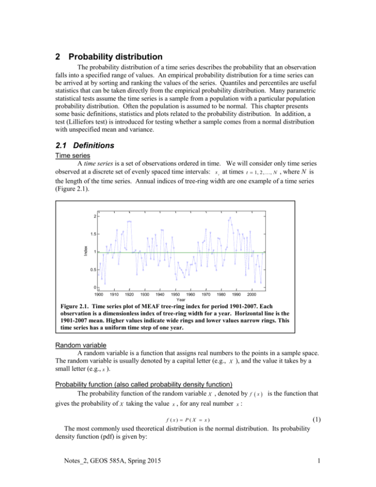
the length of the time series. Annual indices of tree-ring width are one example of a time series
(Figure 2.1).
2
Index
1.5
1
0.5
0
1900
1910
1920
1930
1940
1950
1960
Year
1970
1980
1990
2000
Figure 2.1. Time series plot of MEAF tree-ring index for period 1901-2007. Each
observation is a dimensionless index of tree-ring width for a year. Horizontal line is the
1901-2007 mean. Higher values indicate wide rings and lower values narrow rings. This
time series has a uniform time step of one year.
Random variable
A random variable is a function that assigns real numbers to the points in a sample space.
The random variable is usually denoted by a capital letter (e.g., X ), and the value it takes by a
small letter (e.g., x ).
Probability function (also called probability density function)
The probability function of the random variable X , denoted by f x is the function that
gives the probability of X taking the value x , for any real number x :
f (x) P ( X x)
(1)
The most commonly used theoretical distribution is the normal distribution. Its probability
density function (pdf) is given by:
Notes_2, GEOS 585A, Spring 2015
1
f (x)
exp
2
1
x
2
2
2
(2)
where and are the population mean and standard deviation of X . The standard normal
distribution is the normal distribution with = 0 and =1. A plot of the standard normal pdf is a
bell-shaped curve (Figure 2.2).
Distribution function (also called cumulative distribution function (cdf))
The distribution function of a random variable X is the function that gives the probability
of X being less than or equal to a real number x :
(3)
F ( x ) p ( X x ) f (u )
ux
For a theoretical distribution, the cdf can be computed as the integral of the probability density
function. The cdf of standard normal has an “S-shaped” form (Figure 2.3).
Empirical distribution function, or empirical cdf
Let x 1 , x 2 , ..., x n be a sample of some random variable. The empirical distribution
function
S
x is a function of x, which equals the decimal fraction of the observations that are
less than or equal to
xc
for
xc .
0.4
0.35
1
0.3
0.9
0.25
Density
0.8
0.2
0.7
68%
0.6
0.15
F(x)
97.5% of population has x less than or equal to 1.96
0.1
0.5
0.4
0.05
0
-3
95%
-2
-1
0
x
0.3
1
2
Figure2.2. Probability density function of
standard normal distribution. Sixty-eight
percent of the population is within ±1.0 of
zero. Ninety-five percent is within ±1.96 of
zero.
Notes_2, GEOS 585A, Spring 2015
3
0.2
0.1
0
-3
-2
-1
0
x
1
2
3
Figure2.3. Cumulative distribution function
(cdf) of standard normal distribution.
2
Statistical and deterministic
A time series is deterministic if its future behavior can be exactly predicted from its past
behavior. Otherwise the time series is statistical. The future behavior of a statistical time series
can be predicted only in probabilistic terms. We will consider only statistical time series.
Process
A statistical time series can theoretically be viewed as generated by some underlying
statistical process. Sometimes the term stochastic is used instead of statistical; the two terms are
synonyms. The process might be represented as a mathematical model. The time series can be
considered a single realization of the generating process.
Stationarity
The process can be viewed as potentially generating an infinite number of time series.
The observed series x t is just one possible realization. The value of the series x t at any time
t i can be considered a realization of a random variable X i , with a probability density
function p ( x i ) . Any set of X i at different times, say { X j , ..., X j }, has a joint probability density
1
r
function. If the joint probability density function is independent of time, the process is said to be
strictly stationary. Many statistical procedures assume at least weak stationarity, which means
that the mean, variance, and autocovariance function are independent of time. For Gaussian
processes, weak stationarity implies strict stationarity.
Chapman (2004) introduces the idea of stationarity from an intuitive point of view:
“Broadly speaking, a time series is said to be stationary if there is no systematic change in mean
(no trend), if there is no systematic change in variance and if strictly periodic variations have
been removed. In other words, the properties of one section of the data are much like those of
any other section.” Such an intuitive view basically amounts to observing that the properties of
the series appear to be consistent with a stationary generating process or model.
2.2 DESCRIPTIVE STATISTICS
Sample mean, variance, standard deviation
Let x 1 , x 2 , ..., x N be a time series of length N. The mean, variance, and standard
deviation are defined by
n
1
x
N
s
2
1
N
s
1
N
m ean
(4)
2
N
xt
x
v a r ia n c e
(5)
t 1
2
N
xt
xt
t 1
x
s
2
s ta n d a r d d e v ia tio n
(6)
t 1
Notes_2, GEOS 585A, Spring 2015
3
The sample standard deviation and variance are sometimes written with N 1 replacing N in
the denominators of (5) and (6) so that the sample statistics are unbiased estimators of the
population parameters.
Sample skewness
The shape of a data distribution loosely refers to its symmetry in a histogram, or bar plot
of number observations falling into various ranges of data values. A statistic summarizing the
shape in terms of symmetry of the histogram is the sample skewnesss. Skewness is defined as the
third central moment (the average cubed departure from the mean) divided by the cube of the
standard deviation:
N
1
N
g
x x
3
t 1
s
3
(7)
If g 0 , the distribution is symmetric around x . If g 0 , the distribution has positive
skew, or is skewed to the right. If g 0 , the distribution has negative skew, or is skewed to the
left. An alternative description of skew is given by the relative positions of the mean and mode.
The mode is the most common value, or the peak in the histogram. Mean greater than mode is
positive skew; mean less than mode is negative skew (Panofsky and Brier, 1968). In general for
positive skew, mean>median>mode. The opposite is true for negative skew:
mean<median<mode. Figure 2.4 shows the histogram of a time series with slight positive skew.
Location and spread
The location is the
“center” of the data. The data
typically clusters around some
point that defines this center.
The mean and median are two
commonly used measures of
location. The spread describes
the variability of the data. The
standard deviation is one
measure of the spread. Another
is the interquartile range,
which is the difference between
the 75th and 25th percentiles of
Figure 2.4. Histogram of MEAF tree-ring index. Data
the data. The interquartile
covers 350 years 1658-2007. Smooth red line is theoretical
range is a robust measure of the
pdf of normal distribution with same mean and standard
spread because it is unaffected
deviation as the tree-ring index.
by changes in the upper and
lower 25% of the data. A measure of spread extremely sensitive to individual observations is the
range – the difference between the highest and lowest value. Measures of spread are illustrated
in a time series plot of a tree-ring index (Figure 2.5).
Notes_2, GEOS 585A, Spring 2015
4
Figure 2.5. Measures of spread illustrated in time series plot of MEAF tree-ring index,
1901-2007. Plotted series same as in Figure 2.1. Range extends from highest to lowest
value. Interquartile range (iqr) covers the middle 50% of observations (all except the
highest 25% and lowest 25%). Standard deviation is computed from squared
departures from mean; in this plot the purple band delineates observations within ±1
standard deviation of the mean. For a normal distribution, 68% of the observations
would fall within ±1 standard deviation of the mean. It is therefore expected that for
normally distributed data the iqr would be narrower than the band marking ±1
standard deviations from the mean.
Notes_2, GEOS 585A, Spring 2015
5
2.3
Basic Plots
This section introduces plots useful for an initial look at a time series and for analyzing
location, spread and shape of the data distribution. Some useful plots are listed in Table 2.1.
Table 2.1 Basic plots useful for time series distribution assessment
Matlab
Functions
plot
Name of plot
Time plot
Key Information
Sequence, persistence
Quantile plot
Non-exceedance
probability
cdfplot
Box plot
Quantile-quantile plot
(q-q plot)
Location, spread, shape
Relative shape
boxplot
qqplot
Normal probability plot
Histogram
Normality
Shape
normplot
hist, histfit
Time plot. The series plot (Figure 2.1, 2.5) is the single most important plot in time series
analysis. Unlike the other plots described in this chapter, the time series plot retains the timesequence of observations, and so graphically shows such features as persistence, trend in mean
and trend in variance.
Quantile plot. The f quantile is the data value below which approximately a decimal fraction
f of the data is found. That data value is denoted q(f). Each data point can be assigned an f-value.
Let a time series x of length n be sorted from smallest to largest values, such that the sorted values
have rank i 1, 2 , ..., n . The f-value for each observation is computed as
fi
i 0 .5
n
This equation gives the quantile for any observation. For example, if the series has 99
observations ( n
quantile.”
99
), the smallest ranking data, with
f1
1 0 .5
0 .0 0 5 1 ,
is the “0.0051
99
The middle-ranking, or 50th ranking value ( i 5 0 ) has
f 50
5 0 0 .5
99
4 9 .5
0 .5 0
,
99
and is the 0.50 quantile.
The 0.5 quantile is also called the median. The 0.25 and 0.75 quantiles are called the lower
and upper quartiles. The interquartile range (Figure 2.5) is defined as the difference between the
upper and lower quartiles:
r q (.7 5 ) q (.2 5 )
Half of the observations lie between the upper and lower quartiles.
Notes_2, GEOS 585A, Spring 2015
6
Quantiles for f-values not corresponding exactly to an observation can be linearly interpolated
from flanking quantiles that do correspond to observations. Figure 2.6 shows a sample quantile
plot, with interpolation of the 0.25 quantile. Note that the quantile plot has exactly the same
information as the cdf. The only difference is that the probability axis for the quantile plot is the
abscissa instead of the ordinate.
2.5
Quantile Plot
Mesa Alta Tree-Ring Index
350 years
Tree-Ring Index
2
1.5
1
0.62
0.5
0
The 0.25 quantile is 0.62
(25 percent of the index values are
lower than 0.62)
0
0.25
0.5
Quantile
0.75
Figure 2.6. Quantile plot of a tree-ring index time series. The quantile plot is an empirical
distribution function (see Figure 2.3) with the x and y axes exchanged. Accordingly, the
quantile plot is also a plot of “non-exceedance probability”. For the data plotted here, an index
of 0.62 has a probability of 0.25 of not being exceeded. Conversely, there is a 0.75 probability
of and index greater than 0.62. “S” shaped quantile plots are characteristic of bell-shaped
distributions, in which values tend to cluster toward a central value.
Box plot. A box plot summarizes the data distribution primarily in terms of the median, the
upper quartile, and lower quartile (Figure 2.7). The “box” by definition extends from the upper to
lower quartile. Within the box is a dot or line marking the median. The width of the box, or the
distance between the upper and lower quartiles, is equal to the interquartile range, and is a
measure of spread. The median is a measure of location, and the relative distances of the median
from the upper and lower quartiles is a measure of symmetry “in the middle” of the distribution.
For example, the median is approximately in the middle of the box for a symmetric distribution,
and is positioned toward the lower part of the box for a positively skewed distribution.
“Whiskers” are drawn outside the box at what are called the “adjacent values.” The upper
adjacent value is the largest observation that does not exceed the upper quartile plus 1 .5 r , where
r is the interquartile range. The lower adjacent value is the smallest observation than is not less
than the lower quartile minus 1 .5 r . If no data fall outside this 1 .5 r buffer around the box, the
Notes_2, GEOS 585A, Spring 2015
7
whiskers mark the data extremes. The whiskers also give information about symmetry in the tails
of the distribution. For example, if the distance from the top of the box to the upper whisker
exceeds the distance from the bottom of the box to the lower whisker, the distribution is
positively skewed in the tails. Skewness in the tails may be different from skewness in the
middle of the distribution. For example, a distribution can be positively skewed in the middle and
negatively skewed in the tails.
Any points lying outside the 1 .5 r buffer around the box are marked by individual symbols as
“outliers”. These points are outliers in comparison to what is expected from a normal distribution
with the same mean and variance as the data sample. For a standard normal distribution, the
median and mean are both zero, and:
q .2 5 0 .6 7 4 4 9
q 0 .7 5 0 .6 7 4 4 9
r q .7 5 q 0 .2 5 1 .3 4 9
Where q .2 5 and q .7 5 are the first and third quartiles, and r is the interquartile range. From the
preceding paragraph, we see that the whiskers for a standard normal distribution are at data
values:
Upper whisker = 2.698
Lower whisker = -2.698
And from the cdf of the standard normal distribution, we see that the probability of a lower
value than x 2 .6 9 8 is
p ( X 2 .6 9 8 ) 0 .0 0 3 5
This result shows that for a normal distribution, roughly 0.35 percent of the data is expected to
fall below the lower whisker. By symmetry, 0.35 percent of the data are expected above the
upper whisker. These data values are classified as outliers. Exactly how many outliers might be
expected in a sample of normally distributed data depends on the sample size. For example, with
a sample size of 100, we expect no outliers, as 0.35 percent of 100 is much less than 1. With a
sample size of 10,000, however, we would expect 35 positive outliers and 35 negative outliers for
a normal distribution. It is therefore not surprising to find some outliers in box plots of very large
data sample, and the existence of a few outliers in samples much larger than 100 does not
necessarily indicate lack of normality.
A “notched” boxplot is an extension to the simple boxplot intended to show the uncertainty in
the median by the width of a notch on the side of the box. “Notched” boxplots plotted side by
side can give some indication of the significance of differences in medians of two samples.
Given a sample of data with N observations and interquartile range R , how wide should the
notch in the box plot be for a) 95 percent confidence interval about the median, and b) visual
assessment of whether two medians are statistically different at the 95 percent level? The
Gaussian-based asymptotic approximation of the standard deviation s of the median M is given
by
s 1 .2 5 R / 1 .3 5
N
This approximation “can be shown to be reasonably broadly applicable to other distributions.”
The approximation holds especially if the middle of the distribution is shaped approximately like
the Gaussian.
Because 1.96 standard deviations encloses 95% of a normal distribution, a notch about the
median for a 95 % confidence interval can be drawn at
M 1 .9 6 s
Notes_2, GEOS 585A, Spring 2015
8
For a “gap gauge” which would indicate significant differences in medians at the 95% level,
1.96 would generally be much too stringent. A better choice is for the notch at
M 1 .7 s
which is the width of notches drawn by Matlab.
McGill et al. (1978) stress that there are no hard and fast rules for notch width for comparing
medians of two groups. The choice depends also on the standard deviations of the groups. If the
standard deviations are vastly different, M 1 .9 6 s is appropriate, while, while if the standard
deviations are nearly equal, M 1 .3 8 9 6 s is appropriate. McGill et al. (1978) selected
M 1 .7 s as a compromise.
Figure 2.7. Boxplots and time series plot of tree-ring index for site MEAF. (A) Boxplot
for entire series. (B) Notched boxplots for first and second halves of series. (C) Time
series plot of entire series. Boxplot for entire series shows mild positive skew in middle of
distribution (median toward lower half of box) and positive skew in tails. Boxplots for
halves emphasize the relative skewness of first half. That notches do not overlap
indicates sub-period medians different (α=0.05). Greater skew of first half obvious from
time series plot, but difference in medians not noticeable. In fact, median is 0.79 for first
half and 0.96 for second half.
Quantile-quantile plot (q-q plot). The q-q plot compares the quantiles of two variables. If
the variables come from the same type of distribution (e.g., normal), the qq-plot is a straight line.
This is true even if the parameters of the distributions (e.g., mean , variance) differ. To help in
evaluating the q-q plot, a straight line is usually drawn for reference on the plot. In Matlab, this
line is drawn through the 0.25 and 0.75 quantiles, and is extended. A q-q plot of the second half
(175 years) of the MEAF tree-ring index against the first half (Figure 2.8A) shows large
Notes_2, GEOS 585A, Spring 2015
9
departure from the straight line toward the high-growth range of the data. Specifically, the same
quantile has a higher tree-ring index for the first half of the data than for the last half. This
departure reflects the difference in skew evident in the time series and box plots (Figure 2.7). It is
important, however to consider random sampling variability in the interpretation of q-q plots.
The departures in plots in Figure 2.8 B-D are due to sampling variability, as all series were drawn
from the normal distributions.
Figure 2.8. Examples of quantile-quantile plots. (A) First and last halves (175 years each)
of MEAF tree-ring index (time series plot in Figure 2.7). (B-D) pairs of 175-year samples
from random normal distribution. The random series for the ordinate (v2, v3, v4) were
drawn from a random normal distribution with mean and standard deviation the same as
that of the 1658-1832 tree-ring index. The random series for the abscissa (u2,u2, u4) were
drawn from a random normal distribution with mean ½ that of the 1658-1832 tree-ring
index and standard deviation twice that of the 1658-1832 tree-ring index. Differences in
mean and variance (or standard deviation) do not affect the q-q plot: if two series come
from the same form of distribution (e.g., normal), the q-q plot should fall along a straight
line regardless of differences in the mean and variance.
Normal-probability plot. In the normal probability plot, the quantiles of a normally
distributed variable with the same mean and variance as the data are plotted against the quantiles
of the data. The y-axis is labeled with the f-values for the theoretical (normal) distribution rather
than with the quantiles of the normal variate. The interpretation is analogous to that for the q-q
plot: a straight line indicates the data come from a normal distribution. Curvature indicates
departure from normality. The straight line drawn for reference on the plot is again the line
Notes_2, GEOS 585A, Spring 2015
10
connecting the 0.25 and 0.75 quantiles of the data. Normal-probability plots highlight the
positive skewness in the first half of the MEAF tree-ring series (Figure 2.9).
Figure 2.9. Normal probability plots for first and last halves of MEAF tree-ring index. If
normally distributed, the sample should plot along the straight dashed line. At lower end of
distribution (low-growth), both series are “pulled in” toward the center relative to a normally
distributed series with the same mean and variance as the sample. The normal distribution
would therefore have a longer tail on the left side than the sample. At the higher end of the
distribution (high growth), the data for 1658-1832 is stretched out relative to the normal
distribution, reflecting the high values and skew note previous (see Figure 2.7). The 18332007 segment, in contrasts, conforms well to a normal distribution over the high range.
Histogram with superposed normal PDF. The histogram is a bar chart of frequency or
number of observations in various data ranges. A bell-shaped histogram is indicative of normally
distributed data. Visual interpretation of the histogram is aided by overplotting a properly scaled
theoretical probability distribution for normal distribution with the same mean and variance as the
sample series. Such plots for the full-length MEAF tree-ring index clearly emphasize the
positive skew of the data relative to normally distributed data ((Figure 2.4).
2.4 Lilliefors Test for Normality
The Lilliefors test evaluates the hypothesis that the sample comes from a normal distribution
with unspecified mean and variance against the alternative hypothesis that the sample does not
come from a normal distribution. The main difference from the well-known KolmogorovSmirnov test (K-S test) is in the assumption about the mean and standard deviation of the normal
distribution. The K-S test assumes the mean and standard deviation of the population normal
distribution are known; Lilliefors test does not make this assumption. In the analysis of empirical
data, more often than not the mean and variance of the population normal distribution are
unknown, and must be estimated from the data. Hence Lilliefors test is generally more relevant
than the K-S test.
The Lilliefors test statistic is computed from the maximum vertical offset of the empirical
cdf’s of (1) the sample, after conversion to Z-scores, and (2) the standard normal distribution. A
sample is converted to Z-scores by subtracting the sample mean and dividing by the sample
standard deviation, such that the mean of the Z-score series is 0 and the standard deviation is 1.0.
The empirical cdf of this Z-score series is computed. Similarly, the cdf of the standard normal
Notes_2, GEOS 585A, Spring 2015
11
distribution is obtained at the same probability points. The maximum difference of the two cdf’s
at any point is then computed. Superimposing plots of the two cdf’s immediately reveals where
the cdf’s differ most, and this is the point yielding the Lilliefors statistic.
The Kolmogorov-Smirnov test is identical to the Lilliefors test except that no conversion to Zscores is made in the K-S test. The Lilliefors test, first presented by Lilliefors (1967), is therefore
a modification of the K-S test. To apply the Lilliefors test, you must not just compute the
statistic, but test its significance. Exact tables of the quantiles of the test statistic are available;
these tables have been computed from random numbers in computer simulations and are stored
for reference in Matlab. When you call a function in Matlab to test for normality, the computed
value of the Lilliefors test statistic is compared with the internally stored quantiles of the statistic.
The following description of Lilliefors test is from Conover (1980, p. 357).
DATA. Consider a random sample
x , x2
1
xn
of size n, which might be an observed time
series. Denote the distribution function of the random variable by F x . Compute the sample
mean, x and sample standard deviation, s , and convert the sample to Z-scores:
Zi
xi x
i 1, 2 ,
,n
(1)
s
ASSUMPTION: The sample is a random sample. For natural time series, we of course have
just the observed sample, and often do not have the luxury of repeating the experiment and
drawing repeated samples (running climate history over and over again?). At any rate, we
assume the observed series is a random sample. One complication to keep in mind is that with
autocorrelated time series (a later topic) the observations are not independent of one another, such
that a time series of length n might actually represent fewer than n independent observations.
HYPOTHESES:
: x i comes from a normal distribution with unspecified mean and variance
0
H 1 : x i does not come from a normal distritbution
H
TEST STATISTIC: The test statistic is the maximum vertical distance between the empirical
distribution function of the Z-score series in equation (1) and the distribution function of the
standard normal distribution. Plot the cdf of the standard normal distribution and call it F * x .
Superimpose a plot of the empirical cdf of the Z-scores, and call it S x . The test statistic is the
maximum vertical distance between the two plots, or
*
T1 s u p F x S x
(2)
DECISION RULE: reject H 0 at the significance level if T 1 exceeds the 1 quantile in a
table of quantiles of the Lilliefors test statistic for normality (e.g., p. 464, in Conover (1980)).
EXAMPLE: Lilliefors test applied to the 1658-1832 portion of the MEAF tree-ring series
shows a maximum departure in cdf’s at a standardized value of about -0.167 in the tree-ring
series (Figure 2.10). From the plot alone, one cannot say whether this departure is significant.
Reference must be made to a table based on Monte Carlo simulations. That table indicates the
departure is significant (α<0.05), and that the null hypothesis of normality must be rejected. That
conclusion is consistent with other graphical evaluations discussed previously.
Notes_2, GEOS 585A, Spring 2015
12
Figure 2.10. Graphical summary of Lilliefors statistic applied to test for normality of a tree-ring
index. Test series is the 1658-1832 portion of MEAF tree-ring series. (Top) Empirical cdf’s of a
standard normal series and of the Z-scores of the tree-ring series. (Bottom) Difference between
the two cdf’s as a function of the standardized value of the tree-ring series. This difference is
labeled “Delta P”. The maximum absolute value of Delta P is defined as the Lilliefors statistic.
For these data, the Lilliefors statistic is large enough to be significant (α<.05) such that the
hypothesis of normality is rejected.
2.5 Matlab
The Matlab Statistics Toolbox has functions for statistics and plots used in this chapter. The
function are defined and described in the Matlab help.
REFERENCES
Anderson, O. D., 1976. Time series analysis and forecasting, Butterworths, Boston, 182 pp.
[stationarity, realization, process]
Chatfield, C., 2004, The analysis of time series, an introduction, sixth edition: New York,
Chapman & Hall/CRC.
Notes_2, GEOS 585A, Spring 2015
13
Cleveland, W.S., 1993, Visualizing Data, Hobart Press, Summit, New Jersey, 360 pp. [location,
spread, shape, quantile plot; box plot; q-q plot, histogram]
Conover, W., 1980, Practical Nonparametric Statistics, 2nd Edition, John Wiley & Sons, New
York. [random variables;
probability function;
distribution function; normal
distribution; empirical distribution function; sample mean, variance, standard
deviation; Lilliefors Test (p. 357)]
Matlab Statistics Toolbox Reference – pdf file. [normal probability plot]
McGill R., Tukey J. W. and Larsen W. A. (1978) Variations of box plots. The American
Statistician 32(1), 12-16.
Panofsky, H. A. and G. W. Brier 1958. Some applications of statistics to meteorology. The
Pennsylvania State University, 224 pp. [histogram, skewness]
Salas, J. D., J. W. Delleur, V. Yevjevich, and W. L. Lane, 1980. Applied modeling of hydrologic
time series. Water Resources Publications, P. O. Box 3841, Littleton, Colorado, 80161,
USA, 484 pp. [skewness]
Snedecor, G.W., and Cochran, William G., 1989, Statistical methods, eighth edition, Iowa State
University Press, Ames, Iowa, 803 pp. [skewness]
Notes_2, GEOS 585A, Spring 2015
14

