Gestalt theory of perception
advertisement
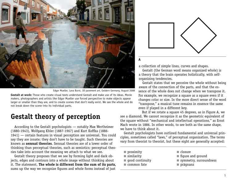
A a collection of simple lines, curves and shapes. Gestalt (the German word means organized whole) is a theory that the brain operates holistically, with selforganizing tendencies. Gestalt states that we perceive the whole without being aware of the connection of the parts, and that the esEdgar Mueller, Lava Burst, 3D pavement art, Geldern Germany, August 2008 sence of the whole does not change when we transpose it. Gestalt at work: Those who create visual texts understand Gestalt and make use of its ideas. Movie For example, we recognize a square as a square even if it makers, photographers and artists like Edgar Mueller use forced perspective to make objects appear changes color or size. In the more direct sense of the word larger or smaller than they are, and to create scenes that don’t really exist. We see the whole and do “transpose,” a musical tune remains in essence the same not break down the scene into its individual parts. even if played in a different key. But if we rotate a square 45 degrees, as in Figure A, we see a diamond. We cannot recognize it as the geometric equivalent of the square without “mechanical and intellectual operations,” as Ernst Mach wrote in 1886. In other words, to see both as the same shape, According to the Gestalt psychologists — notably Max Wertheimer we have to think about it. (1880-1943), Wolfgang Khler (1887-1967) and Kurt Koffka (1886Gestalt psychologists have outlined fundamental and universal prin1941) — certain features in visual perception are universal. You could ciples, sometimes called “laws,” of perceptual organization. The terms say they are innate; they don’t have to be taught. Such theories are vary from theorist to theorist, but these eight are generally accepted: known as sensual theories. Sensual theories are of a lower order of thinking than perceptual theories, such as semiotics; perceptual theo■■ proximity ■■ closure ries take into account the meaning we attach to what we see. ■■ similarity ■■ figure and ground Gestalt theory proposes that we see by forming light and dark ob■■ good continuity ■■ symmetry, surroundness jects, edges and contours into a whole image without thinking about ■■ common fate ■■ prägnanz it. The statement, The whole is different from the sum of its parts, sums up the way we recognize figures and whole forms instead of just Gestalt theory of perception 1 Proximity B C The principle of proximity is apparent in B and C. We perceive Figure B as a random pattern of dots because they are unevenly spaced. In Figure C, the close proximity of some dots leads us to see them as a unified composition. One aspect of Figure C that adds to its unity is that the spaces between the squares are all the same. These consistent internal margins are important to creating unified wholes. In Figure D, we are more likely to form a group from the lines that are closer together than those that are farther apart. We tend to see three pairs of lines and a lonely line on the far right rather than three pairs of lines that are further apart and a lonely line on the far left. Designers manipulate proximity to show relationships between objects. In the familiar IBM logo, proximity works with another Gestalt principle, closure, to turn random shapes into a familiar image. Proximity and size D E Proximity also affects how we judge size relationships, as we see in Figure E. The centers of the two flowers look different in size, but they are exactly the same (Figure F). F 2 Proximity in design Proximity relationships often determine how we “read” a design. This is obvious in typography, especially when not enough thought is given to how space is used (right). Would you drop off your child at this place? The Kids Exchange sign shows a misuse of close-edge proximity, one of four types of proximity relationships. The others are touch, overlap and combining. ■■ The close-edge concept states that items closer to one another, relative to other items, are more likely to be seen as a group. In using space, the general rule is, Put related items close together; separate unrelated items. Look at Figure G. How many groups do you see among the 12 shapes? Does anything look left out? Close-edge proximity is important for how we read type. Compare these examples: KiDs exChaNgE KiDs exChaNgE KiDs exChaNgE Although the fonts are mixed and the case is erratic, we see two words because of closeedge proximity. Even if we widen the spacing, we see two words because the difference in letter spaces and word spaces is relative. ■■ Touch: When the edges of items touch (Figure H) the relationship becomes stronger. See the example below: KiDs exChaNgE G H Overlapped or touching type can make a striking display, but it is not advised for type J meant to be read at long stretches, what Erik Spikermann calls “long-distance type.” ■■ Combine: A strong relationship is created when elements are boxed (Figure J) regardless of what other gestalt concepts are in play. Boxing elements also separates, an important consideration. “Highlighting” (another combining device) is a key typographical version of combine. Quotation marks, brackets and parentheses highlight words in this paragraph. KiDs exChaNgE ■■ Overlap: The strongest relationship happens when items overlap (Figure I). Two the same color form a new complex shape. Overlapped items form a strong group regardless of color. In the example below, the letters all overlap. I 3 Similarity In Figures G and H, the circles and squares are evenly spaced horizontally and vertically, so proximity does not come into play. But we do tend to see alternating columns of circles and squares in Figure L. Gestalt psychologists would argue that this is because of the principle of similarity: Features that look similar are seen as related. Without the two different shapes, we would a square composition, as in the Figure K. The principle of similarity is used to create repetitive patterns that we often find pleasing to the eye. The Beatles album cover uses images of the same shape and size, but as we study them, we find subtle, interesting differences, such as the blacked out image of George Harrison at center. When we use the principle of similarity, we can make a point of emphasis by varying that similarity. In this movie still from King Vi- K L dor’s The Crowd (top), a film from 1928, the actor with his face to the camera demonstrates this point. He also stands out because of another Gestalt principle, common fate. Everyone is going the same direction except him. 4 Good continuity A third Gestalt principle is good continuity: We prefer to see contours based on smooth continuity instead of abrupt changes of direction. In Figure M, for example, we are more likely to identify lines a-b and c-d crossing than to identify a-d and c-b or a-c and d-b as lines. Figure N illustrates how this tendency to seek continuation can lead to misperception. We M think we see a spiral, but as we impose concentric circles on the image (Figure O), we see that the spiral is just an illusion. N O Common fate According to the principle of common fate, we see groups of objects as lines moving along the smoothest path. In the poster below, the colored circles suggest rapidly moving bicycles. The Beatles provide another famous example (right). Poster for the 2010 UCI Road World Championships of cycling, in Geelong and Melbourne, Australia. The designer used similarity in the shapes and colors of the circles, and added a sense of movement by exploiting the principle of common fate. 5 P Closure Closure, a fourth principle of Gestalt, states that we tend to perceive figures as “closed” rather than “open.” Another way to think of closure is that we mentally complete shapes that are only partially there. Closure is a power- Q ful principle that is used in design and art. In Figure P, top, we tend to see three broken rectangles and a partial shape on the left instead of three I-beams and a partial shape on the right. In this case the principle of closure trumps the principle of proximity; if we remove the bracket shapes (Figure P, bottom), proximity takes over. In Figure Q, we see six circles and two triangles. Closure is working on several levels. The closure principle says in effect that we mentally fill in the blanks, and in keeping with the basic principle of Gestalt, we organize what we see into complete shapes. Scott McCloud discusses closure from several angles, including the closure the reader provides between panels of a comic book and the tendency to fill in the personality of the most simple faces, such as Charles Schultz’s Charlie Brown. Closure and comics In Understanding Comics: The Invisible Art, Scott McCloud devotes several pages to the principle of closure, a key concept for the comic book artists. Early in the book, he discusses two aspects of closure: ■■ First, we could not read comics if we didn’t do our part in filling in the gaps between frames. ■■ Second, we fill in the details of simple drawings. This gives comics a universal quality because we can complete the picture in a way that suits us 6 Closure in art and design Designers and artists rely on the principle of closure, such as with this logo for Eaton. The “E” and the “O” are formed out of negative space. The artist has manipulated another Gestalt principle, figure and ground. Edgar Degas (July 19, 1834 – Sept. 27, 1917) is known for compositions such as Jockeys Before the Start with Flagpole that were like snapshots, with the composition seeming to be almost random. The flagpole cuts through the scene. The horse of the main figure is partially hidden; other riders in the background disappear into the pole. Photography influenced Degas. Photos, unlike carefully composed paintings, capture what is there, the frame often coming into play. Degas exploited closure. He relied on the viewer to fill in the missing parts, to see the whole horse and rider when only part is exposed. The viewer must extend the scene outside the frame. Careful examination reveals that Degas’ composition is not haphazard. The pole divides the frame vertically according to the Golden Proportion, and the horse’s head is placed vertically in the same proportion. In the Golden Proportion, ab:bc=ac:ab, a ration of about 1.618:1. 7 S R U T V Rubin’s vase is an ambiguous or bi-stable (reversing) two-dimensional figure introduced circa 1915 by the Danish psychologist Edgar Rubin. The illusion illustrates principles of how we perceive figure and ground. You can see a vase, or you can see two faces, but you can’t see both at the same time. Below: Because we are used to seeing dark figures on a light background, images like this from the Taos Pueblo are a bit startling. The white wall plays against our expectations, with the dark background seen through the doorway. Figure and ground A fifth principle of Gestalt is really several principles that fall under the heading figure and ground. It explores how the brain separates figures from the background, a critical skill for prehistoric man, who had to decide quickly if something in the distance was a threat. Theorists believe several factors figure into how we perceive figure and ground: ■■ Smallness: Smaller areas tend to be seen as figures against a larger background. In Figure R, we are more likely to see a black cross rather than a white cross within the circle because of this principle. Compare figures S and T, two examples of Rubin’s vase. The vase in Figure S takes up a smaller area, so it is easier to see as the figure. ■■ Light/dark: Dark objects on light backgrounds are more common, so when we have a light figure/dark background, as in Figure U, we are more likely to interpret the drawing as two faces. Two other factors, symmetry and surroundness, enter into how we interpret figures U and V. 8 W Symmetry, surroundedness Symmetrical areas tend to be seen as figures against asymmetrical backgrounds. Study Figure W: Which shapes do you see as figures and which as ground? Because some shapes are dark and some light, some symmetrical and some asymmetrical, we might be confused about figure-ground relationships. The principle of surroundedness states that areas seen as surrounded by other areas tend to be perceived as figures. What do you make of Figure X? Observers first assume that the white area is the ground because it surrounds the black areas. But try to reverse that idea in your mind. What word do you see? X M.C. Escher, Sky and Water I #306 (1938), woodcut M.C. Escher fascinates us with his imaginative manipulation of figure-ground relationships, similarity, proximity, continuation and common fate. 9 Camouflage disrupts figure-ground Camouflage uses materials, coloration or illumination to make animals or objects difficult to separate from a background, a phenomenon known as crypsis. A camo method used less often is mimesis, the practice of mimicking something else. Both exploit Gestalt principles. Clockwise from top left: ■■ A leopard’s spotted coat is an example of high contrast disruptive coloration. ■■ A zebra’s stripes provide an example of edge disruption. Predators see one large moving mass rather than individual animals. ■■ Hunters use camo so that they might hide from their prey. ■■ The moths exhibit mimetic camouflage, with wings that look like the eyes of an owl. ■■ The artist Désirée Palmgren produced a series of urban and interior camouflage images, one of which you see here. 10 Prägnanz All of these principles of perceptual organization serve the over-arching principle of prägnanz: The simplest and most stable interpretations are favored. What the Gestalt theorists suggest is that we may be predisposed to interpret an ambiguous image one way over another along these universal principles. Gestalt principles are useful as a conscious approach to composing visual texts, but do not forget that other factors play a large part in how we read images. Chief among these other aspects of perception is what we have learned and what is part of our culture. Gestalt principles reinforces the notion that the world is not simply and objectively “out there” but is constructed in the process of perception. As film theorist Bill Nichols comments: Bracketed Perception Normal Perception A bounded visual space, oval, approximately 180° laterally, 150° vertically Unbounded visual space Clarity of focus at only one point with a gradient of increasing vagueness toward the margin (clarity of focus corresponds to the space whose light falls upon the fovea) Clarity of focus throughout Parallel lines appear to converge: the lateral sides of a rectangular surface extending away from the viewer appear to converge Parallel lines extend without converging: the sides of a rectangular surface extending away from the viewer remain parallel If the head is moved, the shapes of objects appear to be deformed If the head is moved, shapes remain constant The visual space appears to lack depth Visual space is never wholly depthless A world of patterns and sensation, of surfaces, edges and gradients A world of familiar objects and meaning However, a simple experiment allows us to “bracket” visual perception at least briefly. “A useful habit formed by our brains For this to be possible, you need to sit facing must not be mistaken for an essential atthe same direction without moving your body tribute of reality. Just as we must learn to for a few minutes: read an image, we must learn to read the ■■ Gaze blankly at the space in front of physical world. Once we have developed you. this skill (which we do very early in life), ■■ Avoid fixing the space into objects and it is very easy to mistake it for an autospaces between objects; instead, try to matic or unlearned process, just as we see it as a continuum of impressions. may mistake our particular way of readIf the necessary purposelessness is ing, or seeing, for a natural, a historical achieved, the space will lose its familiar propand noncultural given.” erties. Instead of receding in depth, it will Bracketed perception seem to float dimensionless from the bottom We are rarely aware of our own habitual to the top of the field of vision. A rectangular ways of seeing the world. It takes deliberbook, instead of lying flat on a table, will be a ate effort to become more aware of everyday trapezoidal patch of a certain color and texvisual perception as a code. Its habitual appli- ture rising vertically in this flattened field. cation obscures the traces of its intervention. This process of bracketing perception will be more familiar to those who draw or paint who are used to converting three dimensions into two. For those who do not, this little experiment may be quite surprising. We are anesthetized by a psychological mechanism called “perceptual constancy” that stabilizes relative shifts in apparent shapes and sizes of people and objects around us as we change viewpoints. Without mechanisms such as categorization and perceptual constancy the world would be no more than what William James called a “great blooming and buzzing confusion.” Perceptual constancy ensures, as Nichols writes, that “the variability of the everyday world becomes translated by reference to less variable codes. The environment becomes a text to be read like any other text.” 11 What’s going on here? Look at these illusions and note what Gestalt principle you think is in play. 12 What’s going on here? Look at these illusions and note what Gestalt principle you think is in play. 13 What’s going on here? Look at these illusions and note what Gestalt principle you think is in play. 14 What’s going on here? Look at these illusions and note what Gestalt principle you think is in play. 15 What’s going on here? Look at these illusions and note what Gestalt principle you think is in play. 16 Gestalt at work These examples all exploit one or more Gestalt principles. Can you name them? 17 Gestalt at work These examples all exploit one or more Gestalt principles. Can you name them? 18 Gestalt at work These examples all exploit one or more Gestalt principles. Can you name them? 19 Gestalt at work These examples all exploit one or more Gestalt principles. Can you name them? 20
