Module 5: Meteorology
advertisement
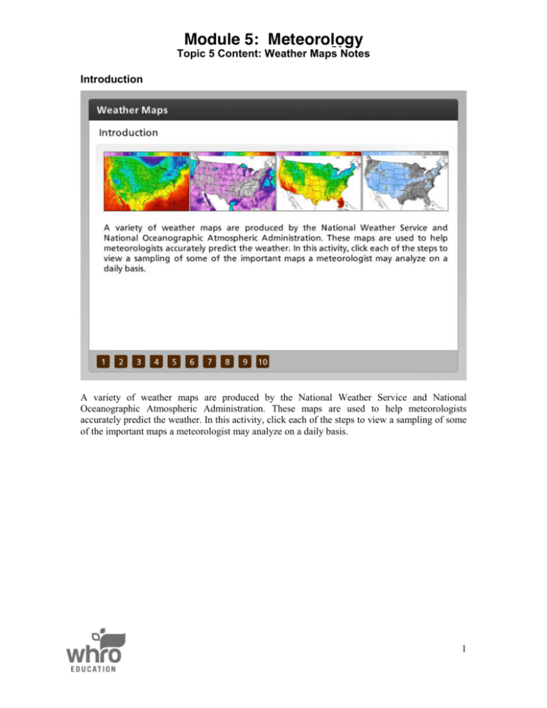
Module5: 11: Meteorology Meteorology Module Topic 5 Content: Weather Maps Notes Introduction A variety of weather maps are produced by the National Weather Service and National Oceanographic Atmospheric Administration. These maps are used to help meteorologists accurately predict the weather. In this activity, click each of the steps to view a sampling of some of the important maps a meteorologist may analyze on a daily basis. 1 Module 11: Meteorology Topic 5 Content: Weather Maps Notes Forecast A forecast map is produced by the National Oceanographic Atmospheric Administration, or NOAA. This map shows pressure patterns, circulation centers, fronts, as well as the types and the extent of precipitation. Notice the yellow lines on this map. These lines are called isobars. They indicate areas of equal pressure. Isobars are much like contour lines on a topographic map. Air moves from high pressure into low pressure, so these lines can indicate the direction of moving air and storms. Some maps may contain isotherms. Just like isobars, an isotherm is a line indicating areas of equal temperature. 2 Module 11: Meteorology Topic 5 Content: Weather Maps Notes Surface Conditions The current surface conditions maps are produced by the National Oceanographic Atmospheric Administration, or NOAA. This map may look confusing and busy; however, NOAA produces a large version that shows the station models for each location in the continental United States. This map also contains pressure, fronts, and isobars. 3 Module 11: Meteorology Topic 5 Content: Weather Maps Notes Temperatures Knowing the temperature helps you decide your daily clothing and activities. Every twelve hours, the temperature map is updated so meteorologists can predict temperature trends for the day. On this map, red indicates a warm temperature and purple indicates a cold temperature. 4 Module 11: Meteorology Topic 5 Content: Weather Maps Notes Relative Humidity Relative humidity is the amount of moisture present when compared to the amount present at saturation. On this map, dark green indicates saturation and red indicates the lowest relative humidity. 5 Module 11: Meteorology Topic 5 Content: Weather Maps Notes Doppler Radar Doppler radar uses radio waves to indicate areas of precipitation. The image shows a Doppler radar for the continental United States. Local Doppler radar stations exist to give meteorologists a more detailed view of local conditions. This map shows major areas of precipitation over the Northwest and Southeast United States. 6 Module 11: Meteorology Topic 5 Content: Weather Maps Notes Dew Point Dew point is the temperature at which air must be cooled to begin condensing back into liquid. This temperature tells meteorologists the temperature at which clouds form. On this map, red indicates the highest dew point temperature and purple shows the lowest. 7 Module 11: Meteorology Topic 5 Content: Weather Maps Notes Precipitation A precipitation map is produced every six hours to show the current precipitation and the precipitation totals. Meteorologists can use this map to determine how much rain will enter an area and how much fell in a certain area. On this map, purple indicates the highest amounts of precipitation, while light green shows the lowest amounts. 8 Module 11: Meteorology Topic 5 Content: Weather Maps Notes Satellite Many weather satellites exist in order to help meteorologists get a more detailed view of the cloud cover. This satellite image shows the cloud cover in the continental United States. The lighter colored clouds are thicker. The red clouds indicate very heavy cloud cover. Meteorologists can correlate cloud cover with precipitation. 9 Module 11: Meteorology Topic 5 Content: Weather Maps Notes Sky Cover Using satellite imagery, a sky cover map is produced. On this map, darker colors indicate heavier cloud cover. 10 Module 11: Meteorology Topic 5 Content: Weather Maps Notes Wind Size and Direction Wind speed and direction is mapped using a partial station model. You can see from this map that wind speed was greatest in the middle of the country. On this map, red indicates the highest wind speed and grey shows the lowest. The station model points the direction from which the wind originates. 11
