DOC Instructions
advertisement
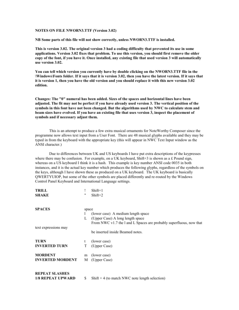
NOTES ON FILE NWORN3.TTF (Version 3.02) NB Some parts of this file will not show correctly, unless NWORN3.TTF is installed. This is version 3.02. The original version 3 had a coding difficulty that prevented its use in some applications. Version 3.02 fixes that problem. To use this version, you should first remove the older copy of the font, if you have it. Once installed, any existing file that used version 3 will automatically use version 3.02. You can tell which version you currently have by double clicking on the NWORN3.TTF file in the \Windows\Fonts folder. If it says that it is version 3.02, then you have the latest version. If it says that it is version 1, then you have the old version and you should replace it with this new version 3.02 edition. Changes: The "0" numeral has been added. Sizes of the spaces and horizontal lines have been adjusted. The fit may not be perfect if you have already used version 3. The vertical position of the symbols in this font have not been changed. But the algorithms used by NWC to calculate stem and beam sizes have evolved. If you have an existing file that uses version 3, inspect the placement of symbols and if necessary adjust them. This is an attempt to produce a few extra musical ornaments for NoteWorthy Composer since the programme now allows text input from a User Font. There are 48 musical glyphs available and they may be typed in from the keyboard with the appropriate key (this will appear in NWC Text Input window as the ANSI character.) Due to differences between UK and US keyboards I have put extra descriptions of the keypresses where there may be confusion. For example, on a UK keyboard, Shift+3 is shown as a £ Pound sign, whereas on a US keyboard I think it is a hash. This example is key number ANSI code 0035 in both instances, and it is the actual key number which produces the following glyphs, regardless of the symbols on the keys, although I have shown these as produced on a UK keyboard. The UK keyboard is basically QWERTYUIOP, but some of the other symbols are placed differently and re-routed by the Windows Control Panel Keyboard and International Language settings. TRILL SHAKE ! " Shift+1 Shift+2 SPACES space l (lower case) A medium length space L (Upper Case) A long length space From NWC v1.7 the l and L Spaces are probably superfluous, now that text expressions may be inserted inside Beamed notes. TURN INVERTED TURN t T (lower case) (Upper Case) MORDENT INVERTED MORDENT m (lower case) M (Upper Case) REPEAT SLASHES 1/8 REPEAT UPWARD $ Shift + 4 (to match NWC note length selection) 1/16 REPEAT UPWARD 1/32 REPEAT UPWARD % Shift + 5 ^ Shift + 6 From NWC v1.7 these Repeat marks need Expression Placement, Justify Right & Align with Next note for Down Tails with Justify Left & Align with Next note for Up Tails. They may be inserted within Beams to indicate the beam + repeat value: e.g. Beamed 1/8 + 1/8 Repeat 1/8 REPEAT DOWNWARD 1/16 REPEAT DOWNWARD 1/32 REPEAT DOWNWARD REPEAT HORIZONTAL the Beam is horizontal. X & Shift + 7 * Shift + 8 ( Shift + 9 These have been entered for downward Beamed Notes, as detailed in UPWARD above. They may have other uses (Upper case) Designed to show a Repeat slash in Beamed notes where DOWN BOW UP BOW d u (lower case) (lower case) SHARP and with Figured Bass. NATURAL FLAT s (lower case) Allows placement above/below Turns, Mordents, Trills n f (lower case) (lower case) WEDGE w (lower case) Above note. Also known as Staccatissimo W (Upper case) Below note. HAIRPINS H h (Upper Case) Crescendo (lower case) Decrescendo ARPEGGIO A (upper Case) INVERTED FERMATA F (upper Case) ACCIACCATURA & APPOGGIATURA SMALL SLUR c (lower Case) STROKE C (Upper Case) In addition to the above, there are three more glyphs which I find more pleasing to view when using split tails or when a chord of different durations is used and these are either Accented, Staccato or Legato. These signs may be a bit lost amongst the print and IMHO they are better displayed above or below the end of a tail. The three signs may be entered as text in NWORNAM Font:ACCENT STACCATO LEGATO a S x (lower case) (upper Case) (lower Case) RESTS When two or more instruments are annotated on a staff, it is particularly useful to be able to enter rests when one or more notes are silent: this allows rests to show as part of a chord where the rest is longer than the note. NWC cannot notate this at the moment. WHOLE REST , Comma (3rd key left from Right Shift) HALF QUARTER EIGHTH SIXTEENTH THIRTY SECOND . / < > ? Full stop Slash Less than More than Query (2nd key left from Right Shift) (1st key left from Right Shift) (Shift+3rd key left from Right Shift) (Shift+2nd key left from Right Shift) (Shift+1st key left from Right Shift) FIGURED BASS (CONTINUO) Provision is made for Figured Bass notation using the standard top row numbers 1 to 9 plus Spaces, Accidentals (the same as mentioned above) and three different length horizontal lines. SHORT LINE MEDIUM LINE LONG LINE x y z (lower Case) (lower Case) (lower Case) (also used for Legato - see above) It is emphasised that within NWC these items are Text for display and printing and do not have any effect on the musical performance. I have tried to match the glyph dimensions to the same scale as NoteWorthy’s font so that if Staff size is 12 points then NWORN3 as User 1 font should also be entered in 12 point. About ten of the glyphs are also contained in Mr. Graham’s BOXMARKS.TTF I have only entered glyphs for the first character set (0033 to 0127 decimal.) Keypresses in this range not allocated to any of the above keys will produce a non musical character ! If you see a strange glyph it is probably due io a typographic error. There are 46 characters left available in the first Character set. Requests for other Symbols will be considered if accompanied by a sketch and description of what it means - I am not a musician ! The following examples of the glyphs are printed at 24 points:- ! ””" ! (Shift+1) TRILL " (Shift+2) space SHAKE (Concatenate several for a long one) A normal Space l (lower case) A medium length space (double normal) L (Upper Case) A long length space (quadruple normal) t (lower case) TURN T (Upper Case) INVERTED TURN m (lower case) MORDENT M (Upper Case) INVERTED MORDENT | | l |L| t T m M $ | | Shift+4 ,or $ 1/8 REPEAT UPWARD % ^ & * ( X Shift+5, or % 1/16 REPEAT UPWARD Shift+7, or ^ 1/32 REPEAT UPWARD Shift+8, or & 1/8 REPEAT DOWNWARD Shift+9, or * 1/16 REPEAT DOWNWARD Shift+6, or ( 1/32 REPEAT DOWNWARD X (Upper case) HORIZONTAL BEAMS d u s n f w W H h A F a S x , . / HORIZONTAL REPEAT MARK FOR USE WITHIN d (lower case) DOWN BOW u (lower case) UP BOW s (lower case) SHARP n (lower case) NATURAL f (lower case) FLAT w (lower case) WEDGE (Staccatissimo) W (Upper Case) WEDGE H (Upper Case) HAIRPIN Crescendo h (lower case) HAIRPIN Decrescendo A (Upper Case) ARPEGGIO F (Upper Case) INVERTED FERMATA a (lower case) ACCENT S (Upper Case) STACCATO x (lower case) LEGATO , 3rd key left from Right Shift WHOLE REST . 2nd key left from Right Shift HALF REST / 1st key left from Right Shift 1/4 REST < > ? c C < Shift+3rd key left from Right Shift 1/8 REST > Shift+2nd key left from Right Shift 1/16 REST ? Shift+1st key left from Right Shift 1/32 REST c (lower case) Small slur for Acciaccatura and Appogiatura C (Upper Case) Slash for tail of Acciaccatura 0123456789 Top row numbers for FIGURED BASS x y z x (lower Case) Short line for FIGURED BASS y (lower Case) Medium line for FIGURED BASS z (lower Case) Long line for FIGURED BASS The ACCIDENTALS and different length SPACES in this font may also be used for adding to FIGURED BASS. Keys NOT allocated for extra ornaments, will probably produce a blank space, except that the TM character at Alt+0153 will show a cat.
