Lab 1: Temperature Trends
advertisement
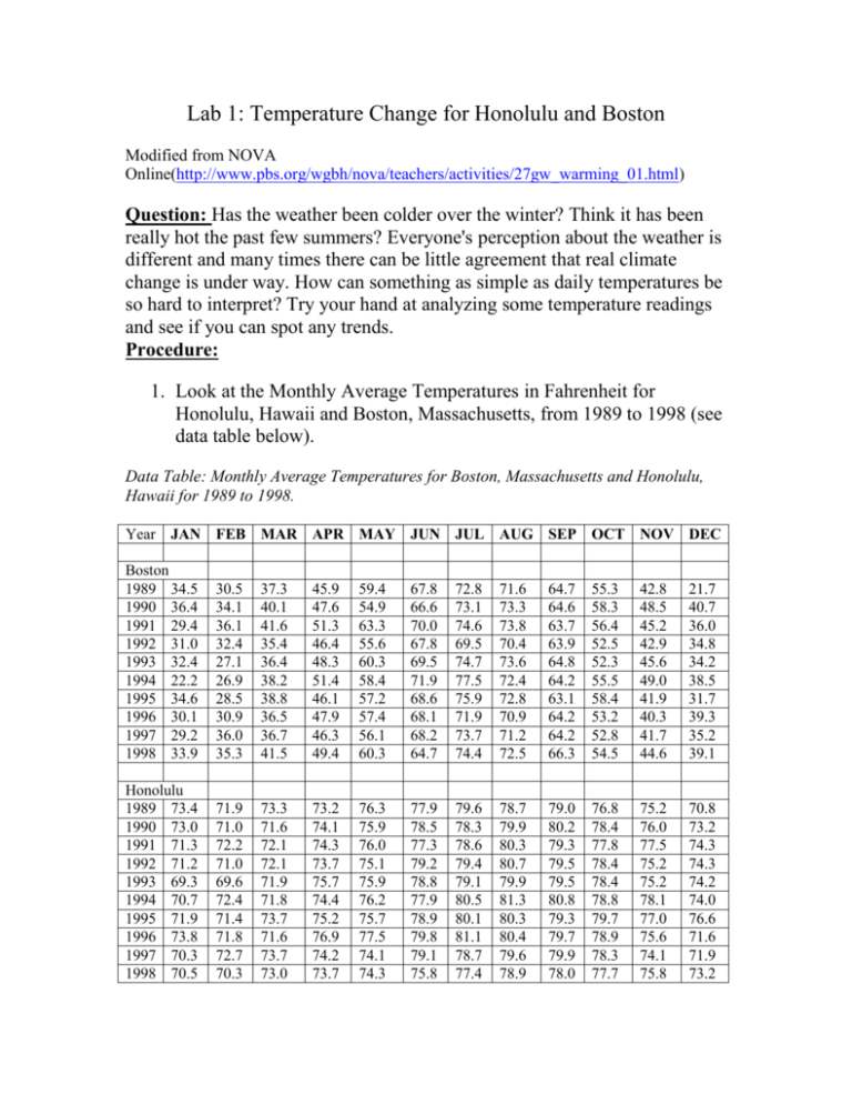
Lab 1: Temperature Change for Honolulu and Boston Modified from NOVA Online(http://www.pbs.org/wgbh/nova/teachers/activities/27gw_warming_01.html) Question: Has the weather been colder over the winter? Think it has been really hot the past few summers? Everyone's perception about the weather is different and many times there can be little agreement that real climate change is under way. How can something as simple as daily temperatures be so hard to interpret? Try your hand at analyzing some temperature readings and see if you can spot any trends. Procedure: 1. Look at the Monthly Average Temperatures in Fahrenheit for Honolulu, Hawaii and Boston, Massachusetts, from 1989 to 1998 (see data table below). Data Table: Monthly Average Temperatures for Boston, Massachusetts and Honolulu, Hawaii for 1989 to 1998. Year JAN FEB MAR APR MAY JUN JUL AUG SEP OCT NOV DEC Boston 1989 34.5 1990 36.4 1991 29.4 1992 31.0 1993 32.4 1994 22.2 1995 34.6 1996 30.1 1997 29.2 1998 33.9 30.5 34.1 36.1 32.4 27.1 26.9 28.5 30.9 36.0 35.3 37.3 40.1 41.6 35.4 36.4 38.2 38.8 36.5 36.7 41.5 45.9 47.6 51.3 46.4 48.3 51.4 46.1 47.9 46.3 49.4 59.4 54.9 63.3 55.6 60.3 58.4 57.2 57.4 56.1 60.3 67.8 66.6 70.0 67.8 69.5 71.9 68.6 68.1 68.2 64.7 72.8 73.1 74.6 69.5 74.7 77.5 75.9 71.9 73.7 74.4 71.6 73.3 73.8 70.4 73.6 72.4 72.8 70.9 71.2 72.5 64.7 64.6 63.7 63.9 64.8 64.2 63.1 64.2 64.2 66.3 55.3 58.3 56.4 52.5 52.3 55.5 58.4 53.2 52.8 54.5 42.8 48.5 45.2 42.9 45.6 49.0 41.9 40.3 41.7 44.6 21.7 40.7 36.0 34.8 34.2 38.5 31.7 39.3 35.2 39.1 Honolulu 1989 73.4 1990 73.0 1991 71.3 1992 71.2 1993 69.3 1994 70.7 1995 71.9 1996 73.8 1997 70.3 1998 70.5 71.9 71.0 72.2 71.0 69.6 72.4 71.4 71.8 72.7 70.3 73.3 71.6 72.1 72.1 71.9 71.8 73.7 71.6 73.7 73.0 73.2 74.1 74.3 73.7 75.7 74.4 75.2 76.9 74.2 73.7 76.3 75.9 76.0 75.1 75.9 76.2 75.7 77.5 74.1 74.3 77.9 78.5 77.3 79.2 78.8 77.9 78.9 79.8 79.1 75.8 79.6 78.3 78.6 79.4 79.1 80.5 80.1 81.1 78.7 77.4 78.7 79.9 80.3 80.7 79.9 81.3 80.3 80.4 79.6 78.9 79.0 80.2 79.3 79.5 79.5 80.8 79.3 79.7 79.9 78.0 76.8 78.4 77.8 78.4 78.4 78.8 79.7 78.9 78.3 77.7 75.2 76.0 77.5 75.2 75.2 78.1 77.0 75.6 74.1 75.8 70.8 73.2 74.3 74.3 74.2 74.0 76.6 71.6 71.9 73.2 Can you spot any long-term temperature changes by scanning the rows? It can be hard to just look at numbers and see trends. So what is another way you can look at the data? These data may make more sense as a graph. 2. We are now going to plot average monthly temperatures for both Honolulu and Boston for two consecutive years. To do this, we will use the following web plotting program “Create a Graph” from the National Center for Educational Statistics available at the following web address: (http://nces.ed.gov/nceskids/createagraph/index.asp?ID=56154FCAB2 176FC9E) 3. Now, follow these instructions to create your first graph comparing average monthly temperatures for Honolulu over 2 consecutive years. a. Click the “Design” Tab on the upper right side of the green area. Then select/click line graph. The window should look like the following: b. Next, we are going to fill in the temperature data, so click the “Data” tab that is underneath the “Design” tab. c. Fill in the “Graph Title”, “X-Axis Label:”, “Y-Axis Label:”, and “Source:” with appropriate values. For “Source:”, put your name. d. Make sure under “Data Set” that you select 12 for “Items” and 2 for “Groups”. e. For the “Group 1” column and “Group 2” column, put the two consecutive years of Honolulu temperatures that you are going to compare in the “Group Label” rows. For example, “1989 Temperature” for Group 1 Group Label and “1990 Temperature” for Group 2 Group Label. f. Now fill in the “Item Labels” column for Item 1 through Item 12 with the 12 months January to December. g. Fill in the corresponding “Group 1” column values with the corresponding month average temperature for the first year you’ve selected. Then do the same for the “Group 2” column values for the second year you’ve selected. h. Pick a “Point Shape” so that the data show up. Also make sure that the “Color” is different for each data set. i. Finally, set a “Min-Value:” and a “Max-Value:”. This sets the minimum and maximum value for the y-axis. If there is too much difference between the minimum and maximum values for the y-axis, you will not be able to see any difference between the data. So, pick a minimum value that is close to the lowest and highest temperature of both years. j. Your “Data” tab window should look something like this: k. Note that you can not use the 1992 and 1993 years for your temperatures. Plots made with these temperatures will have to be redone with different years. l. Next, click the “Label” tab and make sure that “Show Label” yes radio button is selected. You can also change the size of the label (using “Font Size”) and also the data label’s location (using “Position”) next to the data point. m. Now, click the “Preview” tab. Does your plot look something like this? n. Now you are ready to print the plot. Go to the “Print/Save” tab. It should look like this: o. Click the print option in the middle of the page. After doing this, select “PDF (*Adobe Acrobat)” as your “Print Format:” and click print. The window should look like this: p. After printing the graph to a PDF file, it should look like this: q. Now, repeat this for the same 2 consecutive years for Boston. Temperature Change for Honolulu and Boston Lab Evaluations: A. Type your answers to the following questions and submit by the drop box to the instructor. If there is math involved, show your math by typing out (for example 2 + 2 = 4). 1. Is one year always warmer or colder than the other year for all the months? Answer here: 2. If not, what does that say about trying to use just two years to determine if climate is changing? Answer here: 3. What was the warmest temperature and coldest temperature for each year for each city? Answer here: 4. What is the range in temperatures for each individual year between the coldest and warmest months for each city? Answer here: 5. Comparing Honolulu to Boston, which city has the greatest range in temperature between the coldest month and the warmest month for any of the years? Answer here: B. Save your plots as the following: Temperate plot Filename Honolulu Boston Lab1_Honolulu_yourlastname.pdf Lab1_Boston_yourlastname.pdf

