Write lecture on incorporating statistics, graphs, and illustrations to
advertisement
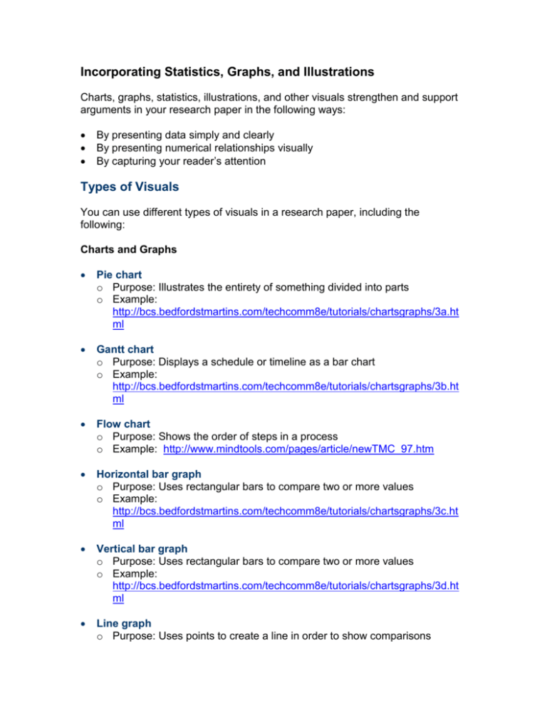
Incorporating Statistics, Graphs, and Illustrations Charts, graphs, statistics, illustrations, and other visuals strengthen and support arguments in your research paper in the following ways: By presenting data simply and clearly By presenting numerical relationships visually By capturing your reader’s attention Types of Visuals You can use different types of visuals in a research paper, including the following: Charts and Graphs Pie chart o Purpose: Illustrates the entirety of something divided into parts o Example: http://bcs.bedfordstmartins.com/techcomm8e/tutorials/chartsgraphs/3a.ht ml Gantt chart o Purpose: Displays a schedule or timeline as a bar chart o Example: http://bcs.bedfordstmartins.com/techcomm8e/tutorials/chartsgraphs/3b.ht ml Flow chart o Purpose: Shows the order of steps in a process o Example: http://www.mindtools.com/pages/article/newTMC_97.htm Horizontal bar graph o Purpose: Uses rectangular bars to compare two or more values o Example: http://bcs.bedfordstmartins.com/techcomm8e/tutorials/chartsgraphs/3c.ht ml Vertical bar graph o Purpose: Uses rectangular bars to compare two or more values o Example: http://bcs.bedfordstmartins.com/techcomm8e/tutorials/chartsgraphs/3d.ht ml Line graph o Purpose: Uses points to create a line in order to show comparisons o Example: http://bcs.bedfordstmartins.com/techcomm8e/tutorials/chartsgraphs/3e.ht ml Tables o Purpose: Arranges data in rows and columns o Example: See Ch. 1 in Axia College’s Writing Style Handbook at https://axiaecampus.phoenix.edu/Writing_Style_Handbook_AxiaUOP.pdf Illustrations Timeline o Purpose: Shows a sequence of events, such as historical or scientific events o Example: http://www.microsoft.com/education/timelinesword.mspx Drawings o Purpose: Conveys information that is better understood visually, for example, a political cartoon, a map, or a drawing to illustrate parts of a tool or a piece of technology o Example: http://electronics.howstuffworks.com/telephone1.htm Pictures or art o Visually convey a powerful image o Example: http://www.axiacollege.com/how-axia-college-works.asp Selecting Appropriate Visuals You must use visuals sparingly to maximize their impact—approximately one to three visuals in appropriate locations in your research paper. In order to decide the best type of visual to use, consider the following questions: Can the visual convey information better than words can? Use a visual only if the visual can better explain the concept than you can explain it with words. If you write a paper about the dangers of mines, for example, including a random piece of flower clip art will not mean much to the reader; however, showing before and after photos of an area that has been mined could make a powerful impact. At what skill level is my audience? Just as you should analyze your audience before you write your paper, you should also analyze your audience when considering which types of visuals to use—you want the information presented to be at the audience’s skill level. Generally, bar charts are easier for the general public to read and understand, whereas line charts are more familiar to scientific audiences. If you were to write a paper to argue the negative effects of second-hand smoke to a general audience, for example, a chart showing the number of deaths due to second-hand smoke would probably be more effective than a chart displaying the different levels of chemicals in the smoke. What is your paper’s purpose and thesis? Consider using information that specifically proves your thesis, supports your purpose, and also makes an impact on the reader. If the purpose of your paper is to convince your audience not to get into credit card debt (or to get out of it), for example, you could insert a chart that breaks down the amount individuals spend in interest every year based on their credit-card balance. What types of visuals am I able to create? You may have a creative idea for a visual but not the proper software or technical knowledge to create it. Choose visuals you can easily create (basic visuals, such as pie and bar charts, in Microsoft® Word and Excel, for example). When choosing visuals from the Internet, be sure you do not violate copyright laws. You can usually find a page on a Web site explaining its copyright laws. Many will allow you to use the image provided you are not going to sell a document with the image in it. When in doubt, email the Web site or company for confirmation that you can use the image in a college paper. Incorporating Visuals Once you have selected the types of visuals and the kind of information the visuals will convey, decide where and how to incorporate each visual into your paper. Effective Use of Visuals Follow the suggestions below for the most common types of visuals: Place the visual in the most logical place—where your argument in the paper relates directly to the information in the visual. Do not include too much information in your visual. A bar chart with 15 different bars, for instance, would overwhelm the reader with too many graphic effects (such as lines, colors, and so forth) or with too much data. Use transitional statements to introduce the visual. Consider the following thesis: Schools need to serve more healthful foods. To support your argument, you might want to include statistics comparing childhood obesity today with figures in the past. To introduce a visual comparing these statistics, you could write, “Researchers have noted that in every decade for the last 40 years, American children have become more overweight. The following chart illustrates this point.” Then, place your chart in the paper following the transitional statements. Number of Overweight Children 2000 Number of children in the thousands 1500 Ages 2-5 1000 Ages 6-9 Ages 10-13 500 0 1960 1970 1980 1990 2000 Years (Williams, 2006, p. 42) Add clear, concise explanations of the visual. Otherwise, your audience may not understand the visual’s meaning or purpose. If necessary, place a short explanation underneath the chart. Just as with your written sources, you must document visual information using APA formatting guidelines. For examples, refer to Ch. 1 of Axia College’s Writing Style Handbook at https://axiaecampus.phoenix.edu/Writing_Style_Handbook_AxiaUOP.pdf. Additional Resources For more information on creating and incorporating charts, graphs, tables, and other visuals into your research paper, refer to the following: Preparing Effective Charts and Graphs at the Axia College Writing Resources Web Site: http://bcs.bedfordstmartins.com/techcomm8e/tutorials/chartsgraphs/index.htm l Ch. 1 in Axia College’s Writing Style Handbook at https://axiaecampus.phoenix.edu/Writing_Style_Handbook_AxiaUOP.pdf Microsoft® Word Tutorial: Creating Tables at http://corptrain.phoenix.edu/axia/com215/wordchart01.htm Wrap-Up If used too often or if used inappropriately, visuals can distract the reader. On the other hand, visuals can impact readers in powerful and memorable ways. To select the most effective type of visual for your research paper, consider the skill level of your audience, the purpose of your paper, and the kind of information you want to convey. Doing so will not only strengthen the arguments in your paper but also enhance your credibility as a researcher.
