Sample+storyboard+section+Brigham+Communications
advertisement

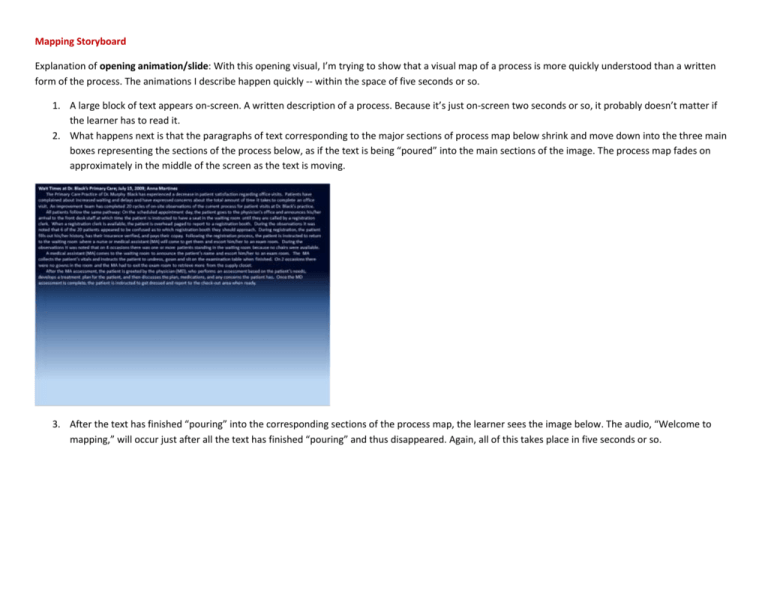
Mapping Storyboard Explanation of opening animation/slide: With this opening visual, I’m trying to show that a visual map of a process is more quickly understood than a written form of the process. The animations I describe happen quickly -- within the space of five seconds or so. 1. A large block of text appears on-screen. A written description of a process. Because it’s just on-screen two seconds or so, it probably doesn’t matter if the learner has to read it. 2. What happens next is that the paragraphs of text corresponding to the major sections of process map below shrink and move down into the three main boxes representing the sections of the process below, as if the text is being “poured” into the main sections of the image. The process map fades on approximately in the middle of the screen as the text is moving. 3. After the text has finished “pouring” into the corresponding sections of the process map, the learner sees the image below. The audio, “Welcome to mapping,” will occur just after all the text has finished “pouring” and thus disappeared. Again, all of this takes place in five seconds or so. Slide topic: Welcome Voice over text Welcome to mapping. Basic template for slide below: Text on-screen Image on-screen See written description above. Articulate Feedback Slide topic: Navigating the Controls Voice over text The lesson controls are found at the bottom of the screen – here you can pause the presentation or move forward and backward through the slides of the lesson. You can also navigate through the lesson by clicking on the slide titles in the left sidebar menu. The rest of the controls are pretty straightforward, but feel free to take a look around. When you are ready to move on, press the pulsing play button below. Slide topic: Lesson Overview Voice over text Text on-screen Navigating the Controls (large font, centered) Image on-screen Articulate Feedback See template above. Orange arrow points down toward play, backward, and forward buttons. Arrow points to sidebar menu. Text on-screen Image on-screen Articulate Feedback Everything we do in our daily work ― whether it’s paperwork, providing medication to a patient, or ensuring the patient environment is clean and safe ― is part of a process. At “part of a process” the image above shrinks, moves “into” the process map (see below), and fades off screen as the process map fades onto the screen. In the previous lesson, you learned about Observation, the method of “going and seeing” how work processes are currently being performed. “you learned about observation…” In this lesson, you’ll learn about mapping methods that will help you to translate those observations into visual tools to aid quality improvement. ”you’ll learn about mapping” There are two methods of mapping: process mapping (slight pause in narration) and value stream mapping. X at “process” at “and value stream…” Both are visual representations of work processes that help to identify improvement opportunities for providing ideal patient care. By illustrating these improvement opportunities, as well as any positive features in the process, you are able to focus on “What is valuable to the patient?” “And what are the barriers to providing better patient care?” (slight pause in narration) This lesson will last approximately 45 minutes and will conclude with an assessment. What is valuable to the patient? What are the barriers to better patient care? (black font, Arial, centered beneath diagram.) at “the lesson will last…” at “you will be able to…” After completing this lesson you will be able to: Identify the main components of a process and value stream map Determine the steps to build a process map Calculate the value quotient of a value stream map Articulate the benefits of drawing out a process So let’s go ahead and start learning about process mapping. Slide topic: Purpose of a Process Map Voice over text Text on-screen A process map is a visual diagram drawn from Purpose of a Process direct observation. It provides an objective, Map (slide title) high-level view of how work is currently done. Provides an objective, high-level view (orange Image on-screen At “steps that occur” white board and orange text fade on. font) The process map enables you to see an entire pathway, including the individual steps that occur within the process and the outcomes produced. Through mapping, activities and connections within the pathway – which you can review in the Rules in Use lesson – are drawn out to reveal opportunities for improvement and waste reduction. Because you can clearly SEE ways to improve, the process map guides you toward the ideal future state. This visual representation is also helpful for engaging team members in quality improvement because it is often easier for everyone to understand a process if it can be visualized. Shows the steps and outcomes of a process Guides toward ideal state Engages team members At “process map” the image below appears in the white box above. When mentioned in narration, the activities (large boxes w/ text), connections (arrows), and “opportunities for waste reduction (spiky cloud and delays) pulse on-screen. Articulate Feedback For example, here is an explanation of a process in words: Now here is an explanation of the same process using process mapping. Which one do you find easier to understand and remember? As the phrase goes, “a picture is worth a thousand words.” Two basic looks for the slide below: All previous text fades off. Text of the Dr. Black observation on-screen Process map fades on at start of narration At “as the phrase goes…” text on-screen fades to grey. And when we get to the most important action of the slide… Slide topic: Drawing a Process Map Voice over text Now that we know what a process map is, let’s learn how to make one and why it is Text on-screen Drawing a Process Map (slide title) Image on-screen Articulate Feedback Right before the voice over of the next section begins, the clipboard appears on lower left of screen. essential to the improvement process. Step 1: Observe. Observing work as it is currently done is key to developing a process map. As we discussed in the Observation lesson, you only truly understand a process after you’ve observed it multiple times. Often the process doesn’t actually flow the way you think it does, even if you work within it every day. Script font, dark red on clipboard Remember back in the Observation lesson when we said you need to analyze your log? That means you need to determine what the major steps or chunks are, as well highlight the delays in yellow, improvement opportunities in red, and positive features in green. Once you have analyzed your observation logs, you can translate your notes into a process map. ~analyze observation logs sections are “chunked” when mentioned in narration; highlights also fade on when mentioned in narration. Step 2: Work with a team. As you begin to map out your work, you and your improvement team will want to be sure to solicit the help of staff who actually work within the process. This corresponds to the Rule of Work Improvement, discussed in the Rules in Use lesson. Including the people impacted by the problem will help you in two ways: 2.Work with a team This image below replaces the ob log above. 1.Observe ~multiple cycles First, staff are more likely to support improvements if they are involved in the improvement process; and second, the map will be more accurate because the information you use to draw the map includes the firsthand knowledge of those who actually do the work. (sub-bullet under 2 above) – Step 3: Include the process title, date, and author at the top of map. This helps other staff know what process is being mapped and whom they can go to with questions or suggestions. 3.Include title, date, author Step 4: Identify the major steps of the process and the specific activities within each step. Identify the perspective from which the map is drawn. A map should always reflect the perspective of the customer, which is typically the patient in healthcare. So we begin by placing a figure representing the patient at the beginning of the map to represent the patient requesting the service and then at the end of the map to represent the patient receiving the requested service. Then the major “chunks” or components of work are denoted by boxes lined up from left to right. Each box lists the specific activities that occur for that process step and the roles of the people involved. If you’re wondering about the arrows, they 4.Identify major steps & activities ~ staff support ~ makes map more accurate From this point till the end of the slide, we are building bit by bit the image below. White background box appears as does Title, Date, and Author when mentioned in narration Symbol of patient fades on at beginning & end of process Boxes for Steps 1,2,3 with arrows fade on in quick succession Activities w/in all boxes appear all at once w/ “Each box lists the specific activities …” Arrows pulse twice when mentioned first time in narration. represent the direction of workflow. You want to have ONE arrow pointing to and ONE arrow pointing from each activity. If you have multiple arrows originating from or connecting to an activity, that step violates the Pathways Rule of Work Design, which states the pathway should be highly specified, predefined, direct, and void of loops or forks. Step 5: Note improvement opportunities, positive features, and delays. As we talked about before, a process map helps identify problems ― which we’ll call improvement opportunities. On your map, improvement opportunities are noted with red spiky clouds near the step where they occur in the process. This helps you quickly visualize where the improvement opportunities occur within the process and where to begin your improvements. Remember, the purpose of drawing a process map is to know WHERE the improvement opportunities exist in your process, not WHAT the underlying causes are. Determining the cause of observed problems occurs through root cause analysis, which you can learn more about in the Lean Approach to Problem Solving lesson. On your process map, it is also important to draw attention to what is working well and therefore what should remain stable. These positive features of the process are noted with green, puffy clouds. A final element to note on your process map is where delays occur by using upside down triangles. Delays are seen when patients are waiting to move from one step in the process to the next. 5.Note improvement opportunities, positive features & delays Improvement opportunities, positive features, and delays fade onto the process map. Improvement opportunity spiky cloud pulses twice when mentioned in narration. Mapping (title; list this Clipboard fades off screen at start of narration. and bullets in the blue space beneath the map; now back to Arial font for title & 3 bullets) shows WHERE improvement opportunities exist determine WHAT the causes are after mapping Green positive cloud pulses twice when mentioned Delay symbols pulse twice the first time mentioned It’s important to remember that process maps will look different depending upon the question or problem you’re trying to address and what you observed. Now that we know the basics of creating a process map, let’s break for a few, quick knowledge checks. Knowledge Check 1 Question type Multiple choice Process maps will differ Question & Answer Choices What is the first step in building a process map? (correct order shown; answers will be scrambled for learner) -Observe the process as it is currently performed -Work with a team to gather data on the process -Include title, date, and author on the map -Identify major steps and activities within the process -Note improvement opportunities, positive features and delays Knowledge Check 2 Question type Multiple choice Question & Answer Choices Spiky clouds are drawn on the process map to: -Identify where improvement opportunities occur -Identify where waiting occurs Feedback Observing the work as it is currently performed is the first step. As we discussed in the Observation lesson, you only truly understand a process after you’ve observed it multiple times. Often the process doesn’t flow the way you think it does, even if you work within it every day. Once you have observed, you can translate your notes into a process map. Image on-screen Articulate Feedback Feedback Correct feedback: Spiky clouds on a process map identify where improvement opportunities occur within a process. Image on-screen I’d like to encircle the question in a spiky cloud. Articulate Feedback Incorrect feedback: Spiky clouds identify where -Calculate the value quotient -Signal which problems should be tackled first improvement opportunities occur. They do not indicate which problems to tackle first. Waiting, or delays, are signaled by upside-down triangles while the value quotient is written out as an equation.


