Paula Scher was an illustrator major in Tyler school of art
advertisement
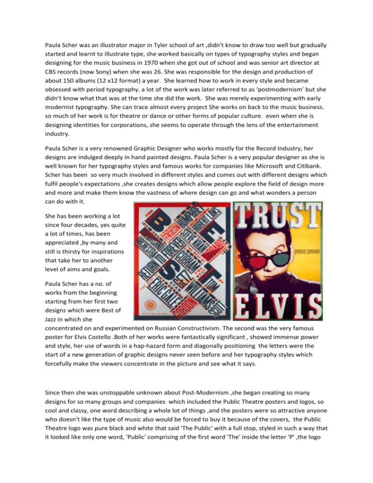
Paula Scher was an illustrator major in Tyler school of art ,didn't know to draw too well but gradually started and learnt to illustrate type, she worked basically on types of typography styles and began designing for the music business in 1970 when she got out of school and was senior art director at CBS records (now Sony) when she was 26. She was responsible for the design and production of about 150 albums (12 x12 format) a year. She learned how to work in every style and became obsessed with period typography. a lot of the work was later referred to as ‘postmodernism’ but she didn’t know what that was at the time she did the work. She was merely experimenting with early modernist typography. She can trace almost every project She works on back to the music business. so much of her work is for theatre or dance or other forms of popular culture. even when she is designing identities for corporations, she seems to operate through the lens of the entertainment industry. Paula Scher is a very renowned Graphic Designer who works mostly for the Record Industry, her designs are indulged deeply in hand painted designs. Paula Scher is a very popular designer as she is well known for her typography styles and famous works for companies like Microsoft and Citibank. Scher has been so very much involved in different styles and comes out with different designs which fulfil people's expectations ,she creates designs which allow people explore the field of design more and more and make them know the vastness of where design can go and what wonders a person can do with it. She has been working a lot since four decades, yes quite a lot of times, has been appreciated ,by many and still is thirsty for inspirations that take her to another level of aims and goals. Paula Scher has a no. of works from the beginning starting from her first two designs which were Best of Jazz in which she concentrated on and experimented on Russian Constructivism. The second was the very famous poster for Elvis Costello .Both of her works were fantastically significant , showed immense power and style, her use of words in a hap-hazard form and diagonally positioning the letters were the start of a new generation of graphic designs never seen before and her typography styles which forcefully make the viewers concentrate in the picture and see what it says. Since then she was unstoppable unknown about Post-Modernism ,she began creating so many designs for so many groups and companies which included the Public Theatre posters and logos, so cool and classy, one word describing a whole lot of things ,and the posters were so attractive anyone who doesn't like the type of music also would be forced to buy it because of the covers, the Public Theatre logo was pure black and white that said 'The Public' with a full stop, styled in such a way that it looked like only one word, 'Public' comprising of the first word 'The' inside the letter 'P' ,the logo also had letters which were bold , and varied in thickness from start to the end, the thinnest was 'C'.So amazingly designed giving a stylish but professional feel. The Public Theatre posters were very bright consisting of pictures of dancing guys with words and phrases all around them, like 'Bring da' Noise, Bring da' Funk', which is actually Bring the noise ,Bring the funk, a very funky style of type, writing 'the' as Da, very attractive and cool also other famous plays mentioned which are 'King Lear' by Shakespeare and 'Wasp' ,although all her designs are identical and there is a specific style which she sticks to in all her works, anything written together or a combination of words written in bold diagonal and vertical ways is a Paula Scher creation. While the change from a vertical to horizontal orientation has the effect of making the posters logo more architectural. After CBS records, She was partners with her friend from college, Terry Koppel – they worked together for seven years under the name ‘Koppel and Scher’. Terry Koppel was a magazine designer and in 1989 there was a recession and he didn’t get anymore magazines to design so he took a staff job, while she continued on her own. She realized that as a woman alone in business she wasn’t likely to get large scale projects and that the work she was already getting was probably be what she would continue to get. When pentagram invited her to join she knew it was an amazing opportunity. She would have never been able to work on the broad diverse types of projects she have been fortunate enough to work on without the reputation and structure of pentagram behind it. "When you hand-draw typography, it looks like Finster or other primitive artists," Scher says. "Because of the complications of the paintings and the patterns they create, some people have commented that they remind them of aboriginal art. There is this primitive quality to them, but I wouldn't describe them as primitive." Initially before the Citibank logo was created by Scher ,Pentagram proposed multiple illustrations depicting the change of the Citigroup and Travellers to the red arched Citi logo over the 14 yr period. Scher came up with the latest Citibank logo which she drew on a napkin during a client meeting ,when the Citigroup had just changed their name to just 'Citi' .Any logo looks like a logo when it is short simple yet stylish conveying its purpose, in my opinion the red arched 'Citi' logo was the best one because it was short , all letters were in the lower case but 'I' without any dot above it and the place of the dot replaced by the arc which starts from one 'I' and ends at the other, so amazingly designed, the red colour looks very bright and grabs attention .The arc shows the bond between the person who has an account in the bank and also the bankers ,it shows the safe and protective bond they share with each other, their money in safe hands and protected under the shade of the bank which acts like an umbrella also represented in the logo.

