QR_MM2011_figs
advertisement
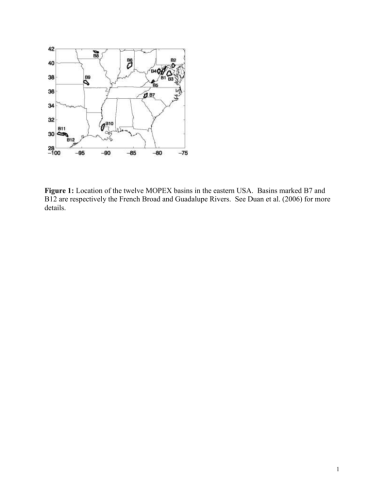
Figure 1: Location of the twelve MOPEX basins in the eastern USA. Basins marked B7 and B12 are respectively the French Broad and Guadalupe Rivers. See Duan et al. (2006) for more details. 1 Figure 2: Simplified wiring diagrams for each of the four parent models (the state variables and fluxes are defined in Tables 1 and 2 respectively). Here Z uz and Z lz denote the depth of the upper and lower soil layers, and wlt , fld , and sat denote the soil moisture at wilting point, field capacity, and saturation. Saturation-excess runoff ( q sx ) is defined as the fraction of precipitation that falls on saturated areas of the catchment and does not infiltrate into the soil – q sx is shown as originating from the lower zone storage in TOPMODEL because lower zone storage in TOPMODEL controls the saturated area. 2 Figure 3: Today’s discharge (persistence; x-axis) used as a forecast of tomorrow’s discharge (yaxis) for the French Broad data set. Red line is the fit for the central tendency (mean) using standard linear linear regression; middle black line is the fit of the median (0.5 quantile); upper black 0.9 quantile; lower black 0.1 quantile. Notice the very similar fits for both the median and mean. Notice also the strong heteroscedastic behavior of the persistence fitting, which is seen by the divergence of the 0.1 and 0.9 quantile lines for higher discharges. 3 Figure 4: Schematic of the QR post-processing procedure. See text for details. 4 Figure 5: Pre- and post-calibration time-series of ensemble simulations (colored lines) and observations (black line). Comparing ovals on both plots, notice the significant change in the PDF’s before and after calibration (discussed further in Figure 6). Also notice the increase in ensemble dispersion, and their non-gaussian structure; also notice the daily changes in the ensemble spread. Are these dispersion variations informative? In Figure 7, will look at the ensemble “snapshots” of the two upper ovals for day #106. 5 Figure 6: The same as Figure 5 (but for the full data set) but data translated into rank histograms. Red dotted lines show 95% confidence limits for a perfectly calibrated forecast. Histograms are U-shaped before post-processing (underdispersive) with larger under- than over-bias. After post-processing, out-of-sample data show much of the under-dispersion corrected for. 6 7 Figure 7: A kernel fitting creates an estimate of the continuous PDF implied by the original FUSE (blue line) and QR-SS post-processed (black line) ensemble forecasts for day #106, as highlighted by the ovals in Figure 5. After post-processed, notice the PDF shifts towards the observation (red line) and changes (increase) in dispersion; also notice the appearance of non-gaussian shapes to these distributions. 8 Figure 8: (needs to be cut and concise explanation …) Frequency usage of the 81 regressors. One of the FUSE models (“best model”) is used in calibrating 76% of the quantiles, the ensemble standard deviation is used 13% of the time, the ensemble mean is not used at all (!); and the ranked ensemble (each day’s sorted ensemble that corresponds to the particular quantile being calibrated) is used only 6% of the time. The figure at the right points out that we would not have expected the under-representation of the ensemble mean based solely on Nash-Sutcliffe (NS) scores for FUSE models: the x-axis represents the NS score PDF of all the FUSE models as shown by the blue line, noting that almost all of the models are bunched together with a NS of about 0.8; the short blue vertical line shows the NS of the model most used in the calibration (I.e. 76% of the time). The axis also represents the percentage of time the regressors are used in the calibration: the black line is the PDF of the times that each FUSE model is used, in this case, the most models are used only about 10% of the time (where the PDF is peaked); the short vertical solid black line corresponds to the 76% mark of the most-used model; the short vertical red line shows the percent of time the standard deviation is used (13%), the green corresponds to the % of time the ranked ensemble is used (6%), and the yellow for the ensemble mean (0%). 9
