Here
advertisement
MATH 2441
Probability and Statistics for Biological Sciences
The Five-Number Summary, Boxplots, and Outliers
To wrap up our coverage of methods of descriptive statistics, we present one more numerical summary
method (the five-number summary), one more graphical method (the boxplot or box-and-whisker plot),
and address an important issue that arises in statistical data collection and analysis: what do we do with
unusual observations (or outliers).
The Five-Number Summary
The so-called five-number summary is most often prepared as the first step in constructing a boxplot. Most
commonly, the five-number summary consists of the five values
x , Q3, maximum }
{ minimum, Q1, ~
Here, 'minimum' refers to the smallest value in the data set, 'maximum' refer to the largest value in the data
x is the median. Some workers use the
set, Q1 and Q3 are the lower and upper quartile respectively, and ~
upper and lower hinges in place of the two quartiles, but the result is much the same.
This set of five numbers gives some direct insight into the distribution of the data. You know the smallest
and largest values observed. The median gives you an idea of the center of the distribution, and the
difference between the upper and lower quartiles (or the corresponding hinges) gives a sense of how spread
out the values are.
Boxplots
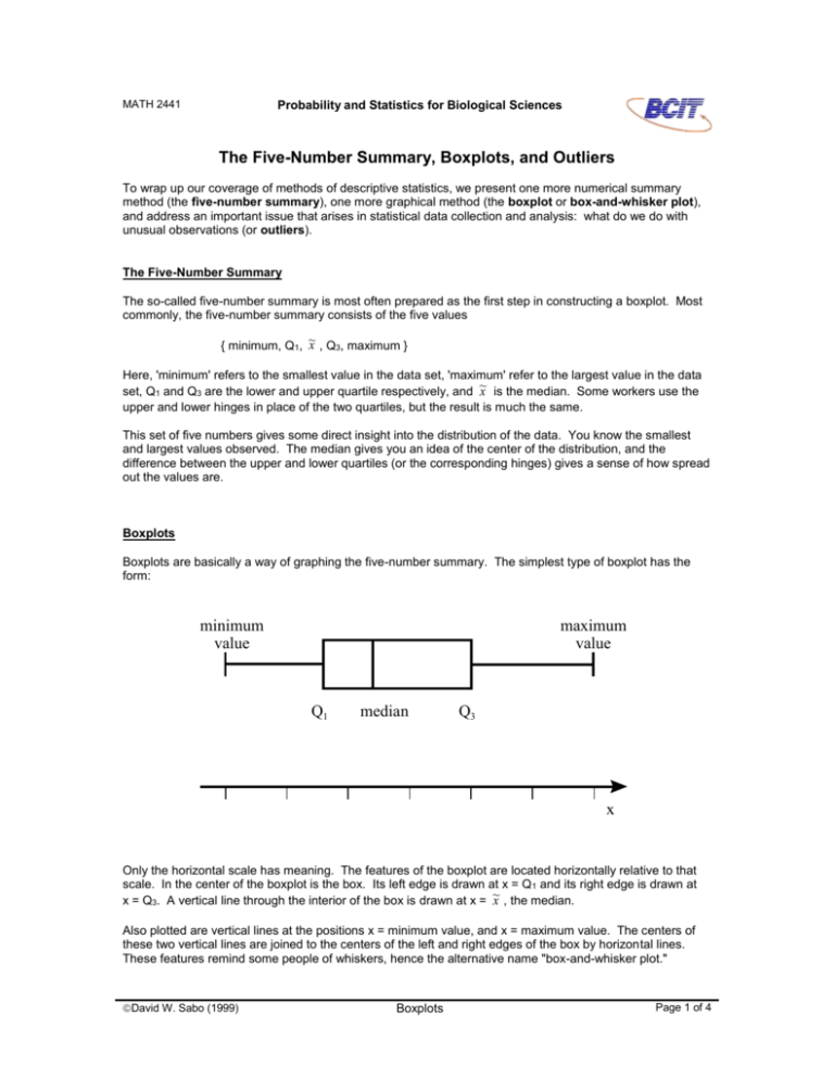
Boxplots are basically a way of graphing the five-number summary. The simplest type of boxplot has the
form:
minimum
value
maximum
value
Q1
median
Q3
x
Only the horizontal scale has meaning. The features of the boxplot are located horizontally relative to that
scale. In the center of the boxplot is the box. Its left edge is drawn at x = Q 1 and its right edge is drawn at
x , the median.
x = Q3. A vertical line through the interior of the box is drawn at x = ~
Also plotted are vertical lines at the positions x = minimum value, and x = maximum value. The centers of
these two vertical lines are joined to the centers of the left and right edges of the box by horizontal lines.
These features remind some people of whiskers, hence the alternative name "box-and-whisker plot."
David W. Sabo (1999)
Boxplots
Page 1 of 4
A glance at a boxplot then tells you visually the span of values between the smallest and largest
observation, the interval containing the middle 50% of the observations (the box), and the location of the
center of the data, as represented by the median. Further, the position of the median line inside the box
gives you some sense of the symmetry of the distribution. If the median line is to the left of the box, the
distribution is skewed to the right and vice versa. Note that the horizontal width of the box is equal to the
IQR (the interquartile range).
Although single boxplots by themselves are informative, probably the most common use of the boxplot is in
comparing two or more sets of data. This would be done by drawing a boxplot for each set of data relative
to the same horizontal scale. (Some people call these side-by-side boxplots.) We will illustrate this
technique in the example below. The relative horizontal positions of the side-by-side boxplots allows you to
compare the general distributions of the various data sets. Unlike back-to-back stemplots, which permit the
comparison of at most two sets of data, you can stack as many boxplots side-by-side as you have room for
on the page.
Outliers
A difficult issue in statistical work is the question of what to do about suspicious or very unusual
observations. Such unusual observations are often referred to as outliers (pronounced owt-ly-ers, from the
mental image that they "lie way out far away from the other observations").
Of course, when you are aware of a procedural mistake in taking an observation or measurement, that data
value should be discarded immediately. This situation might arise when it is clear that a specimen has
become contaminated, or an instrument has not been properly calibrated before use, or someone notices a
certain degree of carelessness in performing the experimental operation.
Sometimes unusual or unexpected types of observations occur and there is no reason to believe they are
the result of a procedural blunder of some sort. Yet, they may be so different from the other observations
that one may suspect that such a mistake may have occurred. If a mistake did occur, then inclusion of that
observation in the data set to be subjected to further analysis may introduce an error into any conclusions
later made. On the other hand, it is possible that the unusual observation is not due to a mistake but reflects
some unexpected property of the population. Exclusion of that observation may mean missing an important
aspect of the population under study.
There is no absolute solution to this problem, because that would require people to be able to know when
they made a mistake that they don't know about. The next best thing is to develop an objective rule that
everybody will follow in deciding when to label an observation as an outlier. Then at least calling an
observation an outlier won't depend on the mood of individual researchers from day to day.
One of the most commonly used rules for identifying outliers is based on the five-number summary and the
x , and Q3 -- and hence, of the IQR -IQR. (This is a reasonable starting point because the values of Q1, ~
are reasonably insensitive to the presence of one or just a few highly unusual observations.) The so-called
1.5 IQR rule starts out by calculating the following four quantities:
lower inner fence = Q1 - 1.5 IQR
upper inner fence = Q3 + 1.5 IQR
(BOX-1)
lower outer fence = Q1 - 3 IQR
upper outer fence = Q3 + 3 IQR
Thus, the inner fences are located a distance of 1.5 times the IQR to the left and right of the corresponding
edges of the box in the boxplot. The outer fences are located a distance of 3 times the IQR to the left and
right of the corresponding edges of the boxplot. Often dotted vertical lines are drawn at these positions on
the boxplot to indicate the locations of the four fences. This is illustrated in the figure for the SalmonCa
example below.
Observations which fall within the interval bounded by the inner fences are not suspicious. Observations
which fall between the inner fences and the outer fences are regarded as mild outliers or possible
outliers. Observations lying outside the outer fences are regarded as extreme outliers or probable
outliers. Although there is no rule that says you must delete either mild or extreme outliers from your data
Page 2 of 4
Boxplots
David W. Sabo (1999)
before proceeding, most references recommend that the validity of both types of outliers be examined, with
particular effort in the case of extreme outliers, before proceeding.
Example: The SalmonCa Data
To illustrate what has been described so far, consider the three sets of data collected in the SalmonCa
experiment described in the standard data sets document. The five-number summary and other relevant
quantities for each is easily determined to be:
SalmonCa0
SalmonCa20
SalmonCa100
Q3
maximum
29.00
59.75
70.50
90.75
129.00
37.00
59.00
67.50
73.25
86.00
45.00
75.00
84.00
101.00
120.00
IQR
31.00
14.25
26.00
lower inner fence
upper inner fence
lower outer fence
upper outer fence
13.25
137.25
-33.25
183.75
37.63
94.63
16.25
116.00
36.00
140.00
-3.00
179.00
minimum
Q1
~
x
The resultant boxplots are:
SalmonCa
SalmonCa100
SalmonCa20
SalmonCa0
-50.00
0.00
50.00
100.00
150.00
200.00
ppm Ca in fillets
Compare the numbers in the table above with the positions of the various elements in the chart. The fences
are rendered as dotted vertical lines, and the boxplots themselves are rendered in solid lines. (We've let the
horizontal axis extend into negative values here so that we could plot the two lower outer fence values that
turn out to be negative. Of course, in this context, the ppm of Ca in salmon fillets could never give a
negative value. Such observations would have to be the result of a blunder of one sort or another!)
You can see immediately that there is a considerable degree of overlap in values between the three data
sets. In the context of the original experiment, this result would tell the technologist that the amount of
calcium present in the processed salmon fillets does not appear to be strongly affected by the concentration
of chlorine dioxide used to sanitize the fillets. The salmon fillets treated with 20 ppm seem to have a less
variable Ca content, and on average, somewhat lower than the unsanitized fillets, and those treated with
100 ppm ClO2, but the difference is very slight.
David W. Sabo (1999)
Boxplots
Page 3 of 4
There is only one outlier visible in these three boxplots, and that is the minimum value observed in the
SalmonCa20 data set. The lower inner fence has a value of 37.63, and the smallest value observed for
those fillets was 37 ppm. This observation is thus the mildest of mild outliers, and probably does not require
further examination.
Before leaving this example, make sure you understand how each of the features in the figure above was
obtained.
Before leaving this topic, we mention two types of variations on the procedure described and illustrated
above.
First, it is not uncommon for people to use the values of the hinges instead of the quartiles in constructing a
boxplot. In the treatment of outliers, the interquartile range would then be replaced by the so-called
H-spread, the difference between the upper and lower hinges. Since the hinge values are often very similar
to the quartile values, this variation results in diagrams very similar to those illustrated here.
A second variation in the way boxplots are drawn involves making outliers a bit more explicit. First, define
the most extreme data values which are still inside the inner fences to be the lower adjacent value and
upper adjacent value, respectively. The whiskers of the boxplot are drawn to these adjacent values rather
than to the maximum and minimum values (though, of course, if there are no outliers, then the adjacent
values are the minimum and maximum values). Then, the individual outliers are plotted as individual points
-- sometimes with the extreme outliers denoted by different symbols than the mild outliers.
Page 4 of 4
Boxplots
David W. Sabo (1999)
