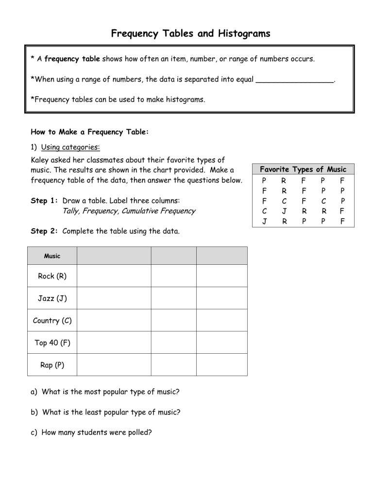
Frequency Tables and Histograms * A frequency table shows how often an item, number, or range of numbers occurs. *When using a range of numbers, the data is separated into equal _________________. *Frequency tables can be used to make histograms. How to Make a Frequency Table: 1) Using categories: Kaley asked her classmates about their favorite types of music. The results are shown in the chart provided. Make a frequency table of the data, then answer the questions below. Step 1: Draw a table. Label three columns: Tally, Frequency, Cumulative Frequency Step 2: Complete the table using the data. Music Rock (R) Jazz (J) Country (C) Top 40 (F) Rap (P) a) What is the most popular type of music? b) What is the least popular type of music? c) How many students were polled? Favorite Types of Music P F F C J R R C J R F F F R P P P C R P F P P F F 2) Using intervals of numbers: Winning Scores The winning Super Bowl scores from 1983 to 2002 are listed in the table. Make a frequency table of the data. 20 31 30 55 46 Step 1: Draw a table. Label three columns: Tally, Frequency, Cumulative Frequency Step 2: Complete the table using the data. 34 35 52 20 38 23 27 37 42 38 34 49 20 39 27 Scores 20-28 29-37 38-46 47-55 Example: Complete the table by filling in the blanks then answer the following question. The frequency table shows the record high temperatures reported by each state of the United States. How many states have reported temperatures above 111˚ F? Temp (˚F) 100-105 Tally Frequency |||| 106-111 112-117 12 |||| |||| |||| | 14 124-129 2 1 Cumulative Frequency * A histogram is a special kind of ______ graph that uses bars to represent the frequency of numerical data that have been organized in _________________. There are TWO main differences between a bar graph and a histogram: 1) appearance: _________________________________________________________ 2) x-axis: _____________________________________________________________ How to Make a Histogram: Example: Use the date from Example 2 (Super Bowl scores) to create a histogram. Step 1: Draw and label the axes. (Remember, the x-axis will be intervals!) Step 2: Draw a bar to represent the frequency of each interval. Example: Use the date from Example 3 (temperatures) to create a histogram. Step 1: Draw and label the axes. (Remember, the x-axis will be intervals!) Step 2: Draw a bar to represent the frequency of each interval. Practice: 1) The number of wins for the 29 teams of the NBA for the 2000-2001 seasons has been organized into a frequency table. Make a histogram of the data. Step 1: Draw and label the axes. If necessary, create interval for the x-axis Step 2: Draw a bar to represent the frequency of each interval. **Why do we use a histogram for this situation? # of wins Frequency 11-20 3 21-30 4 31-40 4 41-50 10 51-60 8 a) How many teams won more than 30 games? b) What was the greatest number of wins by a team? 2) The speed of cars on a stretch of interstate are clocked by a police officer and have been organized into a frequency table. Make a histogram of the data. Speed (mph) Frequency 50-59 2 60-69 14 70-79 18 80-89 3 a) How many people were going 70 mph or faster? b) How many people were speeding, if the speed limit was 60 mph? an 3) The number of wins for all of the teams in the NBA for the 2000-2001 season have been organized into a frequency table. Complete the table, then make a histogram of the data. Wins Tally Frequency 11-20 Cumulative Frequency 3 21-30 7 31-40 4 41-50 21 51-60 8 How many teams are in the NBA? How many teams won more than 50 games? Can we determine what the highest number of wins for a team was? 4) The following frequency table summarizes the grades on the most recent test in Mrs. Crawford’s 4th block class. Complete the table, then make a histogram of the data. Percentage Tally 90-99 |||| ||| 80-89 |||| |||| || 70-79 |||| 60-69 ||| Frequency Cumulative Frequency 8 8 How many students received a C or lower? What grade was the most common? If Angelica is going to take the same test, what grade would you predict that she will get? What percent of students received an A? 5) The histogram below shows the weights of the players on the Washington Redskins. Use the data to complete the frequency table and answer the questions below. How many players weigh between 220 and 240 pounds? How many players are on the team? How many players weigh 240 pounds or more? The Redskins sign a new player. Predict how much he will weigh using the data given. Weight Tally Frequency Cumulative Frequency 6) The histogram below shows the number of people that visited the library last Wednesday. Use the data to complete the frequency table and answer the questions below. Age What was the most common age of people at the library? How many people were between the ages of 20 and 59? Frequency


