A look at colors being used for contract office and hospitality
advertisement

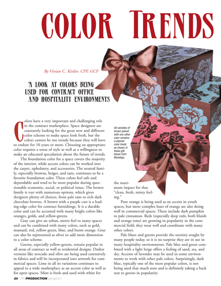
Color Trends By Vivian C. Kistler, CPF, GCF A look at colors being used for contract office and hospitality environments olors have a very important and challenging role in the contract marketplace. Space designers are constantly looking for the great new and different color scheme to make space look fresh, but the colors cannot be too trendy because they will have to endure for 10 years or more. Choosing an appropriate color requires a sense of style as well as a willingness to make an educated speculation about the future of trends. The foundation color for a space covers the majority of the interior, while accent colors can be worked into the carpet, upholstery, and accessories. The neutral family, especially browns, beiges, and tans, continues to be a favorite foundation color. These colors feel safe and dependable and tend to be most popular during questionable economic, social, or political times. The brown family is vast with numerous options, which gives designers plenty of choices, from pale tans to rich dark chocolate browns. A brown with a purple cast is a leading-edge color for contract furnishings. It is a durable color and can be accented with many bright colors like oranges, golds, and yellow-greens. Gray can give an urban, metro feel to many spaces and can be combined with many colors, such as gold, mustard, red, yellow green, blue, and burnt orange. Gray can also be represented as silver to add more dimension to a color scheme. Greens, especially yellow-greens, remain popular in all areas of contract as well as residential designs. Darker versions like avocado and olive are being used extensively in fabrics and will be incorporated into artwork for commercial spaces. Lime in all its variations continues to appeal to a wide marketplace as an accent color as well as for open spaces. Mint is fresh and used with white for C 20 PFMPRODUCTIONSpring2007 All varieties of brown paired with one other color remains a popular color trend, as shown in these gift boxes from Bluedogz. the maximum impact for that “clean, fresh, minty feeling.” Pure orange is being used as an accent in youth spaces, but more complex hues of orange are also doing well in commercial spaces. These include dark pumpkin to pale cinnamon. Reds (especially deep reds, both bluish and orange tone) are growing in popularity in the commercial field; they wear well and coordinate with many other colors. Pale blues and greens provide the serenity sought by many people today, so it is no surprise they are in use in many hospitality environments. Pale blue and green combined with a light beige offers a feeling of sand, sea, and sky. Accents of lavender may be used in some environments to work with other pale colors. Surprisingly, dark blue, typically one of the most popular colors, is not being used that much now and is definitely taking a back seat to greens in popularity. 2007 Color Combinations Analogous colors are maintaining a strong presence in both contract and residential work, with combinations of red, orange, and yellow or blue, green, and purple. Monotone neutrals, blues, or greens provide a very peaceful environment. All-white rooms are becoming popular using mixtures of all types of whites. This is not a good color scheme for hospitality, of course, because of the wear factor. But monotone browns and beiges will hold up very well. Brown continues to be part of many popular color combinations, such as brown with blue, brown with yellow green, brown with orange, brown with turquoise, brown with purple, brown with pale colors, and Yellow-greens like the lime in this bedding from Marimekko are part of many current color combinations. Note the block print/silhouette style of the motifs. brown with deep colors. Brown is definitely a keeper. Yellow-greens are being used with orange, dark red, or lavender. Burnt orange is also being paired with cinnabar, brown, gold, and bronze. Gold and silver are being used as yellow and gray, a popular warm/cool combination. Metallic finishes may be shiny or brushed, but the texture is more visual than tactile. The black and white color combination can be formal or modern. Black chandeliers, large wide black mouldings, and solid black furnishings are providing a statement of “cool.” Look for the introduction of red as the accent color for black and white. Design Themes The classic combination of red, white, and black is emerging as a strong trend in all sectors of decor. These paintings on canvas, displayed against black fabric, are from Tre Sorelle Home Designs. Eclectic design is a leading theme. It requires a designer to successfully assemble a room full of mismatched items and pull them together into a coordinated space. An emphasis on glamour and luxury continues as well as “tranquility” as a sought after lifestyle. Rooms will have color coordination as a “theme,” with oddball accents PFMPRODUCTIONSpring2007 21 Contract Color Directions for 2007 • Chervil -- A minty, herbal-infused green; soothing and calm. color called chestnut represent the largest segment of wood tones. Visible grain used horizontially is expected to increase in use. Also expect to see matte and soft luster sheens used together to create a sense of luxury. ■ • Animé -- a spirited, curiously strong blue-based green. • Appletini -- An intoxicating, yellow tinted green. • Pummelo -- A citron-infused neutral green. • Tunisian Blue -- A turquoise with multicultural roots; Persian, Moroccan, Native American merge. • Liquid Sky -- A clean, clear, slightly red cast blue. Fluid and atmospheric. • Dangerously Elegant -- A deep neutral somewhere between black and brown. • So Sari -- Saris, tribal textiles and antique rugs in a global bazaar; a red with a history. • Indo-Fusheen -- Bright hot pink accent color with passion to spare. • El Paseo -- a pale dusty balance of gold and silver taupe. • Mirage -- Beige and gray hammered into one warmed neutral. • Mystic -- Silver flows in an industrial direction; an urban neutral. For more information on the Color Marketing Group, visit www.colormarketing.org. adding the important cool factor, such as an all gray room with a mirror in a bright orange frame. Trends in Art Silhouettes continue to multiply as the influence of iPod advertisements invades the visual and graphic arts, such as background dancers at the Oscars. Art will contain monochromatic color schemes mentioned above and will use images with simple, solid, shapes based on silkscreen and block print techniques. Sketches and line drawings and art with one or two colors will continue, along with the filigree and swirl motif. Calligraphy and word scribbles will provide interesting designs. Wood finishes of dark espresso brown and a honey 22 PFMPRODUCTIONSpring2006 Color expert Vivian Kistler offers insight about the creation and movement of trends and provides a forecast of the incoming colors and designs in office decor. As an active member, former board member, and senior chairholder of the Color Marketing Group, she combines information from her meetings with the CMG, her extensive travels to European and American trade shows, and her personal tracking system to evaluate and forecast color and design trends.


