T2.4 Displaying MERIS data as a colour
advertisement

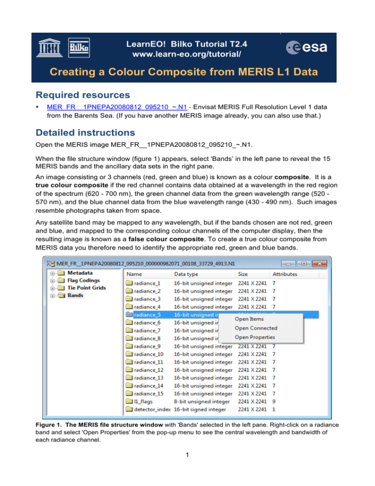
LearnEO! Bilko Tutorial T2.4 www.learn-eo.org/tutorial/ Creating a Colour Composite from MERIS L1 Data Required resources • MER_FR__1PNEPA20080812_095210_~.N1 - Envisat MERIS Full Resolution Level 1 data from the Barents Sea. (If you have another MERIS image already, you can also use that.) Detailed instructions Open the MERIS image MER_FR__1PNEPA20080812_095210_~.N1. When the file structure window (figure 1) appears, select ‘Bands’ in the left pane to reveal the 15 MERIS bands and the ancillary data sets in the right pane. An image consisting or 3 channels (red, green and blue) is known as a colour composite. It is a true colour composite if the red channel contains data obtained at a wavelength in the red region of the spectrum (620 - 700 nm), the green channel data from the green wavelength range (520 570 nm), and the blue channel data from the blue wavelength range (430 - 490 nm). Such images resemble photographs taken from space. Any satellite band may be mapped to any wavelength, but if the bands chosen are not red, green and blue, and mapped to the corresponding colour channels of the computer display, then the resulting image is known as a false colour composite. To create a true colour composite from MERIS data you therefore need to identify the appropriate red, green and blue bands. Figure 1. The MERIS file structure window with 'Bands' selected in the left pane. Right-click on a radiance band and select 'Open Properties' from the pop-up menu to see the central wavelength and bandwidth of each radiance channel. 1 Table 1 Optical wavelengths Wavelength Description 235 - 280 nm UV -C 280 - 320 nm UV -B 320 - 390 nm UV -A 390 - 455 nm Violet 455 - 485 nm Blue 485 - 505 nm Light blue 505 - 575 nm Green 575 - 585 nm Yellow 585 - 620 nm Orange 620 - 740 nm Red 740 -1500 nm NIR To see the wavelength of a particular band right-click on the band in the right pane, and select ‘properties ‘ from the popup menu. Make a note of the wavelength for each radiance band, to help you select three channels for the true colour composite. Figure 2 and Table 1 give approximate wavelengths for the colours seen by the human eye. Question 1 Based on the colour assignment in table 1 and figure 2, which three bands would you select to create a true colour composite? Figure 2. The visible spectrum. The human eye is sensitive to blue, green and red light. Other colours are created by mixing two of these colours. For example: yellow wave lengths (570-575 nm) are detected by receptors on the retina that are sensitive to green and red light; the mixed signal is interpreted by the brain as yellow. Turquoise or blue-green light (app 500 nm) is detected by blue and red receptors and interpreted as as a colour between blue and green. Ultra-violet (UV) light has shorter wavelengths than 390 nm. Near Infrared (NIR) light has longer wavelengths than app. 740 nm. Neither can be detected by the human eye. Open the three bands one by one as individual images. The data is 16-bit integer, so you need to assign a suitable range to the 8-bit computer display, using the Redisplay dialog (figure 3.), which appears automatically. An Autolinear stretch usually works well for MERIS L1 data. Creating the composite From the menu bar select Image > Connect (figure 4) Figure 3. Redisplay dialog To select a stretch click on the arrow in the right corner of the 'Use' box. Figure 4. Opening the Connect dialog. 2 When the Connect dialog (figure 5) opens, select all three images, UNCHECK the ‘Stacked’ check box and click OK. The three images will open side by side in the composite image window (figure 6). The associated Selector widget has three small boxes, which you can click on to assign the images to different colours in the RGB (red, green, blue) computer display. Figure 5. Connect dialog. The 'Stacked' check box is UNCHECKED - the usual setting for colour composites. Pull down the bar at the top of each image and scroll down the properties to reveal the wavelengths. These will tell you how to allocate the colours using the Selector. The three boxes in the Selector correspond to the three panes in the composite image. By convention the red image should be image 1, green image 2 and blue image 3. You can assign these numbers to the three images by clicking on the selector boxes in the correct order: first red (right side), then green (middle) and then blue (left side). Figure 6 Composite image window with associated Selector widget. Once you have assigned image numbers to the three panes, select Image > Composite from the menu bar. This will open a single colour image. To hide the colour bar (which you won’t need) select View from the menu bar, and uncheck ‘Colour Bar’ in the drop-down menu (figure 7). To see the whole image, select View > Zoom from the menu bar to open the Zoom dialog Select ‘Preserve Shape’ and then OK ª(figure 8). Figure 7. Hiding the Colour Bar. 3 Resize the image window to the right aspect ratio by dragging on the edges with the mouse. The result should look something like figure 9. You will notice that the sea and land are rather dark in this image. This is common when you have a lot of cloud. To improve the appearance of the image you will need to select a region that is reasonably cloud free, and use this to create your Redisplay stretch. Figure 8. Zoom dialog Figure 9. The colour composite image. Improving the display Select ‘box selection’ (light square) on the tool bar. In the image, click on a suitable starting point, hold down the left mouse button and draw the region of interest. For best results the selected square should contain a small amount of cloud, some land and most of the turquoise plankton bloom. Release the mouse when you are happy with the selection. Figure 9 gives an example of a suitable selection. 4 From the Menu bar select Image > Redisplay. Choose Autolinear as the stretch to use, and click Apply. The bloom will become more visible. Figure 10 shows an image with an autolinear stretch based on the selection in figure 9. Figure 10. Improved autolinear stretch based on the selection in figure 9. The stretch has saturated the cloud by assigning these to the display value 255 (white) while using most of the display range (1-254) to display the plankton bloom and the land areas. Suggested next step Tutorial sheet T11.7 Dsiplaying EnviSat MERIS data in polar projection builds on this sheet and uses the same image. Answers Answer 1: Red: band 7 (665nm). Green: band 5 (560 nm). Blue: band 3 (490 nm). You could also use bands 8, 5 and 2, which would be close to a true colour composite. You often get better images if the bands are well separated in 'wavelength space', so we have chosen 8, 5 and 2 for the rest of this tutorial, but the results will look much the same with bands 7, 5 and 2. 5
