composition & layout
advertisement
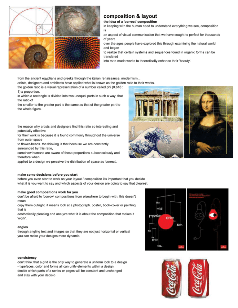
composition & layout the idea of a 'correct' composition in keeping with the human need to understand everything we see, composition is an aspect of visual communication that we have sought to perfect for thousands of years. over the ages people have explored this through examining the natural world and began to realize that certain systems and sequences found in organic forms can be translated into man-made works to theoretically enhance their 'beauty'. from the ancient egyptians and greeks through the italian renaissance, modernism... artists, designers and architects have applied what is known as the golden ratio to their works. the golden ratio is a visual representation of a number called phi (0.618 : 1) a proportion, in which a rectangle is divided into two unequal parts in such a way, that the ratio of the smaller to the greater part is the same as that of the greater part to the whole figure. the reason why artists and designers find this ratio so interesting and potentially effective for their work is because it is found commonly throughout the universe from outer space to flower-heads. the thinking is that because we are constantly surrounded by this ratio, somehow humans are aware of these proportions subconsciously and therefore when applied to a design we perceive the distribution of space as 'correct'. make some decisions before you start before you even start to work on your layout / composition it's important that you decide what it is you want to say and which aspects of your design are going to say that clearest. make good compositions work for you don't be afraid to 'borrow' compositions from elsewhere to begin with. this doesn't mean copy them outright. it means look at a photograph. poster, book-cover or painting that is aesthetically pleasing and analyze what it is about the composition that makes it 'work'. angles through angling text and images so that they are not just horizontal or vertical you can make your designs more dynamic. consistency don't think that a grid is the only way to generate a uniform look to a design - typefaces, color and forms all can unify elements within a design. decide which parts of a series or pages will be constant and unchanged and stay with your decisio get rid of clutter its important to know if something is adding any value to your design on the whole or not. ornamental lines or additional text that don't give any value to your design should be removed. this is not to say your design should be without such things (some times they can tie things together) but their value must be justified on the whole. contrast use opposites to clarify space - think of dark and light, organized and disorganized, fat and thin etc. juxtaposing radically different aesthetics can stimulate interest at a glance. emphasis the way that we digest graphic design revolves around a sort of visual hierarchy we look at the things that are emphasized most first and consider them to have the most importance - we then search for supporting, secondary elements to verify if we have understood correctly. you must decide what is the most important thing you want to say and emphasize this using any of the techniques you feel fit. probably the oldest trick in the book when it comes to composition is placing something of importance at the center where there's little chance it will be overlooked. repeat, crop, off the page by repeating parts of the design the viewer is forced into thinking they may bear some importance. you can also enhance imagery and text by cutting them or cropping them in interesting / unexpected ways. also play with positing elements partly on the page or almost completely off it - again this arouses interest because it's not considered 'neat'.


![arXiv:math/0310197v1 [math.CO] 14 Oct 2003](http://s2.studylib.net/store/data/018249509_1-6f53c8e002c51a3d3f13f50444b5d35b-300x300.png)
