WebDesignSummary.ppt
advertisement
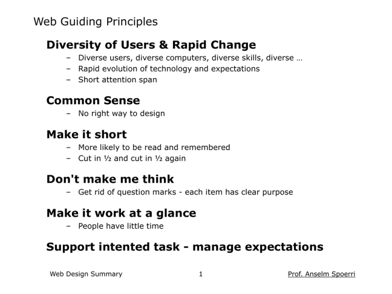
Web Guiding Principles Diversity of Users & Rapid Change – Diverse users, diverse computers, diverse skills, diverse … – Rapid evolution of technology and expectations – Short attention span Common Sense – No right way to design Make it short – More likely to be read and remembered – Cut in ½ and cut in ½ again Don't make me think – Get rid of question marks - each item has clear purpose Make it work at a glance – People have little time Support intented task - manage expectations Web Design Summary 1 Prof. Anselm Spoerri User Behavior Scan pages - don't read them Look for anything = Search Interest Decide quickly Choose first “reasonable item” Muddle through Don't figure out how things work Resist forming models Stick to what works Web Design Summary 2 Prof. Anselm Spoerri Design Implications Scan pages - don't read them • Design for Scanning Make text short - cut words • Make page work at a glance Sufficient left margin, 640x480 = main message • Create Visual Hierarchy Look for anything = Search Interest Decide quickly Choose first “reasonable item” • Make obvious what you can do on a page Muddle through Don't figure out how things work Resist forming models • Don't make users think Stick to what works • Repetition & Consistency • Make obvious what is clickable Get rid of question marks Each item = clear purpose Grid Layout, Easy Navigation, Graphics, Color Coding, Typography Web Design Summary 3 Prof. Anselm Spoerri User Behavior Design Implications Design Specifics Scan pages - don't read them • Design for Scanning Make text short - cut words • Make page work at a glance Sufficient left margin, 640x480 = main message • Create Visual Hierarchy Look for anything = Search Interest Decide quickly Choose first “reasonable item” • Make obvious what you can do • Make obvious what is clickable Muddle through Don't figure out how things work Resist forming models • Don't make users think Get rid of question marks Each item = clear purpose 1 Use Grid System • Maintain Consistency Helps you decide: location of primary & secondary navigation; location and sizes of images; location of headlines, main text, annotations etc. • Create Visual Hierarchy & Rhythm • Present Information Clearly & Logically Users can read info more quickly. Facilitates understanding and recall. • Invisible Hand guiding users and creating sense of place Stick to what works • Repetition & Consistency Grid Layout, Easy Navigation, Graphics, Color Coding, Typography Web Design Summary 4 Prof. Anselm Spoerri User Behavior Design Implications Design Specifics Scan pages - don't read them • Design for Scanning Make text short - cut words • Make page work at a glance Sufficient left margin, 640x480 = main message • Create Visual Hierarchy Look for anything = Search Interest Decide quickly Choose first “reasonable item” • Make obvious what you can do • Make obvious what is clickable Muddle through Don't figure out how things work Resist forming models • Don't make users think Get rid of question marks Each item = clear purpose Stick to what works • Repetition & Consistency Grid Layout, Easy Navigation, Graphics, Color Coding, Typography 2 Create Visual Hierarchy & Guide Eye • Important Things = Visually Prominent (More Important = Larger / Sharp Contrast) Use headlines to guide the eye • Visual Contrast Use sharp changes in size (headline), light intensity (bold), color, texture, motion to create contrast. • Proximity: related things spatially close Spatial separation = conceptual separation. Don't mix alignment styles. • Use Grouping & Nesting to Increase Information Density (Short-term Memory = 3-7) Use bounding shapes. Web Design Summary 5 Prof. Anselm Spoerri User Behavior Design Implications Design Specifics Scan pages - don't read them • Design for Scanning Make text short - cut words • Make page work at a glance Sufficient left margin, 640x480 = main message • Create Visual Hierarchy Look for anything = Search Interest Decide quickly Choose first “reasonable item” • Make obvious what you can do • Make obvious what is clickable Muddle through Don't figure out how things work Resist forming models • Don't make users think Get rid of question marks Each item = clear purpose Stick to what works • Repetition & Consistency Grid Layout, Easy Navigation, Graphics, Color Coding, Typography 3 Typography Heuristics • Sans Serif type is easier to read on screen • Type size 10 -14 points • 7 - 10 words per line • Column width proportional to type size • Bold and italic for small blocks of text • Enough contrast between type & background Web Design Summary 6 Prof. Anselm Spoerri User Behavior Design Implications Design Specifics Scan pages - don't read them • Design for Scanning Make text short - cut words 1 Use Grid System • • Make page work at a glance Sufficient left margin, 640x480 = main message • Create Visual Hierarchy Look for anything = Search Interest Decide quickly Choose first “reasonable item” • Make obvious what you can do • Make obvious what is clickable Muddle through Don't figure out how things work Resist forming models • • • Maintain Consistency Helps you decide: location of primary & secondary navigation; location and sizes of images; location of headlines, main text, annotations etc. Create Visual Hierarchy & Rhythm Present Information Clearly & Logically Users can read info more quickly. Facilitates understanding and recall. Invisible Hand guiding users and creating sense of place 2 Create Visual Hierarchy & Guide Eye • • • Don't make users think Get rid of question marks Each item = clear purpose • Stick to what works • Repetition & Consistency Grid Layout, Easy Navigation, Graphics, Color Coding, Typography • Important Things = Visually Prominent (More Important = Larger / Sharp Contrast) Use headlines to guide the eye Visual Contrast Use sharp changes in size (headline), light intensity (bold), color, texture, motion to create contrast. Proximity: related things spatially close. Spatial separation = conceptual separation. Don't mix alignment styles. Use Grouping & Nesting to Increase Information Density (Short-term Memory = 3-7) Use bounding shapes. 3 Typography Heuristics • • • • • • Web Design Summary Sans Serif type is easier to read on screen Type size 10 -14 points 7 - 10 words per line Column width proportional to type size Bold and italic used for small blocks of text Enough contrast between type and background 7 Prof. Anselm Spoerri Requirements for Web Pages Web Page needs to easily answer • What can I do here? Layout Presents Info Clearly & Logically Facilitates Understanding & Recall • Where do I start? Visual Hierarchy Guides Eye to Important Things Web Navigation needs to easily answer • What site is this? Site ID – logo, image, text • What page am I on? Page name • Major sections of site? Primary Navigation Top Row or Left Column Simple text hyperlinks, icons, rollovers, image-maps, pull-downs • Options at this level? Secondary Navigation Below Top Line or Left Column Expanding / Nesting Hierarchies Static or Dynamic Outlines • Where I am? Go higher or home? Web Design Summary Color Coding, Breadcrumbs Primary / Secondary Navigation 8 Prof. Anselm Spoerri Basic Design Principles Alignment – Don't Mix Alignment Styles - Simplicity – Create Sufficient Left Margin – Constrain Total Width of Page Proximity – Related Things Close Together – Spatial Separation = Conceptual Separation Repetition & Consistency – Grid Layout, Navigation, Graphics Color Coding, Typeface – Creates Ease of Use Contrast – Bigger, Bolder, Color, Spatial Distance – Guide the Eye and Create Visual Hierarchy Web Design Summary 9 Prof. Anselm Spoerri Writing for the Web Concise, SCANABLE and Objective by Jacob Nielsen People scan page – Study: 79% always scanned + only 16 % read word-by-word. Make pages “scanable” – – – – – – Start with conclusion One idea per paragraph Half the word count (or less) than conventional writing Highlighted keywords Meaningful sub-headings (not "clever" ones) Bulleted lists Credibility important and increased by: – High-quality graphics – Good writing – Use of outbound hyperlinks Web Design Summary 10 Prof. Anselm Spoerri
