Edward Tufte is a Professor Emeritus at Yale University, where... statistical evidence, information design, and interface design. He is...
advertisement
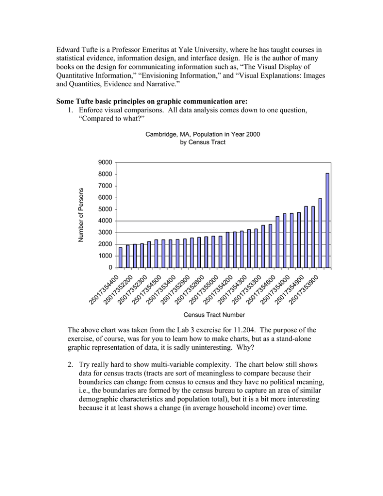
Edward Tufte is a Professor Emeritus at Yale University, where he has taught courses in statistical evidence, information design, and interface design. He is the author of many books on the design for communicating information such as, “The Visual Display of Quantitative Information,” “Envisioning Information,” and “Visual Explanations: Images and Quantities, Evidence and Narrative.” Some Tufte basic principles on graphic communication are: 1. Enforce visual comparisons. All data analysis comes down to one question, “Compared to what?” Cambridge, MA, Population in Year 2000 by Census Tract 9000 Number of Persons 8000 7000 6000 5000 4000 3000 2000 1000 25 01 7 25 354 01 4 73 00 25 5 01 220 7 0 25 352 01 30 7 0 25 354 01 5 73 00 25 5 01 340 7 0 25 352 01 90 7 0 25 352 01 60 7 0 25 355 01 00 7 0 25 354 01 20 7 0 25 354 01 30 7 0 25 353 01 3 73 00 25 5 01 460 7 0 25 354 01 00 7 0 25 354 01 9 73 00 53 90 0 0 Census Tract Number The above chart was taken from the Lab 3 exercise for 11.204. The purpose of the exercise, of course, was for you to learn how to make charts, but as a stand-alone graphic representation of data, it is sadly uninteresting. Why? 2. Try really hard to show multi-variable complexity. The chart below still shows data for census tracts (tracts are sort of meaningless to compare because their boundaries can change from census to census and they have no political meaning, i.e., the boundaries are formed by the census bureau to capture an area of similar demographic characteristics and population total), but it is a bit more interesting because it at least shows a change (in average household income) over time. Average Household Income in Cambridge, MA, Census Tracts 1970-2000 200000 180000 Avg. Household Income (US$) 160000 140000 120000 1970 1980 100000 1990 2000 80000 60000 40000 20000 355000 354900 354800 354600 354500 354300 354200 354100 353900 353800 353600 353500 353300 353100 353000 352900 352700 352500 352300 352200 354700 354400 354000 353700 353400 353200 352800 352600 352400 352100 0 Census Tracts We can also see that there are a couple of tracts that spiked in income in 2000 and a few that either increased or decreased in opposition to the trend established over the previous three decades. 3. Show causality – dynamics/mechanism – how did it happen? Ask yourself, “what is the intellectual task that this display is supposed to help with” and address that cognitive task with the display. Average Household Income in Cambridge, MA, Census Tracts 1970-2000 200000 30.00% 180000 25.00% Avg. Household Income (US$) 160000 140000 20.00% 1970 120000 1980 15.00% 100000 1990 2000 80000 % of Pop. >65 in 2000 10.00% 60000 40000 5.00% 20000 355000 354900 354800 354600 354500 354300 354200 354100 353900 353800 353600 353500 353300 353100 353000 352900 352700 352500 352300 352200 354700 354400 354000 353700 353400 353200 352800 352600 352400 0.00% 352100 0 Census Tracts I’ve added another variable, i.e., the percentage of the population over age 65 in the year 2000. Look for patterns and unexpected associations. Ask yourself why did certain events take place in one tract and not another? The above graph doesn’t show a strong connection between the percentage of older people in the population of a census tract and the average household income over time, but it does serve an exploratory purpose. It at least draws attention to the tracts that are different from the majority, i.e., where the elderly population was high in 2000 and the average income declined steadily between 1970 and 2000. This pattern would inspire you to look more closely at those tracts to find out what was really going on in that neighborhood. After analyzing your data you would want to create graphs that “help with the intellectual task at hand,” i.e., tell the story hidden in your data. …more Tufte guidelines on graphic displays… 4. Avoid jargon and technical mumbo jumbo. 5. Completely integrate words, numbers and images. Otherwise the narrative and argument go into disarray. Don’t put boxes around figures—it acts like a fence. 6. Present information sequentially. 7. Presentations stand or fall on quality, relevance and integrity of CONTENT. Good information design can’t rescue bad content. 8. Data decorators should “do no harm.” 9. Put labels on data lines (stay away from keys and legends) – this enables people to reason immediately. A separate key presents an impediment to learning. You can eliminate codes half of the time. Use side notes, not footnotes. 10. Use small multiples (small, high resolution images next to each other in a series) – it is easier on viewers because of the repetition and it adds inherent credibility (“I looked at 38 days of temperature changes and all my data is here.”) Don’t strip out too much detail or perform evidence selection. Further recommendations: 1. Make visual marks as small as can be effective, e.g., avoid big long pointer lines leading to a letter code—this activates negative space. 2. Confusion and clutter are failures of design. You don’t want people to waste a lot of time decoding the design. Make differences = information. Don’t strip out the detail—fix the design. 3. It isn’t always necessary to show a zero point on the graph if it means empty vertical space to zero—more data horizontally is more helpful. 4. Display averages and variability (as in the small multiples illustration above). 5. Standardize, massage and adjust data. Using a standard format (repeated) helps the reader who learns the scale to easily translate other related displays. 6. Don’t trust displays without footnotes saying where data came from, whether data is missing, whether indexes were used to adjust, where full data set is. 7. Don’t just be descriptive—explain why, show causality, use annotation. Stay away from rainbow flashing gold undershadowed pointers -- the most powerful visual element in the display should be the CONTENT. Chartjunk = statistical stupidity. 8. “Don’t get original – get it right.” Go with conventional designs with high resolution data and repeat. Choose from the portfolio of excellence in your field (collect sample graphics). “Talent imitates, but genius steals” (TS Eliot). 9. Use Adobe Illustrator for control of graphics display. 10. People should put their names on their work (reports, presentations). Named authorship signals personal responsibility—often see better work associated with pride of authorship. 11. Good design is clear thinking made visible. Tufte’s thoughts on websites: 1. On websites, put as much as possible on the front screen—show off what people can learn, don’t make them dig and download. Better to scroll down often than drill down. Some of Tufte’s favorite websites: http://www.excite.com/ http://www.photo.net/ Tufte thinks is the best on the internet. http://www.bookfinder.com/ 2. Provide a high resolution interface within the eyespan of the viewer. 3. Give them a back button (split screens) so they can figure out where they are and how to get back. 4. People flee a website that takes a long time to download. The average time to download > average site visit. The ONLY reason people come to the site is for content—not design. Nobody uses a search engine to look for fancy design. 5. Great information design is self-effacing—it gives itself up to information. 6. Consider the needs of the user—websites should be 80% content. The phone book has 36000 characters per page—okay for scanning. A computer screen usually has 5000. The eye can see 150MB at a glance, in 14-16 bit color, with tremendous depth of field, and the human mind has a built in editor that selects, neglects, integrates and synthesizes. Tufte’s thoughts on presentations: 1. Show up early—something good is bound to happen. Say hello, give out your handout, advance your cause. 2. Start with what the problem is, who should care and why, and then what your solution is. 3. A must—Give everyone a piece of paper (high resolution)—leave traces— something for them to take home, show to others—show they can hold you responsible for what you told them. Talking is not the most efficient way to communicate – terrible way to transmit information. It takes 21 minutes to read ½ of the front page of the NY Times aloud = average time of a news show. A series of charts someone can refer to will avoid forcing them to memorize everything you say and keep it on the screen. 4. 5. 6. 7. Transfer information—without it, why have the meeting? Confirm a piece of the audience’s prior knowledge to increase credibility. Never apologize for yourself. Distracts from content, impacts credibility. To explain complex concepts, go from the particular to the general to the particular. Put the message in a context the audience can relate to in order to reinforce the particular. Give an information payoff right away. 8. We can do a lot better than overheads – low resolution, leave no traces, bullets = sloppy thinking, often filled with noble/generic goals, leaving out the important part that will cause things to happen. “Powerpoint subtracts from the total sum of the world’s knowledge.” (Tufte’s view of PowerPoint: “Watching a PowerPoint presentation is like viewing a school play—it is loud, slow and simple.”) 9. Your audience deserves endless respect—don’t use the “keep it simple stupid” principle—your colleagues are enormously selective and probably care about the content and are on your side. Assume they care as much about the subject as you do and are just as smart. 10. No one who patronizes or distrusts readers can write decently. 11. Say what you think. 12. Use humor to change the pace, make it memorable, quickly reinforce or extend a point. Allows hyperbole. Be careful—don’t insult, don’t be nasty—alienates audience. 13. Use gender-neutral language. It is okay to use singular and plural in speech (the user – they)—avoid accidents of gender. 14. If you believe it, let people know. Let them see your enthusiasm. Use gestures, get off the stage. 15. Practice, practice, practice, in front of a friend or videocamera. 16. Avoid placeholders (uh, you know). 17. Don’t get dehydrated. 18. Finish early--something good is bound to happen, and you will thrill your audience. (“No one ever wished it longer” Samuel Johnson on Milton’s Paradise Lost.) 19. Get better content. It’s all about content—quality, relevance and integrity. (N.B. Except for the charts and a few of my notes and edits, the above information was taken nearly verbatim from Bet Zimmerman’s notes upon attending the seminar “Presenting Data and Information” presented by Edward Tufte, Yale University, July 27, 2000.) Remember, Tufte says don’t use bulleted points…and numbered lists as above ;) Using Excel to Enhance Charts Tufte finds a lot of fault with Microsoft products that “help” us create visual displays of information, such as Power Point and Excel. However, we use Microsoft’s products in 11.204 so you can begin the journey of communicating with data. You can enhance Excel graphs with some of the options built into Excel, such as, mixing data of different scales by including a secondary axis and changing the chart type for the added data, as shown in the illustration below. Average Household Income in 1970-2000 with the Percentage of Elderly Population in 2000 in Cambridge, MA, Census Tracts 200000 30.00% 25.00% 160000 140000 20.00% 120000 100000 15.00% 80000 10.00% 60000 Percentage of Elderly in the Population Avg. Household Income (US$) 180000 % Pop. >65 in 2000 2000 40000 5.00% 20000 1990 1980 1970 355000 354900 354800 354600 354500 354300 354200 354100 353900 353800 353600 353500 353300 353100 353000 352900 352700 352500 352300 352200 354700 354400 354000 353700 353400 353200 352800 352600 352400 0.00% 352100 0 Census Tracts Here are some tips on manipulating charts in Excel. Plotting One Data Series Along a Secondary Axis 1. Select the data series in your chart. 2. Choose Format->Selected Series. 3. Select the Axis tab then click the Secondary Axis option button. You can also look under “Combination Charts for Showing Mixed Data” in the Excel Help section. Selecting a Different Chart Type for a Data Series For most 2-D charts, you can change the chart type of either a data series or the entire chart. To change the chart type of a data series, 1. Click the data series. 2. On the Chart menu, click Chart Type. 3. On the Standard Types or Custom Types tab, click the chart type you want. 4. Select the Apply to selection check box. Note If you clear the Apply to selection check box, Microsoft Excel changes the chart type for the entire chart even if a single data series is selected. Remember, Tufte recommends that you alter your charts in Adobe Illustrator if you can’t get the effect you want in Excel.
