Pie Charts
advertisement
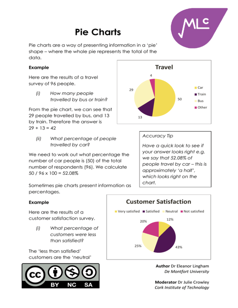
Pie Charts Pie charts are a way of presenting information in a ‘pie’ shape – where the whole pie represents the total of the data. Travel Example 4 Here are the results of a travel survey of 96 people. (i) How many people travelled by bus or train? Train 50 13 Accuracy Tip What percentage of people travelled by car? Have a quick look to see if your answer looks right e.g. we say that 52.08% of people travel by car – this is approximately ‘a half’, which looks right on the chart. We need to work out what percentage the number of car people is (50) of the total number of respondents (96). We calculate 50 / 96 x 100 = 52.08% Sometimes pie charts present information as percentages. Customer Satisfaction Example Here are the results of a customer satisfaction survey. (i) Bus Other From the pie chart, we can see that 29 people travelled by bus, and 13 by train. Therefore the answer is 29 + 13 = 42 (ii) Car 29 Very satisfied Satisfied 20% Neutral Not satisfied 12% What percentage of customers were less than satisfied? 25% The ‘less than satisfied’ customers are the ‘neutral’ 43% Author Dr Eleanor Lingham De Montfort University Moderator Dr Julie Crowley Cork Institute of Technology (25%) and the ‘not satisfied’ (20%). We calculate the total 20 + 25 = 45 Therefore 45% of customers were less than satisfied. (ii) How many customers were less than satisfied? We cannot say. (The data we are given tells us the percentage of customers in each category, but we do not have any information on the number of customers involved). 2015 2005 Example (Total Output: 200 TWh) Consider the above pie charts on energy production. (i) 5% 20% 30% 8% Nuclear Coal Gas 45% (Total Output: 220 TWh) Other 22% 34% 36% What was the decrease in output from coal between 2005 and 2015? We need to first work out the amount of energy produced from coal in each year. In 2005 45% of energy was produced from coal, so we need to calculate 45% of 200 TWh 45% x 200 = 90 TWh And for 2015 36% x 220 = 79.2 TWh Then we must calculate the difference in production (90 – 79.2 = 10.8 TWh). Therefore there was a decrease of 10.8 TWh in output from coal between 2005 and 2015. (ii) If total output was 7% higher in 2010, than in 2005, what was the percentage change in total output between 2010 and 2015? First we work out total output in 2010. We know that there was an increase of 7% between 2005 and 2010. Therefore the 2010 figure is 107% of the 2005 figure 107% x 200 = 214 TWh To work out the percentage change in output between 2010 and 2015 we first work out the change (220 – 214 = 6 TWh) and then express this as a percentage of the 2010 figure 6 / 214 x 100 = 2.8% Therefore, there was a 2.8% increase in total output between 2010 and 2015. Author Dr Eleanor Lingham De Montfort University Moderator Dr Julie Crowley Cork Institute of Technology
