1. Serum glucose (a) The split plot in time model. model
advertisement
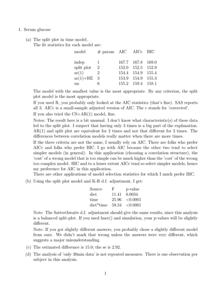
1. Serum glucose (a) The split plot in time model. The fit statistics for each model are: model # param indep 1 split plot 2 ar(1) 2 ar(1)+RE 3 un 6 AIC AICc BIC 167.7 152.0 154.4 153.9 155.2 167.8 152.5 154.9 154.9 159.4 169.0 152.9 155.4 155.3 158.1 The model with the smallest value is the most appropriate. By any criterion, the split plot model is the most appropriate. If you used R, you probably only looked at the AIC statistics (that’s fine). SAS reports all 3. AICc is a small-sample adjusted version of AIC. The c stands for ’corrected’. If you also tried the CS+AR(1) model, fine. Notes: The result here is a bit unusual. I don’t know what characteristic(s) of these data led to the split plot. I suspect that having only 3 times is a big part of the explanation. AR(1) and split plot are equivalent for 2 times and not that different for 3 times. The differences between correlation models really matter when there are more times. If the three criteria are not the same, I usually rely on AIC. There are folks who prefer AICc and folks who prefer BIC. I go with AIC because the other two tend to select simpler models (in general). In this application (choosing a correlation structure), the ’cost’ of a wrong model that is too simple can be much higher than the ’cost’ of the wrong too complex model. BIC and to a lesser extent AICc tend so select simpler models, hence my preference for AIC in this application. There are other applications of model selection statistics for which I much prefer BIC. (b) Using the split plot model and K-R d.f. adjustment, I get: Source F diet 11.41 time 25.96 diet*time 59.34 p-value 0.0034 <0.0001 <0.0001 Note: The Satterthwaite d.f. adjustment should give the same results, since this analysis is a balanced split-plot. If you used lmer() and simulation, your p-values will be slightly different. Note: If you got slightly different answers, you probably chose a slightly different model from ours. We didn’t mark that wrong unless the answers were very different, which suggests a major misunderstanding. (c) The estimated difference is 15.0; the se is 2.92. (d) The analysis of ’only 30min data’ is not repeated measures. There is one observation per subject in this analysis. 1 (e) The estimated difference is 15.0; the se is 3.09. (f) The rep. meas. analysis provides more df to estimate either the variance component for observations. The df associated with subjects is the same. After using the Satterthwaite approx. the df for the rep. meas. analysis is higher (12.4) than for the ’only 30 min’ analysis (9). The really big difference is that the rep. meas. analysis can provide comparisons of averages over times. Note: The se. for the ’30 min only’ analysis is slightly higher, but if you adjust for the slightly estimated higher variance among the subset, the two analyses would have the same se. That’s because the multiplication factor (2/6) is the same in both analyses. 2. NH4 uptake distance in streams. (a) Source d.f. Location 7 Type 2 L*T 14 error 48 c.total 71 (b) Location and Type are fixed. The Location*Type interaction and the error are random. (c) The differences do not look consistent across locations. Locations 1, 2, 5 and 7 have very small differences between Undisturbed and Ag; location 4 has a huge difference. (d) F = 2.26, central F with 2, 14 df Note: This is broad sense inference with location*type as a random effect. (e) F = 7.74, central F with 2,48 df Note: Location*type is fixed for this narrow-sense analysis. (f) Undisturbed - Ag = -23.6 with s.e. = 6.0 (g) In contrast, the differences after log transformation are quite consistent. They are not all the same, but they are much, much more similar. Note: In fact, if you treat the interaction as random, the estimated variance component for the interaction is negative. That means there is no deviation from parallel lines if you had perfect knowledge of each mean. All the visible deviations from parallel lines are due to sampling error in the means. (h) F = 10.66, p = 0.0015. Note: This is broad sense inference, like in 1c. The different conclusion from 1c is because now the interaction is much smaller. (i) Broad sense inference is needed because the investigators want to make conclusions for streams in general, not just these 8. I believe that the log-transformed analysis makes the most sense, because treatment effects are consistent across locations on that scale. It is possible to make general statements with some precision when you use the log scale. If you believe that the difference on the untransformed scale is the only biologically relevant quantity, then you would 2 choose to analyze the untransformed data. Either transformation was accepted if the explanation was reasonable. Note: Because the inferences are clearly for streams in general, narrow sense inference is not appropriate. This idea applies equally well to observational and experimental data. (j) Using broad-sense inference for log-transformed values, I get a difference of -0.193 with se of 0.042. If you argued for broad-sense inference of the untransformed values, I get a difference of -23.6 with a se of 11.1. Figure 1: Plot of average uptake distance(left) and log average uptake distance(right) 3. Epileptic seizures (a) fit a Poisson distribution, estimates of interaction is -0.30 with s.e.= 0.0698 (b) over dispersion parameter is 2.72 ≥ 1, indicates over dispersion (c) deleted (d) Estimate the difference between the two treatments and its s.e. for period 1, which is -0.41 with s.e.=0.25. 3
