TypeforWeb - WordPress.com
advertisement
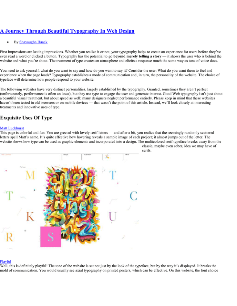
A Journey Through Beautiful Typography In Web Design By Shavaughn Haack First impressions are lasting impressions. Whether you realize it or not, your typography helps to create an experience for users before they’ve even read a word or clicked a button. Typography has the potential to go beyond merely telling a story — it shows the user who is behind the website and what you’re about. The treatment of type creates an atmosphere and elicits a response much the same way as tone of voice does. You need to ask yourself, what do you want to say and how do you want to say it? Consider the user: What do you want them to feel and experience when the page loads? Typography establishes a mode of communication and, in turn, the personality of the website. The choice of typeface will determine how people respond to your website. The following websites have very distinct personalities, largely established by the typography. Granted, sometimes they aren’t perfect (unfortunately, performance is often an issue), but they use type to engage the user and generate interest. Good Web typography isn’t just about a beautiful visual treatment, but about speed as well; many designers neglect performance entirely. Please keep in mind that these websites haven’t been tested in old browsers or on mobile devices — that wasn’t the point of this article. Instead, we’ll look closely at interesting treatments and innovative uses of type. Exquisite Uses Of Type Matt Luckhurst This page is colorful and fun. You are greeted with lovely serif letters — and after a bit, you realize that the seemingly randomly scattered letters spell Matt’s name. It’s quite effective how hovering reveals a sample image of each project; it almost jumps out of the letter. The website shows how type can be used as graphic elements and incorporated into a design. The multicolored serif typeface breaks away from the classic, maybe even sober, idea we may have of serifs. Playful Well, this is definitely playful! The tone of the website is set not just by the look of the typeface, but by the way it’s displayed. It breaks the mold of communication. You would usually see axial typography on printed posters, which can be effective. On this website, the font choice isn’t particularly decorative or playful; it’s a rather simple sans serif. A nice touch is the background pattern, which mimics the reading direction and the movement of the user’s head from side to side as they read the text. ebsite is altogether remarkable. The page has such a dynamic feel, created by the different elements on it. The nameplate is in a bold yet elegant e, setting the tone for the design. A sense of movement is established by the diagonal lines, which follow the slant of the “A” in the nameplate, the rhythm for the website. The movement of the slideshow of teasers grabs your attention, and the images are large without feeling cramped. er, the main background image of the website is 2560 × 5350 pixels and 2.4 MB — ouch! Cirq Designed to look like an old poster, this website for a vineyard is quite unique and innovative. The design successfully achieves a vintage feel and translates beautifully as a website. I love how the shadow behind “Russian River” moves with your mouse and creates movement on the otherwise static page. The main drawback here is that, for some reason, the text is embedded as images on the website, preventing it from being copied and pasted. Also, surely a similar design could be created at less than 3.4 MB and 43 HTTP requests. The layout and typography here work together in a modular system, often overlapping one another. This approach to layout is refreshing because it isn’t rigid and has a fluidity to it. The typography has the same feel because it is widely spaced, despite being heavy and dense. Captions and descriptions, in an easy-to-read serif typeface, appear alongside the work. Rijksmuseum The large letters in a custom typeface span the screen and continue off page, making the Rijksmuseum seem larger than life. The home page then rotates through beautiful photographs of the museum’s contents. The main navigation is also rather interesting; when clicked, it slides down for users to select a subcategory. The total size of the home page is 955 KB with 31 HTTP requests — well optimized. I Shot Him This Web design studio greets you with a photographed welcome message, which is refreshing. The user immediately gets a sense of the physical space that these designers work in. There is a rawness to it, an authenticity. The type is the focal point without being loud or overwhelming. I really like how they have moved away from the perfection of the computer and show themselves as being unique. Although the home page isn’t as interactive as you’d expect, the personality of the design studio is established by the photograph, which has depth and texture. The hand-rendered type personalizes the website and sets up an expectation of the kind of work the studio produces. The type treatment throughout the rest of the website reinforces a relaxed yet creative energy, as the wording is short and to the point. Another interesting aspect is the navigation; it’s hidden on the landing page, but hovering over an icon provides access to it. As you scroll down, the navigation is revealed and remains fixed at the top. Banger’s This website has a lot of character. Banger’s is a down-to-earth eatery specializing in beer and sausage. Its story looks like it’s drawn on the brown cardboard box that its food is delivered in. The logo looks like a hand-painted sign, unique and imperfect but all the more beautiful for it. The fixed navigation works well as you scroll down, and the hover effect (turning the words red) is simple yet effective. The type contributes a lot to the visual identity, and the graphics are great — but the performance, not so much. A huge downside is that the home page is 7.2 MB, with 254 HTTP requests. Frankly, that’s unacceptable. Caava Design Caava Design has sans-serif typefaces, which maintains a neat, clean aesthetic. The typeface used for “Good design is good business” is large, easy to read and obvious, and the italicized introduction stands out. The typography throughout is used purposefully and is not necessarily loud, and the written content doesn’t detract from the portfolio. However, the small text is perhaps too small to be read comfortably, and the spacing in the justified columns is untidy. The contrast in size also discourages the user from reading the entire website. Again, the visuals don’t justify the size: 5.7 MB and 90 HTTP requests. The Black Sparrow The Black Sparrow has a vintage look. The wide variety of typefaces all help to establish an eclectic, rustic feel. The theme for this drinkery and lounge is based on the writings of Charles Bukowski, reflected in the literary elements and old typewriter-style logo. I love the navigation bar and how the icons roll over when you hover them. The website has a definite 1930s feel, and the sparrow illustrations support it. However, with the space available, the font size does seem a bit small to be read easily. Nocturnal The beautiful slab serif used here is simple, clean, large and easy to read. It is round and widely set, giving the website plenty of breathing room. The simple, neat layout together with the type treatment give a good overall snapshot of the designer’s work. This website works effectively as a design portfolio; while it doesn’t do anything unusual, it focuses heavily on the artist’s work, and sometimes that’s all that is necessary. Marie Guillaumet The handwritten typeface works beautifully by personalizing this portfolio and giving a sense that the designer is physically involved in the production process. A sense of individuality and uniqueness is connected to the designer and, in turn, her work. The handwritten type also works well with the hand-drawn icons, adding character to the website. It’s almost as though we are peering into her visual diary, getting a piece of the designer herself, which will appeal to prospective clients. Vintage Hope The website’s heading looks like it was painted with a thick paintbrush in big heavy strokes. The typeface is so wonderfully bold and expressive. Together with the beautiful photography that fills the background, it gives the user a sense of the openness and freedom that characterize the organization. Vintage Hope raises money for the less fortunate in Malawi by loaning out vintage china, and the visual identity has an excited, happy and positive look to it. And that’s at 1 MB in size and 40 HTTP requests — impressive. Browser Awareness Day As this page loads, the user is called upon to help make the Web “fun,” “fast” and “safe.” The keyword in each slide is set in decorative type. Creativity is evident in the lettering, which grabs attention, enticing the user to scroll down and learn more. The note on the right has a comic book-style typeface, adding to the playfulness of the website. When you scroll down, the same comic-book typeface is used, along with other playful typefaces. Rob Edwards The typography here is just beautiful. It’s a design piece in itself and sets up an expectation of the designer’s work. The “Hi there” is large and grabs the user’s attention, and the rest of the decorative circus-style typefaces are engaging and fun. You don’t see this every day, and it works effectively as an introduction. The rest of the website feels a bit out of place, though, especially in its spacing and contrast. 82nd & Fifth This website is all about visuals, and the typeface supports that. The sans serif is beautifully simple and light, and the tinted block backgrounds for the captions are sophisticated. With this website, the typeface isn’t the focal point, but rather supports the strong photographs. The website as a whole is quite dynamic; as you scroll down, more thumbnails are loaded. The website also has a seemingly transparent navigation bar; when it’s hovered over, a black bar folds out to reveal the menu. The whole website is thoughtfully constructed to showcase the art pieces. The downside is its 6.4 MB and 120 HTTP requests. ECC Lighting & Furniture Love it or hate it, Helvetica takes center stage on this website. The category buttons are big and bold and grab the user’s attention. The graphic design here is classic, clean and minimalist. The type in the navigation is vertically oriented in the top-right, creating an interesting effect, while still allowing the user’s focus to remain on the main category navigation. The way the images are not shown until the area is hovered over is intriguing. Marianne Brandt What do you expect when you hear the name Marianne Brandt, and how would you translate that into a website? Naturally, a Bauhaus-level focus on functionality is key. This website has a definite Bauhaus feel to it, with its flat colors and Futura font. The overall aesthetic is minimalist and clean but definitely not boring or dull. What grabbed my attention was the “Thanks / Danke” piece, in which the language you’ve set (English or German) determines which word stands out in bold red. It’s such a great idea for websites that support more than one language. The different sections remind me of colored plastic file dividers, a great way to sort through information on a website. The colors, geometry and overall character are consistent with Bauhaus principles. Nate Navasca The style and type treatment on this website are perhaps a little more traditional, with a bold sans-serif headline and a serif typeface for the body text. If it ain’t broke, why fix it, right? The designer focuses on functionality and simplicity, and it works well. Ewket The design here is flat and simple. Created with basic shapes, it looks like the first layer of a painting. Ewket deals with basic education matters in Ethiopia, and the use of Andale Mono for the body text is not exactly what you’d expect, but it works for the purpose. The font is a sharp sans serif that has a bare and basic feel. Ewket is a grassroots program, so the very basic and simple design mirrors its function. However, it isn’t really reflected in performance: 4.6 MB and 58 HTTP requests are unnecessarily large. The Dissolve I love the nameplate and how it creates an old cinema aesthetic. The typeface has that vintage feel and contrasts with the serifs used in the articles. The website has the simple, clean and sophisticated appeal of an old movie. The navigation makes great use of the space; once the identity of the website is established with the nameplate, the teasers for each category appear in its place as you hover over it. The Whig This dive bar is a place to sit back, relax and have a drink with your buddies. The typeface chosen to illustrate this is Medula One. This sans serif isn’t overly decorative but has a medieval look to it, with its brushed strokes. It’s friendly and not pretentious, hinting at the ambience of the bar. Find & Form With a clean, monochromatic aesthetic, this website keeps body text to a minimum. The typography is simple and low-key, allowing the images to speak for themselves. The monospaced font is a bit unusual here; still, it communicates the team’s slogan that “The digital world craves old-school craft.” The aesthetic is contemporary. Also interesting is how navigation moves horizontally as you scroll down the page, making room for the rest of the website. Carrera There is a timelessness to the design of Carrera’s website, just as there is an authenticity and timelessness to its products. Website design should be consistent with product design. This eyeglass company cites one of its objectives as being to strike a “perfect balance between heritage and fashion.” The simple, bold uppercase type achieves this, having a classic feel without being outdated or overused. The typography is bold and prominent, although different enough that it doesn’t compete with the logo. Also worth mentioning are the interesting hover effects throughout the different sections of the website. Myfelt The typography used here is friendly and warm, congruent with the products, text and illustrations. All of the elements work together to communicate the same message. One of my favorite things about this website is that the dots in the rugs are incorporated into the logo and nameplate. Vogue The Playfair Display font, by designer Claus Eggers Sørensen, sets a bold yet not brash tone. The elegance of this serif is consistent with Vogue’s brand. According to the designer, the typeface is viewed best at larger sizes. All Saints Estate There are a few ways to achieve class and elegance with type, and this website hits the nail on the head with its blend of serif and lightweight sans serif. Garamond Premier Pro Display has a contemporary yet sophisticated look that is delicate and perfect for body text and appropriate to vineyards and wine. Evening Edition The blackletter typeface for this nameplate is consistent with the traditional nameplates of print newspapers. It carries authority and gravitas and separates this news source from tabloids. Served MCR This fun doodle-inspired website is for a ping-pong competition. The typography is rough and looks hand-drawn; in some areas, the type is animated or set against an animated background. Animated type is unusual in Web design, but here it grabs the user’s attention. The “Register” banner is an instance of this; the text is legible and prominent. This typography is appropriate because there isn’t much text, which keeps the website easy to use. However, the performance of the page is devastating: 7.5 MB with 175 HTTP requests. The main background image is 2032 × 4761 pixels and 2.2 MB — on both desktop and mobile. Enso Large, bold, full-caps sans-serif type can get in your face, as if it’s shouting. However, Enso uses muted tones to counter the bold typography — although, yellow is a little difficult to read. The layout is original and interesting; the designers want you to notice the type running down the page and to scroll down to read the entire message. This is a clever tactic because the navigation is scattered around the page in bright pink. The logo at the top acts as a home button, rolling out to reveal the whole word when hovered over. Crafting Type This website is all about type, so the typography has to sell itself. The contrast between the light uppercase type for “Crafting” and the heavy lowercase typeface for “type” creates visual balance in the logo. The body text is large and legible. The serif typeface and simple elegant layout also contribute to the legibility. Nautilus This beautiful website is neat, clean and easy to navigate. The typography works well, with the three fonts coming from the same family. This is a nice way to differentiate your type while maintaining consistency and not disturbing the aesthetic. Unfortunately, Web typography has its cost: 12.6 MB and 73 HTTP requests, with two enormous images, at 3.5 and 2.4 MB, respectively. Kick My Habits The thick bold typeface of “Kick My Habits” is the first thing you see on the page. The skinny typeface (named KG How Many Times), with its charming handwritten feel, contrasts with the heaviness of the other type. The website, a beautifully designed and illustrated quiz that figures out how much money you waste on bad habits, has a relaxed, informal tone. And it doesn’t spend much of your bandwidth either. With all of the imagery on the page, it’s just 1.2 MB, although 161 HTTP requests are initialized upon the initial load; more content is loaded on demand. Monocle Monocle is a beautiful website with a classic quality. It uses serif and sans-serif typefaces in different weights, staying simple and elegant. Monocle is a global news website, with a focus on international affairs, business, culture and design. The layout is innovative, providing everything that the user could need right there. The categories are organized as tabs, with subcategories to further whittle down the information. Rezo Zero The custom typeface here by Julien Blanchet is unique and grabs attention. It establishes the identity of the brand, setting a mint green against a monochromatic website. The typeface is neither overused nor underused, translating beautifully as a logo. More Sleep Neat but friendly and inviting! Those were my first thoughts upon visiting this website. The large type with slightly rounded corners has a friendliness to it. The typewriter-style font used for the descriptions and explanations has a round, soft, welcoming appeal. Lenta Lenta is a Russian news website. It’s amazing how the graphic qualities of the type guide you and influence your perception of the website and its contents. The identity of any news website is established by its nameplate. A clean sans serif is used here, with a weight that conveys authority for the news source. The typeface remains effective when the text is translated into other languages. In keeping with a traditional news layout, articles and teasers throughout the website are in a serif typeface. Pixel Recess Pixel Recess makes use of the sans-serif Adelle Sans, which is neat and legible and looks great on a screen. The more intriguing type, however, is the headline typeface, Zeitgeist, which has a distorted, pixelated, even blurry appearance, reflected in the playground slide in the top-left corner. Pixelation is traditionally regarded as a mistake, but because the rest of the website is sharp, here it draws attention to itself — a clever tactic indeed. Conclusion It’s not just about what you say, but how you say it, right? Depending on your purpose, we could try to experiment more and get creative with our typography. We can be bold and daring with strong, large letters, or get quirky and unique with handwritten type. We should keep in mind that type should always be legible, because there’s no point in showing off type that no one can read. Type can do so much for a design if it sets rhythm and creates an atmosphere. It’s easy to get distracted by beautiful type treatments and large Retina-ready background images. But we shouldn’t neglect performance. Custom Web fonts can slow down loading times, so let’s find ways to counteract that. Finally, if you’d like to explore more interesting websites with a heavy focus on typography, make sure to visit Typewolf and Font in Use.
